

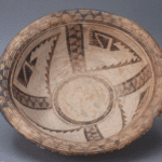
Formed ca. 1895-1901, this bowl has an unusual form, an unusual slip, an unusual design and unusually complete provenance.
It is one of three known examples of pottery of this shape and design by Nampeyo.
There is a well-known posed photograph of Nampeyo and Annie by Sumner Matteson taken between the mid-1890’s and 1901, the date being disputed (Kramer, 1996:75. Also see Ashton, 1976:33 and Wade and Cooke, 2012:148). Originally titled “Nampeyo and Queuchawa, the Boss Potters of Tewa,” the photograph shows Annie holding a small jar with Nampeyo to her left. They sit on the floor of their home and in the foreground are nine pieces of decorated pottery. Behind them are several pieces of utilitarian pots. Ones eye is drawn to the two women, with the pottery seen as props. However the pot in the foreground closest to the camera has an internal design very similar to bowl 2012-02 in this collection.
A second similar bowl (“potter unknown”) is in the collection of The Arizona State Museum, Tucson (catalog #CPO4741):
A third example is part of the extraordinary Cooke Collection now housed in The Museum of the West in Scottsdale (Wade and Cooke, 2012:146-149). The design on these three bowls is unlike anything else Nampeyo produced. Except for that Matteson photograph, we would not have known the maker.
Having reprinted the Matteson photograph, Kramer (1996:210, #8) adds a footnote that bears directly on the origin of bowl 2012-02. The photograph was originally published in a book about Matteson. The photograph “was presumptively dated 1901 by the authors,” Kramer writes:
“When I asked two members of Nampeyo’s family to compare Matteson’s photograph with those known to have been taken in 1901 by A.C. Vorman (pp. 72, 74 and 79—81 in Kramer; Fig. 2.18 in the Blairs, 1999:76 and on file with the collection), both said that Matteson’s was taken several years earlier, that Annie was much younger in Matteson’s photograph. I discussed their assertions with co-author (of the book of Matteson photographs) Bourns who said that Matteson may have taken the photograph between 1895 and 1899, a period during which Bourns cannot account for Matteson’s travels. If, during further research, he finds that Matteson visited First Mesa before 1900, the photograph will be the earliest to picture jars made by Nampeyo.”
And one of those jars is bowl 2012-03 in this collection or a close sibling.
Bowl 2012-03 and the two similar bowls were probably made in the last few years of the 19th century and represent one tangent of Nampeyo’s search for a personal aesthetic. As such, they are rare examples of her work before she began to focus on a Sikyatki Revival style in the early years of the 20th century.
In this catalog entry, first I will discuss the form and design of bowl 2012-02 and then cite Wade’s description of the Cooke bowl. Then I will compare the design on 2012-03 to Nampeyo’s later Sikyatki Revival design strategies. Next I will look at bowl 2012-03 in the context of other early pottery by Nampeyo to try to determine how her strategy of design changed over time. Finally we will review the unusually complete provenance of this bowl.
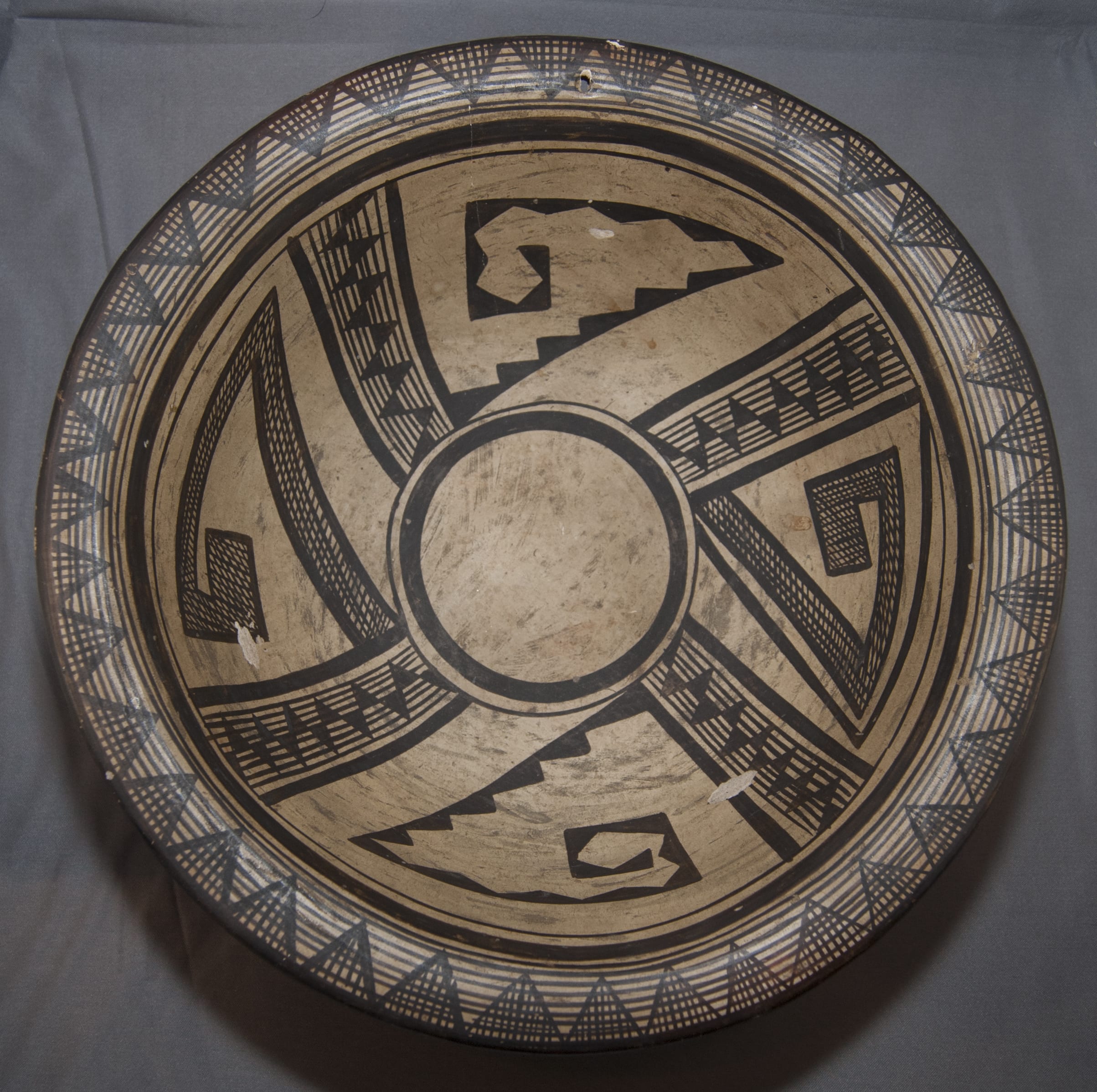
Form:
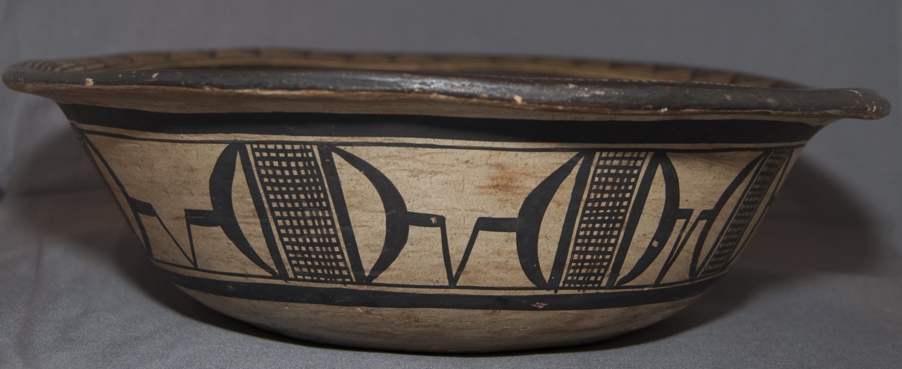
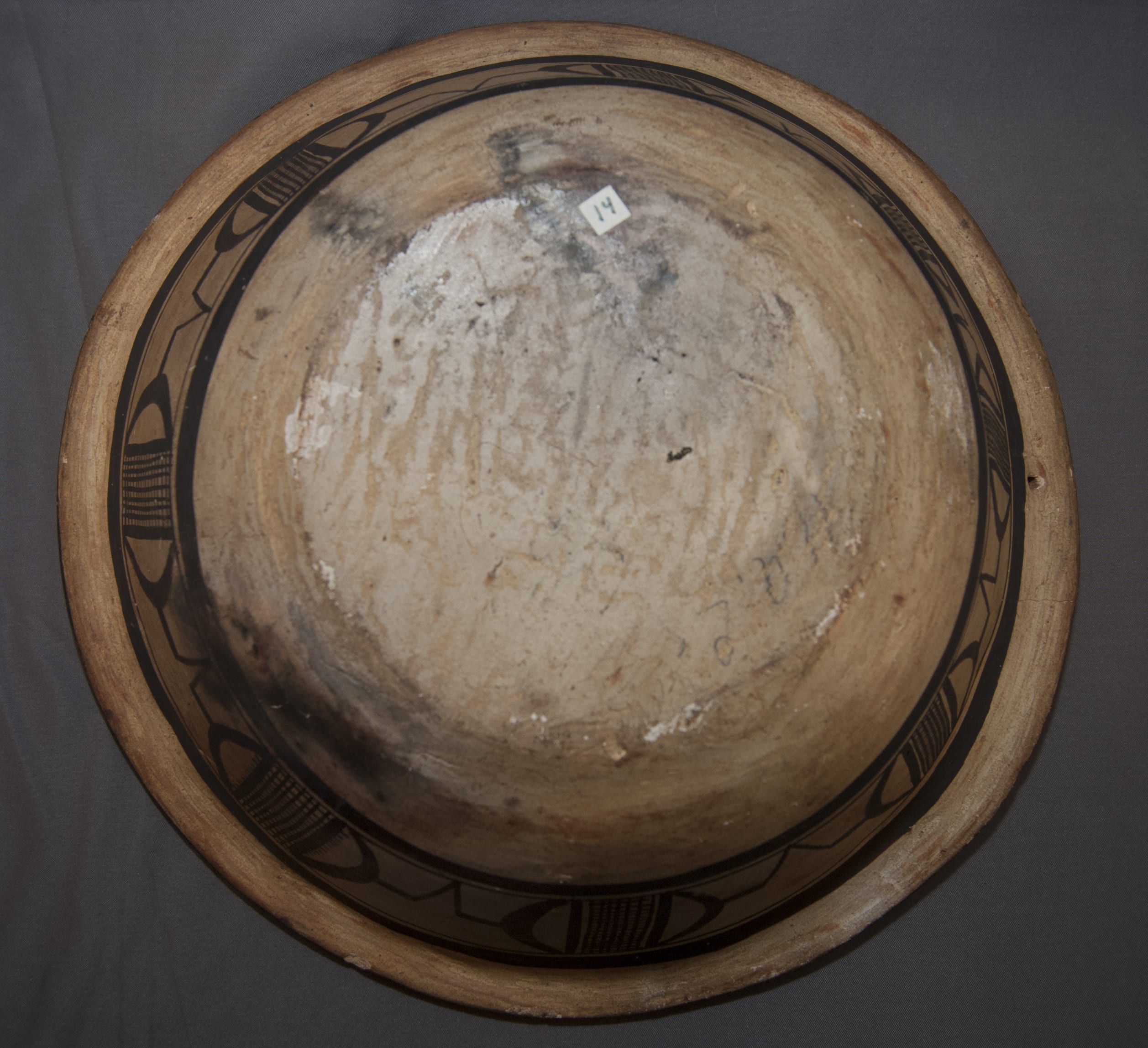
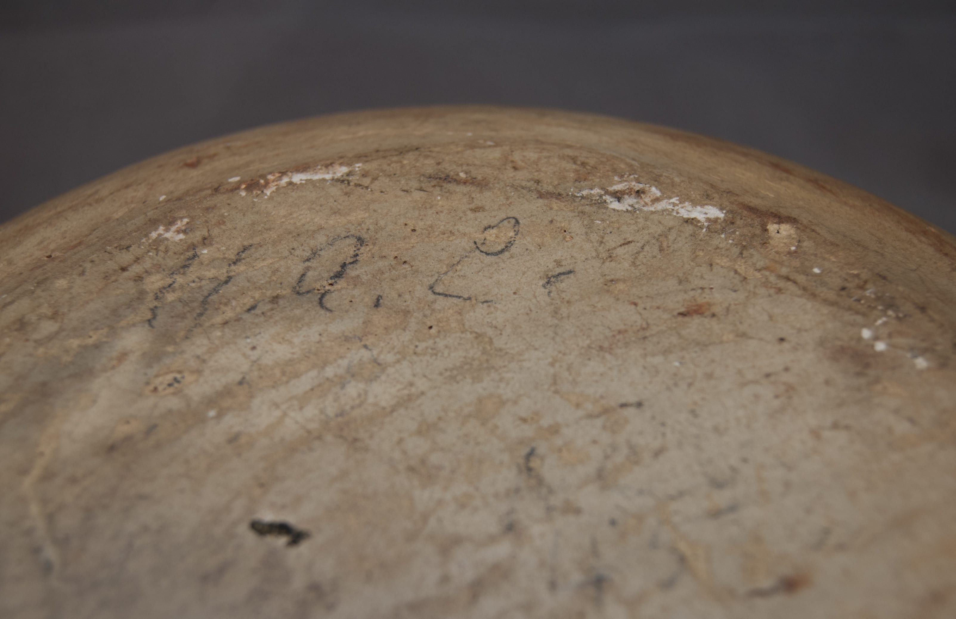
In a couple of spots internal to the bowl and on the bottom, the rag wiped grey/white slip has flaked off, revealing that the core of the vessel is formed from clay that fires white.
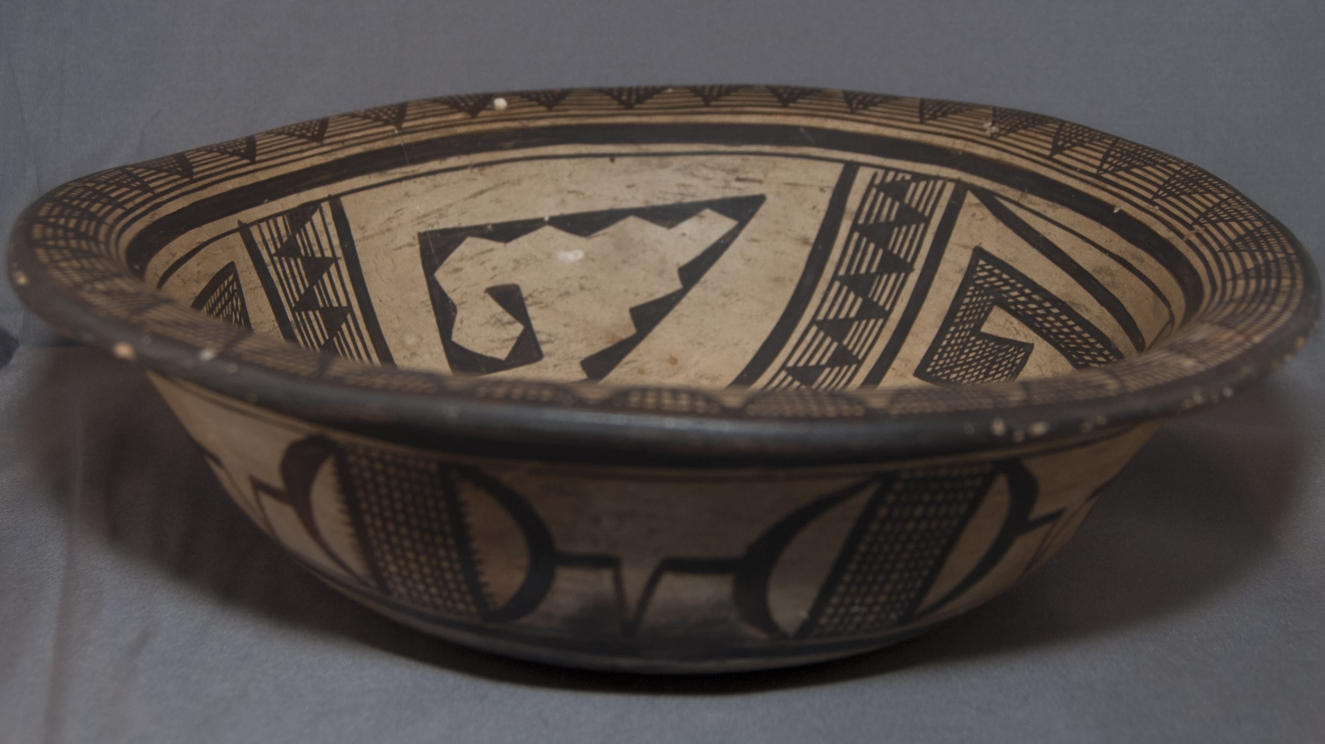
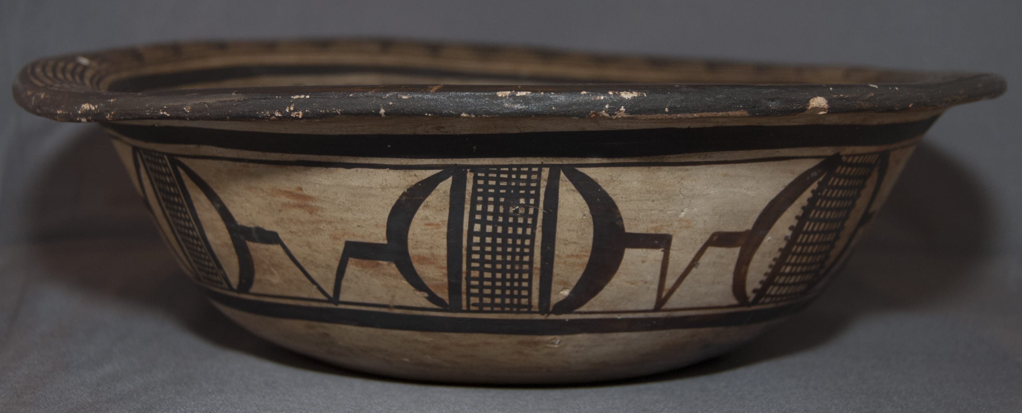
The flat foot that forms the base looks like a thin disk of clay had been applied to the bottom, though this is just an impression and not a statement of how the bowl was formed. This disk is about 5-inches in diameter and the bowl extends outward about 0.5″ above the disk before it begins to slope upward. The opening of the bowl (minus the rim) is about 9-inches wide. Thus the bowl rises from about a 6-inch base to a 9-inch opening, which is not a great difference. As a result, the walls of the bowl flare as they expand from base to top, but this change of dimension is modest and the flare is gentle, ending is the sharp outward expansion of the 1-inch lip. The walls of the bowl are substantial and even, but not thick. There is no evidence that a puki (external base form) was used to begin coiling the pot, a juncture line often seen on pots from Hopi.
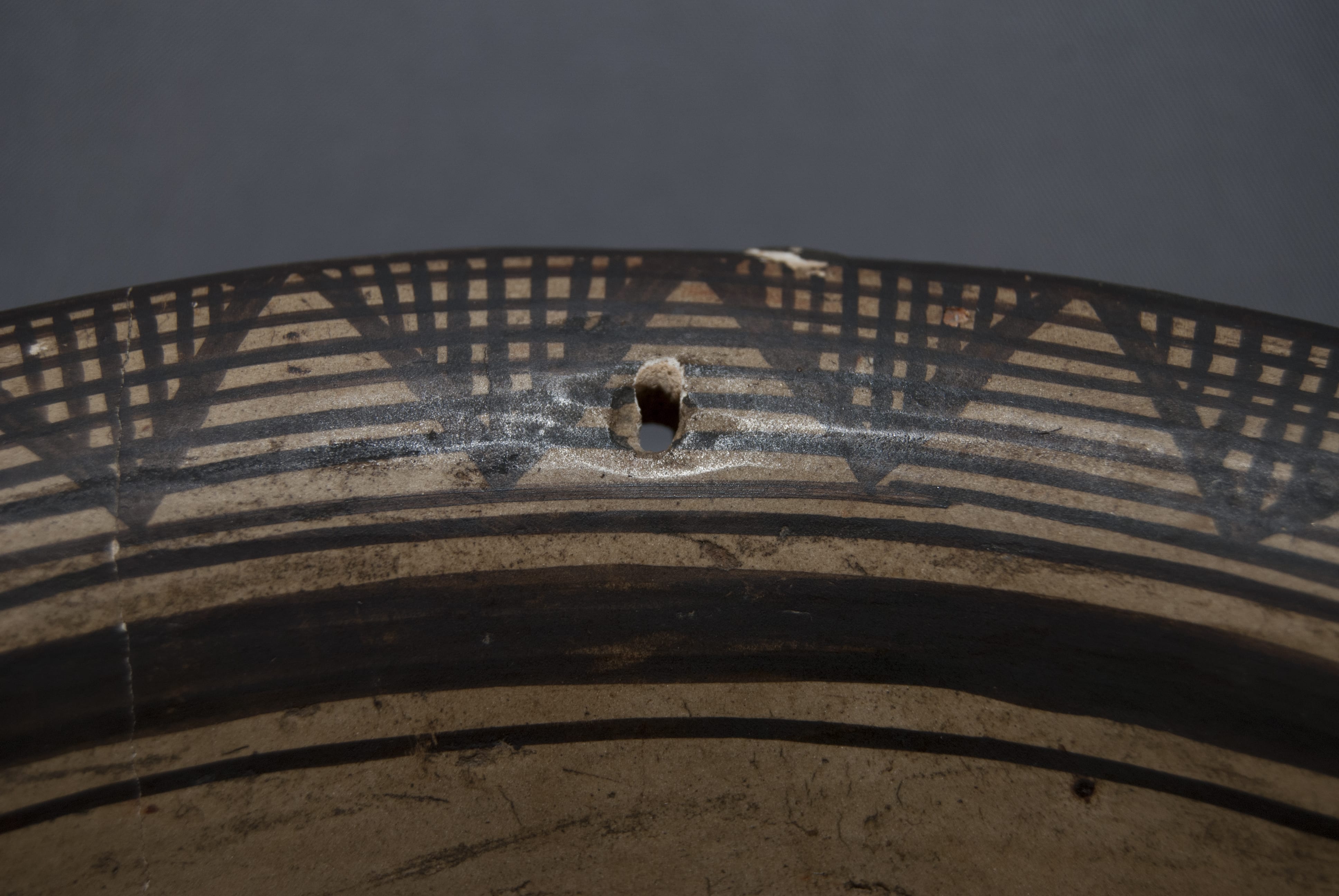
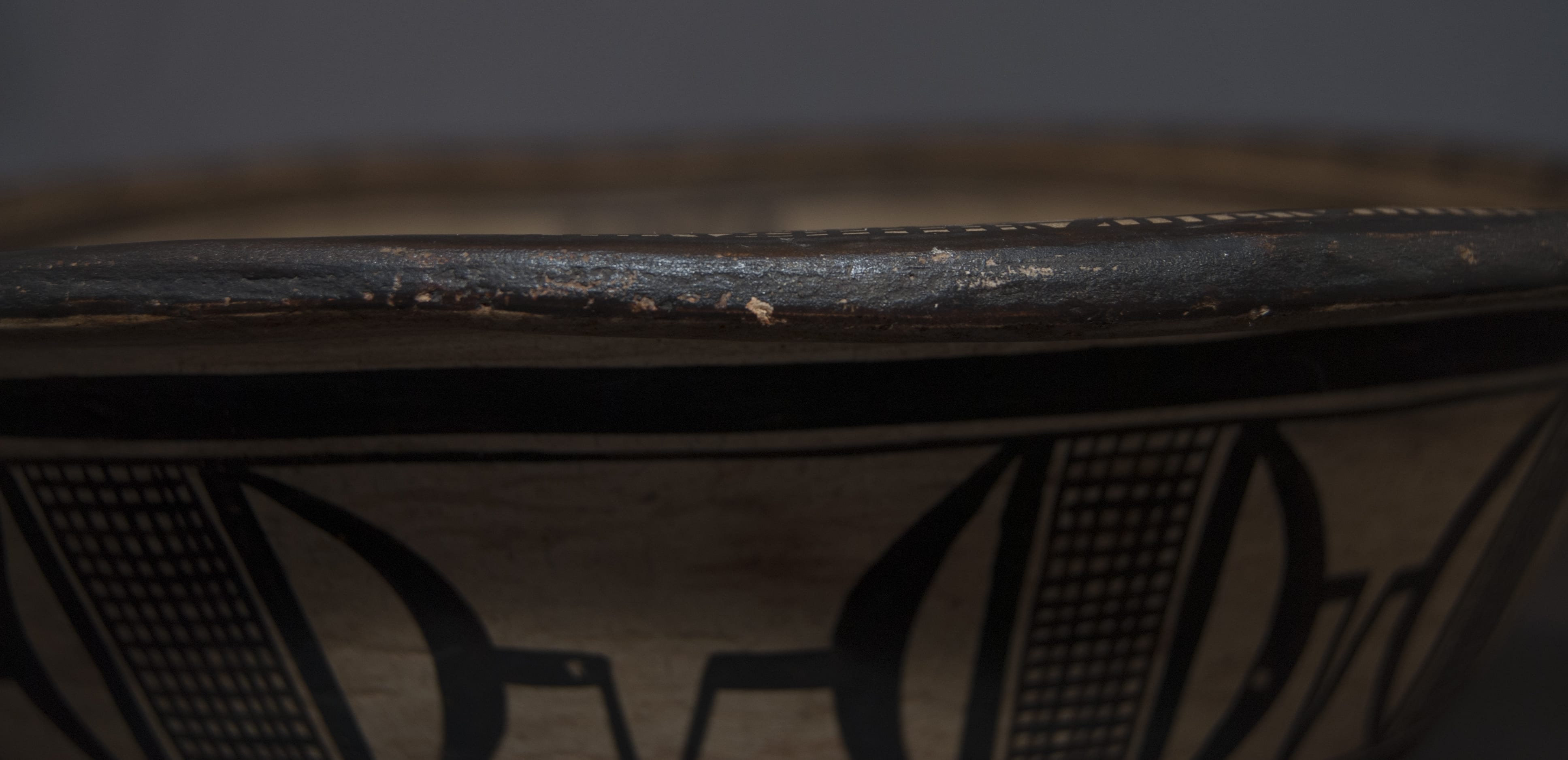
Other than the two bowls with variations of this design I know of no Hopi or Hopi-Tewa bowl with either the flared rim or the slight “foot” that characterize this pot; these characteristics are more Anglo than Native in form. A typical Hopi-Tewa food bowl is relatively deeper than bowl 2012-02 and has a “helmet” shape. (See bowl 1996-04.) The shape of 2012-02 looks more like a serving dish or cereal bowl produced by Wedgewood. Perhaps the Anglo shape was designed to appeal to the tourist market in the 1890s. After purchase, small hole was drilled through the rim of 2012-02, presumably to hang it by a string on a wall.
Design:
A grey slip has been wiped onto the surface of the bowl. It is not crackled like Nampeyo’s Polacca ware (2014-10, 2015-03) nor does it have the smooth, stone-polished finish of some Nampeyo pots (2013-17, 2015-12). See Appendix B for a discussion of the progression of white slip seen on Nampeyo pots. The slip on bowl 2012-03 is most like bowl 1993-04, but the finish on bowl 2012-03 is more carefully done. The designs on these two pots is extraordinary while the slip on both bowls is applied casually. Apparently at times Nampeyo cared more about her design than her slip.
The design on 2012-02 is neither Polacca nor Sikyatki inspired. Rather, the design of bowl 2012-02 seems to reflect Pueblo II (1150 CE to 1300 CE) pottery, perhaps more specifically Kayenta black-on-white ware (1260 CE to 1300 CE). Pots made during these periods are characterized by fine hatching lines, often painted over solid white backgrounds. “Negative motifs, especially circular and rectangular scrolls, and the characteristic “mosquito bar” (fine) cross-hatching, are defined by the fine painted linework” of Kayenta ware, writes Ed Wade (1980:23). Ashton (1976:32) offers photographs of four Nampeyo jars with black-on-white decoration that also carry Pueblo II motifs and “suggest that Nampeyo was copying prehistoric designs prior to 1890.” About one of these jars, Wade writes:
“(Thomas) Keam commented on Nampeyo’s artistic inquisitiveness and employment of designs taken from ancient Black on white ceramics. A photograph taken of his storeroom around 1900 by A.C. Vroman shows a large cylindrical vessel decorated with precise geometric designs reminiscent of 13th Century Kayenta pottery motifs. The jar was documented by Keam as having been the work of Nampeyo and is now housed in the collection of the Thomas Burke Museum in Seattle, Washington” (2012:131).”
The Vroman ca 1897 photograph to which Wade referred is found in Ashton (1976:32). Bowl 2012-02 carries a design of the same style as the jar now in the Burke Museum.
As Barbara Kramer notes “Shapes and designs borrowed from Sikyatki ware constituted only one of many prehistoric periods incorporated by (Nampeyo)….(D)uring the late 1890s…(d)esigns painted on (her pots) were more static and vessel shapes less graceful than her later ones” (1996: 160 and 167-168).
On bowl 2012-03, Nampeyo has taken these ancient traditions and created a complex, intriguing design.
Interior design:
Polacca “C” ware was the common pottery type at Hopi when Nampeyo was born and when she was a teenager learning to make pots. The typical interior design of such Polacca pots was a curvilinear “rainbird” orbiting around a circular hub (cf. 2014-06). Nampeyo used the same general format on bowl 2012-03.
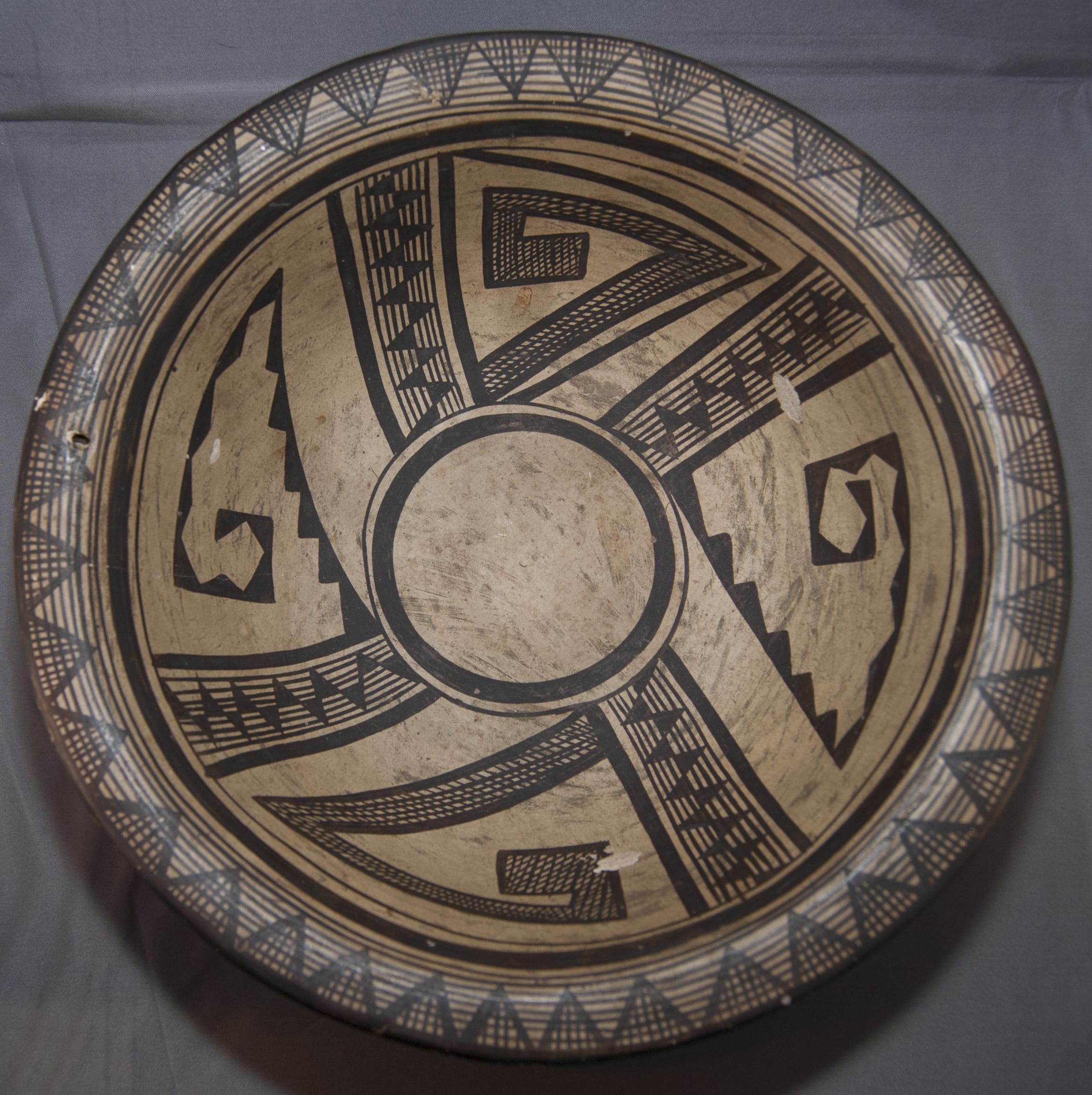
The interior design has 7 elements:
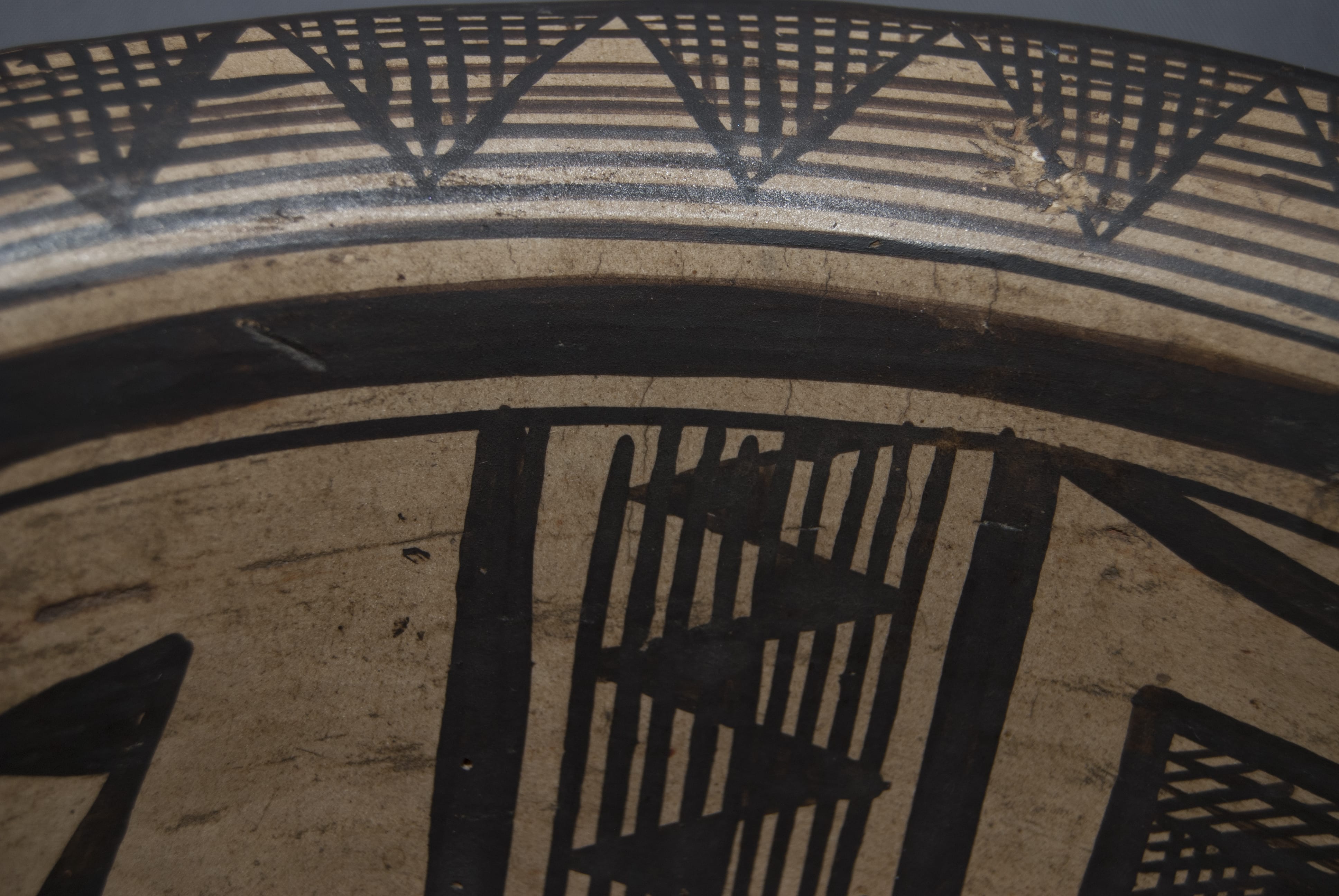
Element #1: Painted on the flared lip between the black rim and the thick framing line are eight concentric circles in a space only an inch wide. The distance between the eight circles varies a bit, but nowhere do any of the circles touch. Drawn around the rim of the bowl are 37 triangles with their bases built on the outer edge and their apexes resting on the 7th circle from the rim. Dividing a circle into four quadrants or multiples of four (4, 8, 16, or 32) is relatively simple. Dividing the rim into 37 equal segments is extraordinarily difficult and is the mark of a master craftsman. Within each of the 37 triangles are five to seven lines perpendicular to the circles, thus creating a set of crosshatches within each triangle.
Element #2: Below this rim design is a thick framing line over a thin framing line.
Element #3: On the inside bottom of the bowl is a circular thin framing line over a thick circular framing line; together they form an empty central disk four inches n diameter. Between this central disk and the framing lines near the rim, elements #4, #5, #6 and #7 orbit around this central hub.
Element #4 is composed of four linear bands of lines and triangles about an inch wide that divide the inside layout of the bowl into four quadrants. Each of these four designs is formed by thick parallel lines that run between the thin framing lines on the rim and center of the bowl. These thick lines enclose nine parallel thin lines (in one case eight thin lines). The fifth of these thin lines forms the base of small triangles that alternate direction and whose apexes touch the outer-most thin line. Twelve to 14 small triangles are drawn in each of the four repetitions of this design. Most of these triangles are isosceles, but the first and last in the series are the equivalent of an isosceles triangle cut in half.
In all four renditions, the half triangle closest to the rim is pointed in a clockwise direction while the half triangle closest to the center of the bowl is oriented in a counter-clockwise direction. The triangles in this design element seem to have been painted from the center of the bowl toward the edge, judging from one case where the outermost clockwise half triangle was so squeezed for space as to almost be un-noticed. Of the hundreds of design elements that make up the interior and exterior designs on this bowl, this small, squeezed, and misshaped triangle is the only painting “error.”
The next two elements on the interior of the bowl are made up of large crooks organized into two pairs with each pair posed on opposite sides of the central open circle. Though all four images have an overall triangular shape, they are constructed quite differently.
Element #5 consists of a pair hollow black crooks with six sides composed of a series of solid black triangles. The six sides are joined by corner triangles: the first side is formed by six triangles in a row, the second side is formed with three triangles in a row, the third side is composed of only one triangle. The remaining three sides (the end of the crook) are composed of only corner triangles. As a result, the interior of these crooks is left unpainted. The end of one crook is more closed-off than the other. The first turn in the crook is at an angle of about 35 degrees; the remaining four turns are all at 90 degrees. The two renditions of this pattern are oriented so that the 35-degree turn on one points to the right while the other points left.
Element #6 consists pair of crooks that have the same overall shape as the first, but the interiors are filled with design. Each crook has six sides with multiple angles, the first about 35 degrees and the remaining 90 degrees turns. Fairly thick black lines form the outer border of the design. Internal to these framing lines inside the two longest sides of the crook are from three to six thin lines parallel to the thick framing lines. Crossing these thin lines are other lines forming an overall cross-hatched, meshed, design that reflects the cross hatching in the rim triangles. As with the triangle crooks of motif #2, the crosshatched crooks in motif #3 are oriented in opposite directions.
The fact that the four crooks on the interior share two different designs will prove critical when we discuss provenance, below.
It’s all very symmetrical except….
There is one additional interior element that throws the interior design off symmetry.
Element #7: Both crosshatched crooks grow out of one of the thick black lines that form part of the linear motif discussed above. One of these crosshatched crook stands alone in its space. The second of these crooks has two additional thick black lines that parallel the two longest sides of the design and join with the first black line to form a triangle that surrounds the crook.
The significance of this surrounding triangle is very great. This may sound like hyperbole, but will be justified when a) we compare the design on bowl 2012-02 to the design strategy we expect on Nampeyo’s Sikyatki Revival work, and b) becomes extraordinarily significant when we discuss provenance, below.
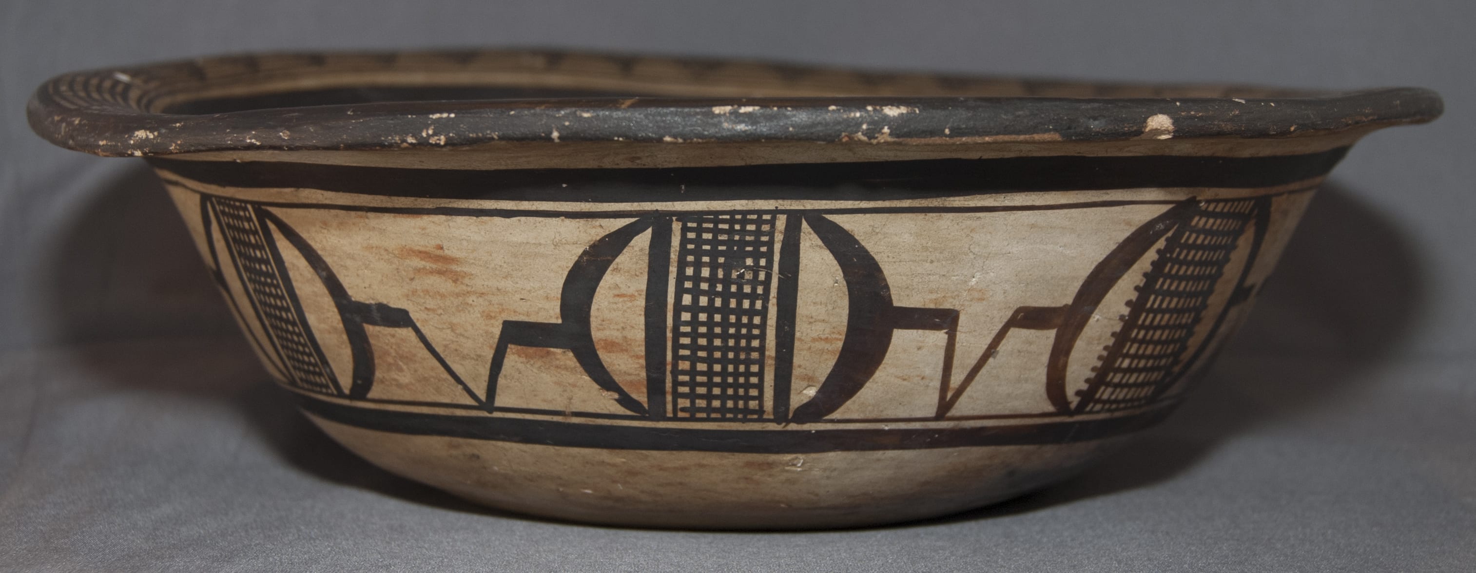
Exterior design:
The exterior of the bowl is decorated with a band of two designs, each repeated eight times.
Central to the exterior design are rectangles formed by seven to nine thin vertical lines and 13 to 17 thin horizontal lines. Each of these rectangles is bracketed by heavy black elements in the form of parentheses. Linking these parenthetical elements are two horizontal lines as thick as the parentheses and emerging from them. These are joined by a somewhat thinner V-shaped element, thus forming an early version of Nampeyo’s “clown face”:
“Nampeyo whimsically tucked variations of the clown face into many designs throughout her career (Kramer, 1996:188).” According to Martha Struever (see appraisal below), this V-shaped element is a motif found on ancient ware from Sikyatki.
Notice that the central square flaked by thick parentheses is a version of a central motif also used by Nampeyo on bowl 1993-04 in this collection.
This pattern of rectangles, parentheses, and clown faces is repeated in a chain around the exterior of 2012-02. The eight clown face elements vary considerably in width in sets of three. Starting with the clown face immediately to the left of the hole in the rim, the first set of three and the next set of three each have one thin, one medium and one wide “V” elements in random order. The final two clown faces are thin and medium in width. Thus, the external design has three thin, three medium and two wide “V” elements. No “V” element has a neighbor that is the same width as it is. The significance of this pattern is discussed below.
The triangle of the clown faces, of course, reflects the many triangular motifs on both the interior rim and the interior of the bowl. The crosshatched rectangles on the exterior of the bowl similarly mirror the crosshatching on the rim and interior of the bowl. In short, the overall design of bowl 2012-02 is carefully rendered and well integrated.
Ed Wade’s more technical description of the Cooke bowl:
“The composition –how the decoration is aligned inside the bowl—corresponds to a favored pattern spanning from 1200 to 1375 (CE), or the end of the Jeddito Polychrome tradition at Hopi. Technically it is an offset radial layout with a fourfold subdivision, a style that was abandoned by Sikyatki and later potters. Adding to the confusion of identifying this intriguing vessel is the banded subdivides interspersed internally with black positive and striped negative triangles. The same-banded unit is seen on the outflaring lip of the bowl. This design unit is not of Hopi origin but common to late 19th– and early 20th-century Keresan pottery from Acoma, Santo Domingo, and Cochiti. Where Nampeyo was exposed to the design remains a mystery. The triangular serrated fret on the outside and inside of the bowl was favored by Nampeyo up to about 1900 when it was displaced by more curvilinear motifs; however the deep basin shape with an outflaring lip is unusual for the potter. (Wade and Cooke, 2012:149).”
The Cooke bowl is displayed at the Museum of the West in Scottsdale and is dated as being made c. 1895-1900. Ed Wade’s label reads in part:
“[Nampeyo’s] aesthetic versatility was so broad that sometimes her best pieces have been confused with the work of other potters or even other pueblo traditions. This Prehistoric Revival bowl is a case in point… it just doesn’t look Hopi. (Such pots) are quite rare…The design on this pot has nothing to do with the late 14th-century Sikyatki tradition but is a loose interpretation of a number of prehistoric black on white ceramics including Tusayan.
“It has been difficult for collectors and scholars alike to grasp the phenomenal range of decorative and scluptural styles practiced by Nampeyo. Her aesthetic versatility was so broad that sometimes her best pieces have been confused with the work of other potters and other Pueblo traditions. This Prehistoric Revival bowl is a case in point. The former owners acquired it from a prominent auction house and it was not attributed to Nampeyo, whose Prehistoiric Revival ceramics are quite rare”
How different is the design on bowl 2012-03 from her later Sikyatki Revival design?
Born about 1860, Nampeyo’s ceramic career stretched over 60 years (about 1880-1942). Kramer (1996:167-177) divides this span into five periods. Period 1 (pre-1900) is not well documented: “Few photographs and vessels from this period are extant, but it can be deduced that Nampeyo had not yet found her personal style” (1996:177). After 1900, Nampeyo increasingly used curvilinear and avian designs on her pottery, a style commonly called “Sikyatki Revival” style.
Bowl 2012-02 was fabricated during Kramer’s Period 1. Given its early date, how well does its design foreshadow the style used by Nampeyo later in career, the style that made her famous?
Superficially, there is little resemblance between the design on bowl 2012-02 and her Sikyatki Revival style. The intricate and somewhat static design on bowl 2012-02 contrasts sharply with the fluid, energized designs for which Nampeyo later became famous. Compare, for example, the detailed, constrained design on bowl 2012-02 with the curvilinear, free-floating designs on bowls 2002-03 and 2014-07, made about five to 10 years later. At first glance, the designs seem entirely different. Nevertheless, an analysis of the design on 2012-02 calls into question this first impression.
In Appendix “B” I defined six characteristics of Nampeyo’s mature Sikyatki Revival style using an ancient Sikyatki bowl bowl 1993-04 as a benchmarks. When these criteria are applied to bowl 2012-02, the results are surprising:
1) A tension between linear and curvilinear elements often represented as a contrast between heavy and delicate elements.
On the interior, there is a tension between the circular lines in the design (on the rim and in the center) and the triangular elements that, in various formats, populate the design. On the exterior of the bowl, there is a similar tension between the delicate linear crosshatched rectangles, the linear “V” shaped clown faces and the heavier curved “parentheses” that frame the clown faces.
2) A deliberate asymmetry of design.
As detailed above, the interior design of bowl 2012-02 is strikingly balanced, which gives the bowl a somewhat static feeling. Nevertheless, “Element #7,” the black triangle surrounding one of the crosshatched crooks, is not duplicated around the other three crook images on the bowl, thus deliberately throwing the interior design out of balance. More subtly, the exterior design repeats the same sequence of elements eight times around the bowl, but the width of the “V” forming the clown faces seems deliberately varied so that the width of one “V” is never the same as its neighbor. Had this variance been unintentional, one would expect the “V” motif to be a consistent width, with perhaps the last one or two V elements narrower as Nampeyo discovered she was running out of room. This is not the case. The variance in width is deliberate.
3) The use of color to integrate design elements.
Since the bowl is monochromatic, Nampeyo’s use of color in this design is not an issue.
4) The use of empty (negative) space to frame the painted image.
On the “classic” Nampeyo Sikyatki Revival pot, the use of negative space to frame the design is clear and dramatic (see 2005-16). To a more moderate degree, space is left around the four internal crook designs on bowl 2012, highlighting these design elements. This is particularly true of the two hollow crooks formed by solid-black triangles. On the exterior of the bowl, considerable empty space is left around the elements between the crosshatched rectangles, thus highlighting these motifs.
5) The use of a thick above a thin framing line on the interior rim of her bowls.
The thick-above-thin framing lines are clear on bowl 2012-02, both on the rim between the lip and the bowl interior and framing the circular area in the center of the interior.
6) Nampeyo’s painting is confident, bold, and somewhat impulsive compared to the more-studied, plotted and careful style of her daughters, descendants and other Hopi and Hopi-Tewa potters.
On the “classic” Sikyatki Revival Nampeyo bowl her painting is “confident, bold and somewhat impulsive.” While the complex painting on bowl 2012-02 is done with great precision by a potter who can easily be described as “confident” (there appears to be no over-painting of brush strokes), the design is not at all “bold or impulsive.” The phrase “tightly controlled” would better describe the decoration. Of the hundreds of brush strokes necessary to paint the design, only one (the meager triangle that finishes off one of the legs of the design that divides the interior into quadrants) seems out-of-pattern or unplanned. The design on bowl 2012-02 is energized by those whirling crooks, but it is neither “bold” nor “impulsive.” Thus on this one dimension, Nampeyo’s painting of 2012-02 is clearly at variance with her later “classic” style.
In short, although the design on bowl 2012-02 looks strikingly different than Nampeyo’s Sikyatki Revival designs, on four of the five dimensions that apply, Nampeyo displays the aesthetic sensibilities that later made her famous. The design is not as “impulsive” as her later Sikyatki Revival designs, but this was a deliberate choice by the artist. By choosing such a complex pattern, she precluded the possibility of impulsivity.
Other early Nampeyo pots in the collection that do not carry a Sikyatki-derived design:
There are now six pots in this collection by Nampeyo dating from about 1900 or earlier that do not carry a Sikyatki-derived design. Each pot represents a different tradition of ceramic decoration. This is a small and certainly not a random sample of her early pottery, but some stylistic patterns are discernible among these six pots and these patterns suggest the process whereby Nampeyo developed her mature style. As detailed in “Appendix A,” I list these pots in the approximate order of their creation:
2015-03: Acoma style seed pot ca 1885-1890: uses color to integrate the design, has empty space and framing lines, but lacks the other design strategies.
2009-17: Piki bowl ca 1890: This Polacca-style bowl has empty space and framing lines, but the other design strategies are weakly present or absent.
2009-08: Small bowl with footprint, ca 1890: This bowl incorporates all of Nampeyo’s later design strategies.
2012-02: Kayenta-style black-on-white bowl ca 1895-1900: has linear/curvilinear tension, asymmetry of design, empty space and has thick-over- thin framing lines. Design is confident, but intentionally not impulsive.
2014-10: Polik’Mana tile ca 1895-1900: The design is confident, but all the other design strategies are absent because this is an easel portrait, not a pot.
2017-04: Tray with Polik’Mana, Polacca-style interior; Sikyatki design exterior, ca 1900-1905: The tray has asymmetry of design, the use of color to integrate the design, empty space to frame the design, and the painting is confident, bold and impulsive. Because of the form, the exterior design lacks linear/curvilinear tension or negative space..
In short, the two oldest pots seem to show minimal adherence the Nampeyo’s Sikyatki Revival design strategies. Then suddenly we find an odd footprint bowl that exemplifies all of these strategies. I suggest that thereafter Nampeyo varied from this six-point design strategy because of the form of the pot or the intention of her design. Thus the tile shape or slight walls of 2014-10 and 2017-04 constrained her painting. Similarly the complex design on 2012-02 constrained her impulsive painting. The six-point strategy is simply a typology I developed having studied Nampeyo brushwork. I think she carried these possibilities in her head, but adapted them as she enjoyed playing with shapes and design.
Why did Nampeyo make so few bowls with this Kayenta-inspired design?
We only know of three bowls by Nampeyo with the design seen on pot 2012-03. Why did such designs prove to be a dead end in her aesthetic development? I suggest three reasons:
First, Nampeyo adopted the bold and energized designs suggested by Sikyatki traditions because they were more attractive to Anglo buyers than the more static Kayenta design.
Second, the decoration on bowl 2012-02 completely covers the visible surface of the bowl and is painted with such closely packed detail of design that it required hundreds of detailed strokes with a yucca brush. Such a dense design is a tour-de-force and must have taken many hours to paint. Over her 40-year career as a designer (about 1880 to 1920), Nampeyo was largely in the business of producing pottery for the Anglo market. Had she continued to draw Kayenta derived designs like 2012-02, she would have had a limited output given the time investment in each rendition. Nampeyo’s Sikyatki Revival style is painted with larger design elements requiring fewer brush strokes. By focusing on the Sikyatki derived designs Nampeyo was able to produce the volume of pottery necessary to support her family. As Wade points out, however, a variety of Kayenta-inspired motifs were retained by Nampeyo and incorporated into her later Sikyatki Revival style of pottery (2012:131). Most notably in terms of bowl 2012-02, the “musical notation” bars that are the central linear design element of this bowl are regularly found on her yellowware bowls. (Photographs on file.) When used on these later Sikyatki Revival bowls, however, such designs are an accent, in contrast to their predominance on 2012-02.
Finally, I suggest that Nampeyo did not pursue Kayenta derived designs because of problems with her vision. We know that Nampeyo developed trachoma in her eyes as early as the mid-1890s, about when bowl 2012-02 was painted (Kramer 1996:69-70). The progressive loss of eyesight in subsequent years would have made renditions of detailed Kayenta designs difficult and then impossible. By about 1920, Nampeyo had serious difficulty painting even her bold Sikyatki Revival designs (Ashton 1976:33, and Judd 1951). Had she persisted in using detailed Kayenta-derived designs, her incapacity to paint would have begun much earlier.
Provenance:
Few pots have such a clear provenance as does bowl 2012-02.
First we have the 1895-1901 Matteson photograph of Nampeyo with bowl 2013-02 or its sibling, perhaps the earliest known photograph of Nampeyo with a collection of her pottery.
Second, note that the painting on bowl 2012-02 in this collection is somewhat more complex than that on the Allan Cooke bowl. The four triangular serrated frets on the inside of the Cooke bowl are all of the same hollow design. In contrast, bowl 2012-02 has two styles of frets on the interior of the bowl and one of these frets is bordered by a parallel line that unbalances the symmetry of the design. This difference allows us to further specify the bowls’ provenance.
On March 27, 2020 I received an email from Ed Wade reading “Thought you might like to know who collected you bowl. Allan’s bowl is also pictured. It was Mr. Vroman! This is a picture he took of his collection in 1902-1903.

Moki Pottery, from the collection of A.C. Vroman; A.C. Vroman (American, 1856 – 1916); 1900; Platinum print; 15.8 × 20.9 cm (6 1/4 × 8 1/4 in.); 84.XM.472.14
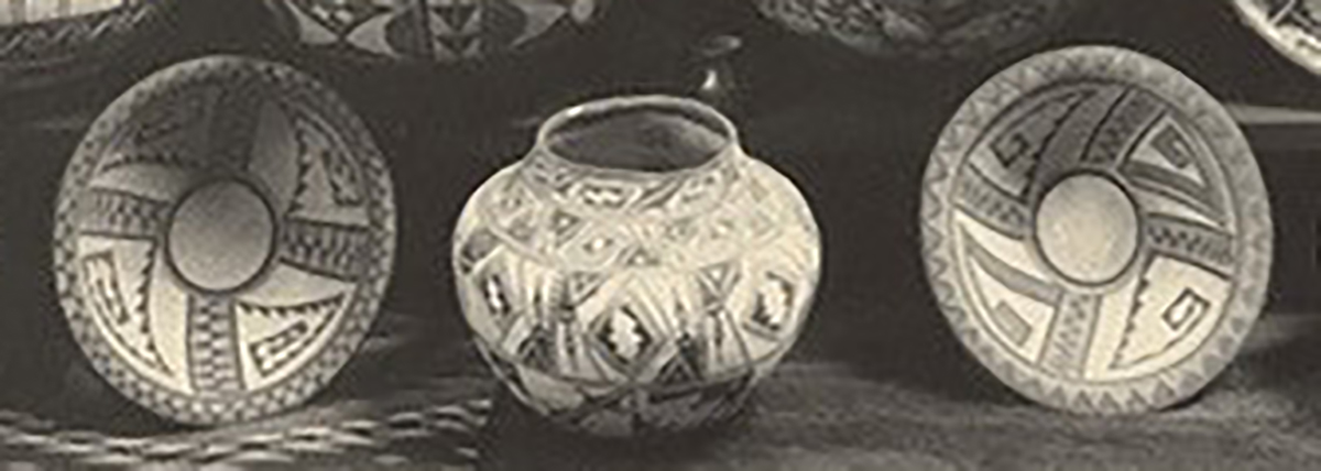
Notice the two bowls on the bottom shelf flanking the central olla. Both bowls have four greek frets rotating around a central hub. On the left bowl all four greek keys are formed of triangular shapes with the residual internal space left unpainted. This is the bowl in the Cooke Collection, see Wade and Cooke, 2012:147. The right example has two opposing greek keys that are similar, formed of triangles with the residual space left unpainted. However, the second set of opposing greek keys are filled with a meshwork of crosshatching. This bowl is 2012-02 in my collection. Notice particularly the triangular black line framing the crosshatched crook in the 2 o’clock position. This is “Element #7” discussed above. It is extremely unlikely that an historic Pueblo bowl was photographed soon after it was made, but that seems to be the case here. My thanks to Ed Wade for his research and his sharing.
Third, I purchased bowl 2012-02 on 2/1/12 from Martha Struever of Santa Fe, NM. She produced a U-Tube video to advertise this bowl, and that video, including its recent provenance, can be found here:
https://youtu.be/-Y_WDqyHP18
In her appraisal of bowl 2012-02, Marti wrote in part:
“Date of origin: 1890 – 1900…. The jar has extensive use of parallel lines interrupted by triangular devices. This design layout was used by the renowned potter Nampeyo of Hano as she interpreted the designs on early Kayenta black on cream wares. The motifs have been called “Medieval Music” as they look like bars of music. The bowl has a series of painted designs on the exterior walls with V-shaped motifs like those that appear on pre-Hopi wares from Sikyatki. A very similar bowl is illustrated in (Kramer, 1996:75)… in a photo by Summer W. Matteson…The bowl illustrated in the Matteson image is in the foreground of that photograph. It could possibly be the same bowl (as 2012-02), that later (after the photo was taken) had exterior painting added. The interior design appears to be the same on both pieces….” [Full appraisal on file.]
In summary: we have 1) a photograph of Nampeyo with bowl 2012-02 or its sibling, 2) a 120-year-old photograph of the pot taken when it was new and 3) a video about its immediate prior owners. Bowl 2013-02 is easily the best documented Nampeyo pot in my collection.
Note that jar 2018-10 by Nathan Begaye displays an eight-pointed monochromatic star pattern that is even more intricate than the pattern on Nampeyo’s bowl 2012-02. Although these two pots were made about 110 years apart, they both seem to be “see-what-I-can-do” pots where the artists are pushing the detail of their painting to the limit.
