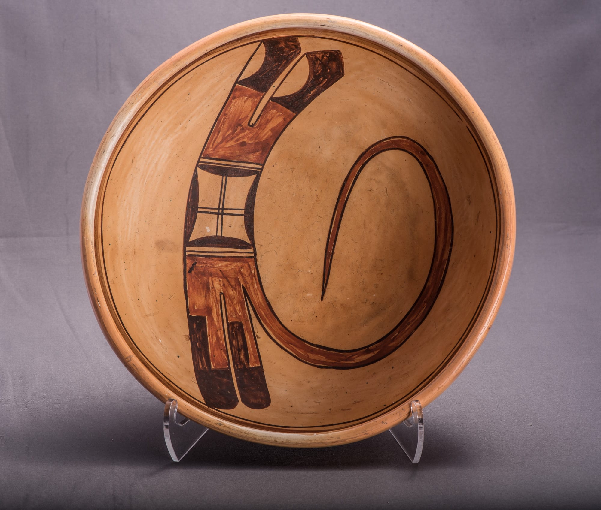
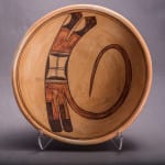
Of the more than five dozen Nampeyo of Hano pots in this collection, two bowls an d a jar stand out as having particularly powerful designs because, without flourish, they display the essence of Nampeyo’s design greatness. Bowl 2014-07 is one of these pots and is particularly noteworthy because of the simplicity of its design; haiku on clay.
What I said of the other bowl in the pair (2002-03) applies equally to bowl 2014-07:
“The design on the interior of this bowl is composed of elements that are typically used by Nampeyo; what is extraordinary is their simple, powerful configuration. Of the…Nampeyo (pots) in this collection, this bowl and one other … best demonstrate the genius of Nampeyo’s designs. They startle my eyes and smile my face. These are the pots I keep near my bed so they greet me every morning.”
Also see jar 2025-05, which is a member of this exclusive group of three exceptional pots.
Form:
Bowl 2014-07 is well-made with substantial, even walls. There is an extra coil of clay forming the inner lip, an accepted criteria for defining a bowl as formed by Nampeyo (Blairs, 1999:91). The bowl is slipped with a thin layer of clay that was then stone-polished. The bottom of the bowl is worn, allow us to observe the light almost white color of the clay that formed the bowl. The slip fired with an even light gold blush with only incidental lighter color where it was protected from he heat of the fire by another pot or protective shard. Thje slip is lightly crackled. Following a classification established by Harold Colton, Barbara Kramer would classify the vessel as “Sikyatki Revival” (1996:160).
Early in the 20th century collectors sometimes shellacked Hopi pots to protect their painted surface. That was done to this bowl and the applied surface had crackled and “alligatored” by the time I bought it. I removed the shellac with acetone and the interior painted surface was revealed in pristine condition. The exterior is unpainted.
Design:
The form of bowl 2014-07 is common; its unobstructed surface encourages innovative design:
“…The characteristic Hopi vessel is the small bowl….It is on these small bowls that the most typical Hopi patterns are found….The decoration of the water jar is very much more formal than that of the bowl….The character of the decorative motifs is…less free on the water jar than on bowls. Water jar patterns are very largely geometric and angular (1929:41-42).”
The design on bowl 2014-07 is a simplified derivative of the “bird-hanging-from-skyband” design first seen in this collection on bowl 1993-04, a curvilinear element sweeping off of a linear design. All elements of the design were outlined with a thin black line, presumably before the design was filled with color.
Three major elements of design form a linear band on bowl 2014-07. One end of the linear form displays two large feathers emerging from a common red base. A straight line separates this base from long, pointed black tips. Set into the rim side of these tips are unpainted lunettes.
Set against the base of these two feathers is an unpainted strip with a single line down its middle, what I call a two-lane “highway.” This is a common device that Nampeyo uses to segregate her design elements. The next element in the band of design is bracketed by these highways. I call this design a “windowpane” and it is a form unique to Nampeyo. An otherwise empty rectangle has low black hills set against all four sides. The central space is bisected by two sets of parallel lines set a right angles to each other.
Following the second highway element Nampeyo has painted a red “comb” base that subdivides into three linear forms again a typical layout used by Nampeyo to support a fan of feathers. Two of these bases, as expected, grow into feathers with long rounded black tips. The juncture between the red stem and the black tips is notched so that a 1.25 inch segment has parallel colors: half of feather stem (on the rim side) is black while the parallel segment is an extension of the red base.
Swirling out of the feather base closest to the center of the bowl is a large red curlicue that dominates the upper half of the design. The form curls back towards its stem, almost enclosing an egg-shaped unpainted surface. Until its last turn, the curlicue maintains a fairly consistent width, then narrows to a point. The inner framing line of the curve is strikingly smooth and I speculate it was drawn first. The top framing line was then required to smoothly follow this lower curve and does so until about the 2-o’clock point on the photograph, above. It then bumps out a bit, slightly widening the width of the red curlicue, before quickly making a sharp turn and narrowing toward the tip.
Design Analysis:
When I first went online and saw a postage-stamp-sized image of this bowl in the Allard catalog, my impression was instantly “That’s by Nampeyo.” Few artists are able to have such an impact with only a glance, but the best work of Nampeyo does. In part my response was due to that unique windowpane design, especially when it abuts a fan if tails, this sequence of designs being almost a Nampeyo signature. I was surprised when the live bidding was lackluster, perhaps because “as sold” the surface had that crackled shellac surface.
We should see if my first impression of the design on bowl 2014-07 withstands a more studied look. In “Appendix B,” Section 4, I define six design strategies that are characteristic of Nampeyo’s mature work and can be used to distinguish her work from the pottery of other artists. Applying these criteria to the design on this bow will help us understand why it has such visual power. The strategies are:
1) A tension between linear and curvilinear elements, often represented as a contrast between heavy and delicate elements.
The design has only two patterns: a thick linear band of elements and a thin red curlicue that curves away from it. The contrast and visual tension could not be clearer. This design has a second, unusual, source of tension. Sets of feathers are usually tail elements of design and propel a design upward (cf 2019-12). Here, however, the tails are at either end of the linear band and thus push toward each other, creating an additional energy. The curlicue can be seen as a release of this contrary tension, exploding off the side. While the contrary tail feathers are an unusual format, this same device is used on bowl 2002-03, the visual companion to this bowl.
2) A deliberate asymmetry of design.
The two sets of tail feathers might have been identical: both have red bases and black tips. However, Nampeyo intentionally made the two sets of tips very different, avoiding symmetry.
3) The use of color to integrate design elements.
The color pattern on the linear band alternates black and red. The extremes of the band and its center are black, attracting a viewer’s eye along the full length of design. Red elements pull the eye towards the middle of the design and then send it spiraling along that great red curve into space. Both colors provide coherence.
4) The use of empty (negative) space to frame the painted image.
Except for the feathered tips of the band, the entire design is surrounded by considerable space. Moreover the curlicue captures a egg-shaped unpainted surface within its loop, giving unpainted surface form within the design, a technique Nampeyo also used on seedpot 2005-16 and canteen 2019-12.
5) The use of a thick above a thin framing line on the interior rim of her bowls.
This bowl has the expected framing lines.
6) Nampeyo’s painting is confident, bold, and somewhat impulsive compared to the more-studied, plotted and careful style of her daughters, descendants and other Hopi and Hopi-Tewa potters.
This is the characteristic that I first saw when this pot was listed in the Allard Auction catalog, but it is also the most subjective of the six design strategies. Art is a subjective exchange between viewer and object, however, so this is also the most important of Nampeyo’s design characteristics.
Uncurled, the curlicue is about 12.5-inches long. Drawing it requires that long top and bottom curved framing lines be drawn a consistent distance apart, while rotating the pot so a hand can guide a yucca brush around the curves until finally turning the design back towards its origin and then converging the two framing lines to a point . Similar thin “eagle wings” appear on Nampeyo seedjars (cf 2005-16), but this is by far the longest example in this collection. Creating such an element while keeping the framing lines smooth and regular requires extraordinary confidence and skill, the ceramic equivalent of walking a high wire between skyscrapers.
While unusually simple, the design is also bold, a classic case of “less-is-more.” Nampeyo knows when to stop adding to her design and let her design elements achieve maximum visual impact. The result (as I keep on saying of this design) is striking.
Evidence for “impulsive” painting is in the details. Having outlined her form, Nampeyo did not quite fill in the red paint on the curlicue on the outer edge near the base. The “two-lane highway” in the band of design furthest from the curlicue is imperfectly drawn. The center line is way off center. One round-tipped feather is substantially wider than the other and its tip crosses the thin framing line. These sorts of “errors” would be avoided by high-priced, fine-art Hopi-Tewa potters today, but such details do not concern Nampeyo. She was a sophisticated folk artist and seems to have simply enjoyed the challenges of applying pigment to clay.
At a minimum the presence of all six of these design strategies on bowl 2014-07 certifies the pot as “by Nampeyo,” but that pedigree was never in doubt. More instructive is the question:
“What would an ideal pot look like if you imagine an example of Nampeyo’s work stripped of all distracting design elements so that the only design left was the essence of Nampeyo’s mature style?”
This mind game is the reality of bowl 2014-07. Many other Nampeyo pots in this collection also demonstrate these six design strategies, and some of them are masterpieces. See “Appendix D” for a ranking of Nampeyo pots in this collection. But all of these Nampeyo pots are more elaborately designed than this bowl. Reduce the genius of Nampeyo’s design to its essence, and you have 2014-07. This small bowl exemplifies J.J. Brody’s definition of a “great” pueblo pot:
“The symbolism,” he said, is “below the level of consciousness.” The form is simple
and basic geometric; the painting reinforces the form; the painting lines are crisp,
controlled and harmonious; and “most of all” the pot is “dynamic,” a source of
perpetual discovery. He concluded: “you should feel the handwriting and character of
the artist” (1990b).
Bowl 2014-07 and J.J. Brody never met, but they share the same aesthetic.

