

Photographs courtesy of King Galleries. Click on image to enlarge.
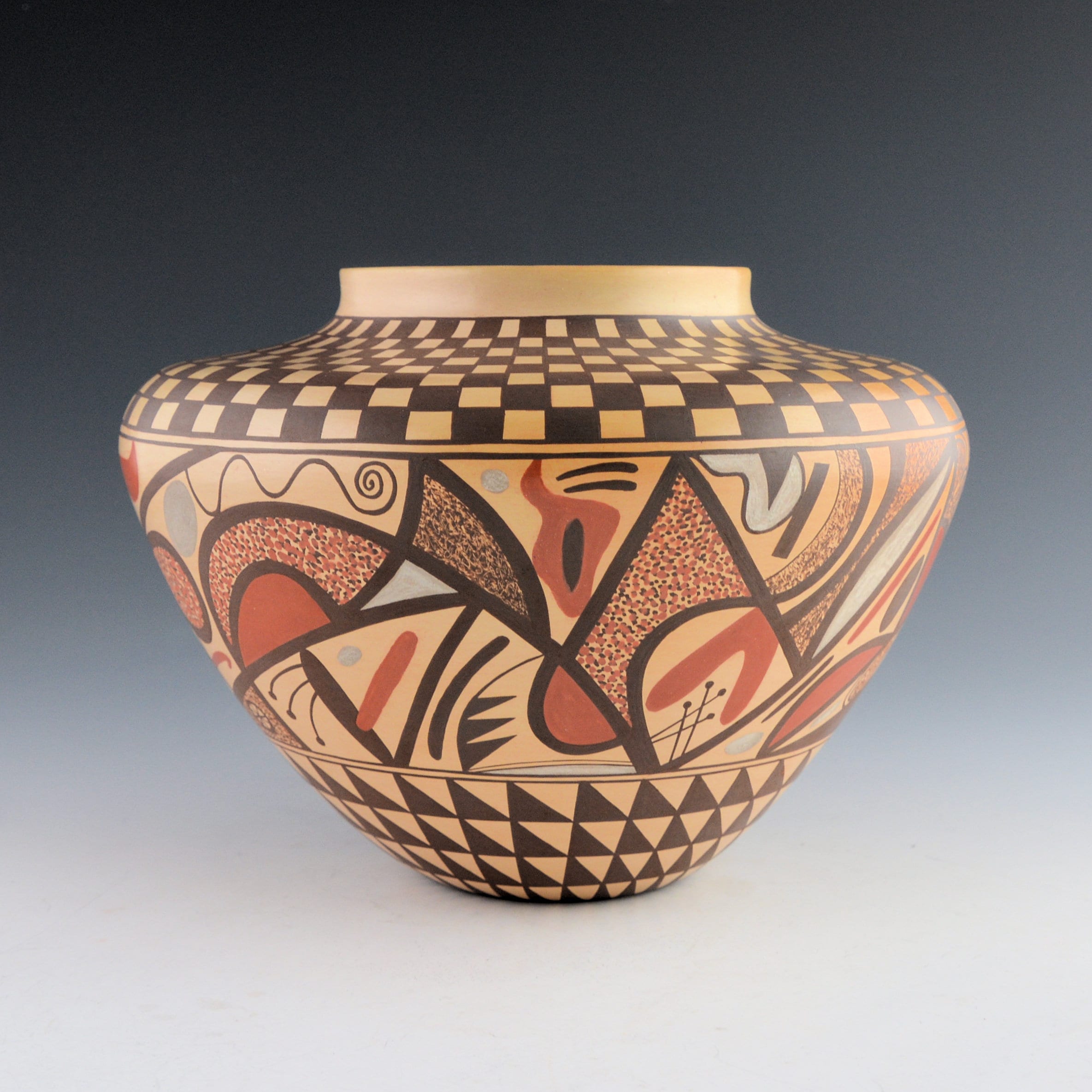
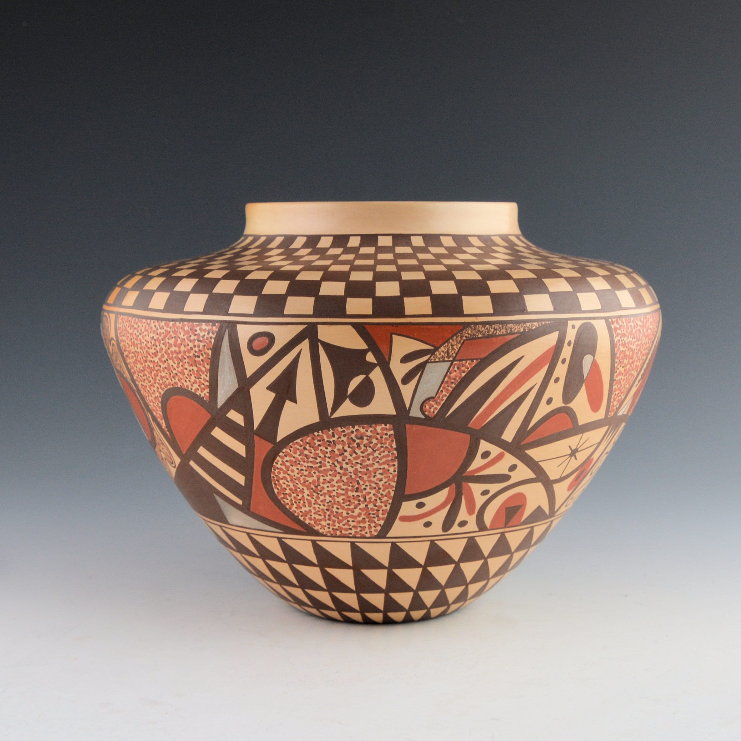
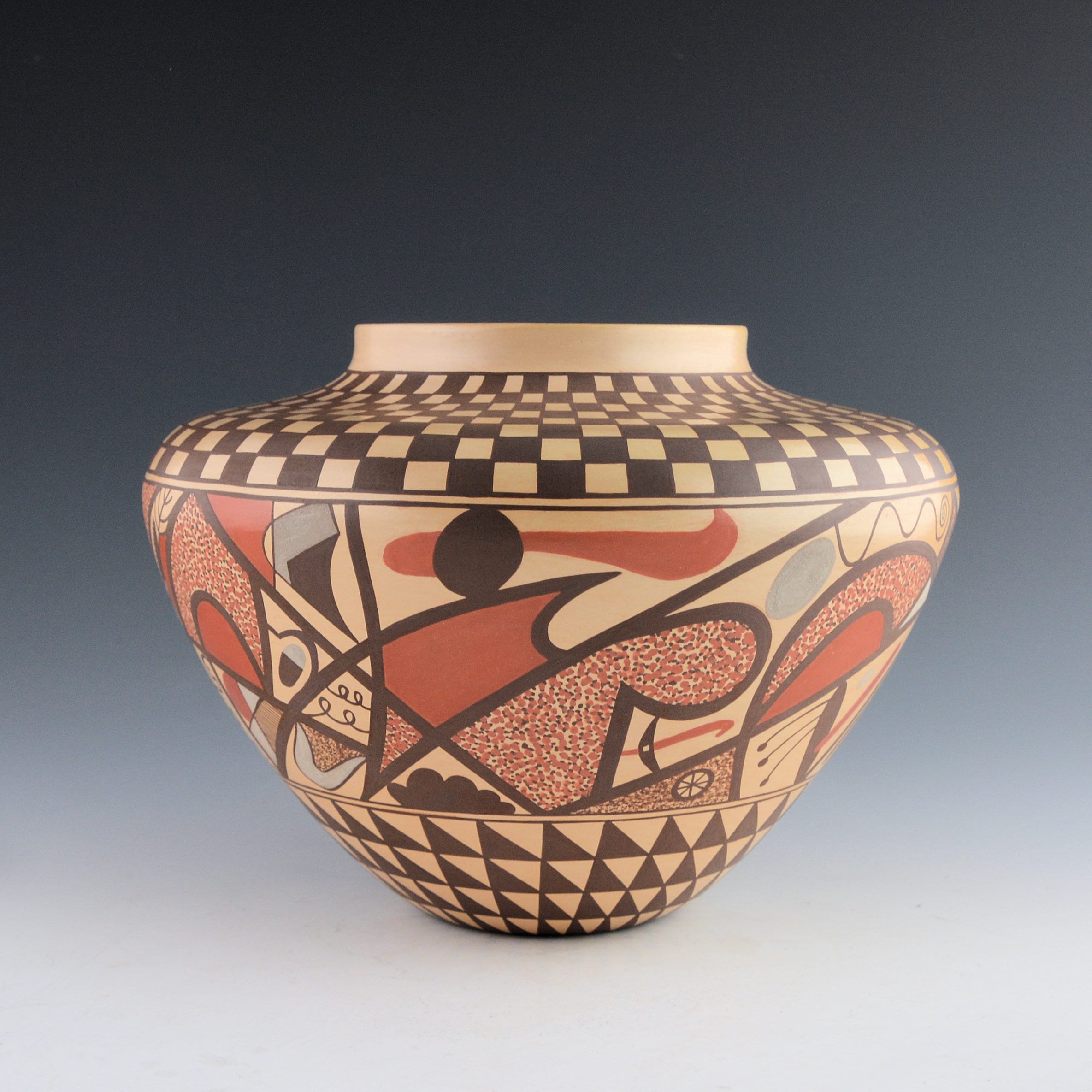
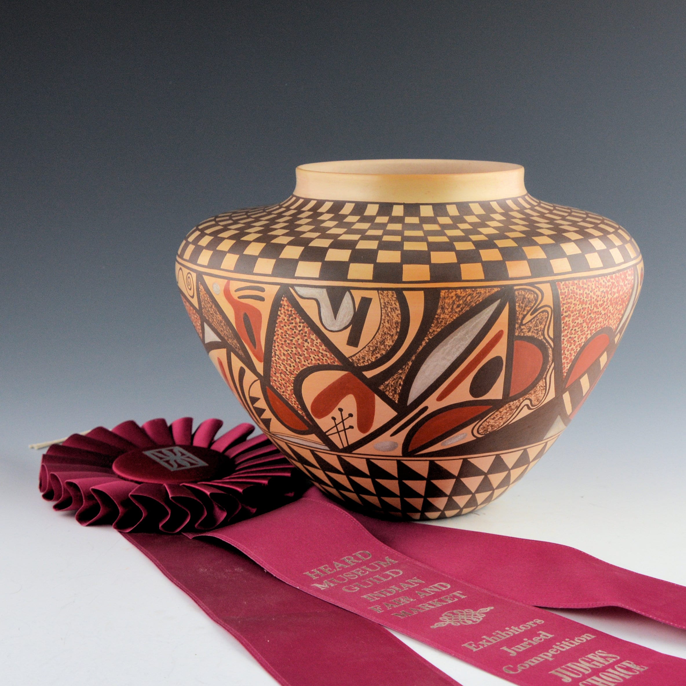
The techniques used to make this jar are traditional: organic and mineral paints and an outdoor, dung firing. The end cap designs are monochromatic and formal, inherently conservative in color and form. They are derived from traditional pueblo design. The midsection is colorful and exuberant, inspired by Paul Klee, Alexander Calder and abstract modernism. In spite of the audacious tension between the end caps and the central band of design, the overall design coheres, like a Tokamak fusion reactor: energy contained.
Made in 1998, the pot is a marker in the evolving career of Les Namingha. His first pots used traditional Hopi/Tewa designs (1994-09) but his painting has grown increasingly spontanious as his career evolved (2007-04). Within a few years of making jar 2020-02, Les turned from natural clays for color and outdoor dung firing and begin firing his pots in kilns and then painting them with acrylic paint. Although he still occasionally paints traditional pueblo designs (2016-02), his work is increasingly abstract. That inclination is clearly expressed in the central band of design on this jar, a harbinger of his 21st century acrylic designs.
Form:
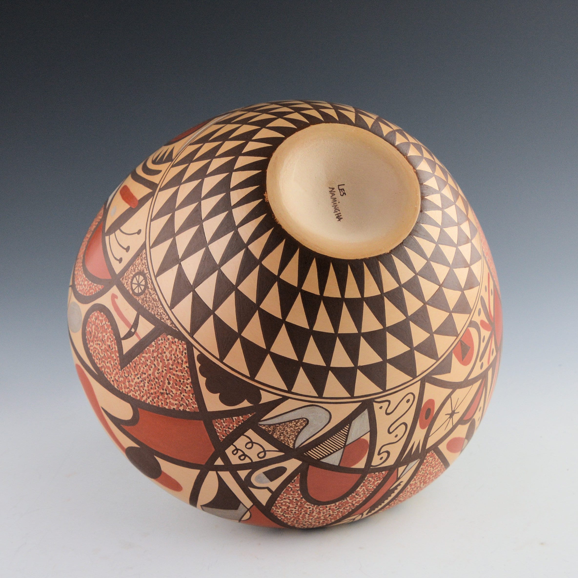
The jar has thin, even walls. The base is dramatically concave, a feature common at Zuni (where Less was born and raised) but concave bases are not characteristic of Hopi or Hopi/Tewa pottery. In a short vertical space of 4 inches, the 2.4375-inch base expands outward to the vase’s maximum width, a 330% growth in diameter. The effect is a dramatic visual uplifting of the vase. From this waist the top curves sharply inward 2.25-inches toward as slight neck surrounding a 4-inch wide mouth.
Often I can distinguish junction points on the inside of a Hopi pot. As a potter reverses the direction of her coils (where the sides meet a top surface), the inside surface may often be a bit irregular. No such transition marks are visible inside this pot. Given the great regularity of the walls, jar 2020-02 may have been formed on a potter’s wheel. I just can’t tell. When lightly struck with a finger, the vessel emits a dull “thunk” sound, indicating a traditional outdoor dung firing. The grey clay used for most pottery at Hopi turns tan when it is fired. If the fire is particularly hot at one spot (perhaps the wind blew from that direction), the clay fires more golden. Often such “blushing” is particularly attractive on a pot (cf 1992-02 and 2017-09). However, on jar 2002-02 the unifomn beige color works well. Since the surface of the jar is entirely covered with detailed design, blushing would have been a visual distraction.
The monochromatic end caps:
The 0.25-inch neck is left unpainted, thereby creating an upper boundary for the checkerboard pattern that covers the top of the jar. The squares are organized into 8 rows and 64 columns, with the color alternating so that any one square is surrounded by squares of the other color. The circumference of the pot, of course, is larger toward the waist and smaller near the neck, so the squares get smaller as they approach the neck. They also get squeezed so that their shape near the waist is square while those closer to the vase mouth become more rectangular. Being monochromatic and regular, this design seems formal.
The bottom of the vase carries a similar monochromatic and regular design. This pattern can be thought of as also being formed of squares, with each square cut diagonally into two triangles, the upper right being unpainted and the lower left solid black, forming belts of triangles. Visually the eye sees 4 rows of right triangles organized into 32 columns with (again) color alternating so that any one triangle is surrounded by triangles of a different color. As before, the triangles are wider in the top row and are forced to narrow as they approach the smaller base so that the triangles in the bottom row are isosceles.The unpainted arrows are residual to the black, so this format takes on the character of “figure/foreground reversal…when you look at the pot, the figure and the background against which it is placed keep changing places, the figure becomes the background and the background becoming the figure (Wycokoff: 1985: 100-102).” This eye trick enlivens the monochromatic design.
The width of the of monochromatic designs on the top of the jar and the bottom are the same (2.25 inches), but because the top band presents itself directly to the viewer while the bottom of the jar is somewhat obscured by the width of the jar, the top design has more visual impact thnt the bottom.
The central band:
The central band of designs is bordered by two thin framing lines drawn a fraction of an inch apart. Between them are what seems like a collection of Alexander Calder mobiles.
The design is structured by thick black lines that wander through the space in seemingly random patterns. These lines are both curved and linear and segment the panel into a wide variety of irregular spaces, each a canvass for design. Within these borders Les has painted a wide variety of textures, forms and squiggles using red, blue and black paint. All three colors are natural pigments. The red and black are solid, pure colors; the blue shows some streaking and variation in intensity.
Nine of these segments are filled with masses of well-defined red and black dots, pointillisms of color. Seven additional sections are covered with small fuzzy black smudges, like a detritus of ground feathers. Under a magnifying glass tiny inscribed lines overlay these black specks; perhaps Les applied the paint and then used a tool to scratch it away. Stars, arrows, antennas, ovals and dots are featured in other segments. Squiggly lines, some recalling amoebas and others snakes, wiggle in space.
So complex and varied are the forms around the midsection of the jar that a more detailed description of its polychromatic designs seems impossible, or at least not useful. The eye sees what words cannot accurately describe. The design has both humor and energy. The more I look, the more I discover and my eye delights in bouncing off of one pattern of design to a different form and pattern. The design looks like it is having fun. Tellingly, none of the forms recall traditional Hopi or Hopi/Tewa design elements.
Sources of inspiration:
Raised at Zuni by a Zuni mother and now married to a Zuni woman, Les is also a descendant of Nampeyo through his father, but within a matriarchal descent system that does not emphasize such connection. Les was trained as a potter by Dextra Quotskuyva (Nampeyo), the foremost Hopi/Tewa potter of her generation, and this training took place while he studied art and design at an Brigham Young University. Thus Les stands at a rich intersection between the cultures of Zuni, Tewa and Hopi, folk art and fine art, the reservation and the university. Filtered by his talent, all these influences are present on jar 2020-02, but they are segregated. The shape of the jar is typically pueblo, the concave bottom characteristic of Zuni. The monochromatic, structured designs on the top and bottom of the pot also are drawn from pueblo pottery traditions. The modern middle band of design draws from his university exposure to abstract expressionism and other modern art movements. The contrast between the energized polychromatic band of design and the structured monochromatic bands that sandwich it creates great visual tension and energy. It’s a complicated pot; Les has complicated aesthetic sources.
On 10/9/09, I spoke with Les in the Blue Rain Gallery, Santa Fe. He explained that for three years during his summer vacations from college (1990-1992) he learned pottery making from Dextra at her home in Polacca. She taught him traditional Hopi/Tewa techniques of clay preparation, coiling, shaping, painting. and firing “The years of working under Dextra’s supervision ended around 1995 when I moved away,” Les said in published remarks,
“That is when I became more involved in blending modern art with the instruction I had been given at Polacca. I had a desire to express myself in an contemporary way, and I shifted in that direction…I had been asked to paint a gourd for a charity auction. I used acrylic paint, which planted the idea to try it on my pots…I made another change in the latter part of the 90’s. I began to use an electric kiln…(B)y simplifying the procedure, it allowed me to focus more on the painting process…I (also) love the process of (easel) pointing, and I love to work with (acrylic) color…For my contemporary ceramics, I…sometimes begin with free-flowing abstractions where the process of painting is importyant. With this method, the structure and balance naturally take place (King, 2017:277-278).”
Twenty-two years after Les made pot 2020-02, there seems to be a ready market for his acrylic pots, but kiln firing and flashy paint are so different from traditional Hopi technique that the results somehow offend me. Then I remember Nampeyo’s “pure abstraction” style (2006-11 and 2015-04), which I treasure, and I smile at my ability to wear custom-made artistic blinders. As a Tewa living at Hopi, Nampeyo’s experiments with form, finish and design during the last 20 years of the 19th century surly offended her conservative neighbors. If Les needs an aesthetic justification for his use of acrylic paint on pottery –and he does not– Nampeyo’s willingness to experiment with her clay and her pure abstract designs offers a good shield from his critics. She experimented with form and design during her entire career (cf 2015-03, 2012-02, 2014-17 and 2019-19). Thus jar 2020-02 marks a movement in Les artistic evolution from more traditional Hopi/Tewa designs and technique towards a radically different acrylic style. Separated by 100 years, the innovative spirit of Nampeyo and Les are related by more than bloodline.
You also might want to take a look at pot 1994-16, a Polacca “D” vessel with a goofy, doodle-like design that was made about 100 years before Les made the pot discussed here. Their designs also share a spirit of exploration, experimentation and fun.
Commentary:
E.J. Guarino, a commentator on the King Galleries website, wrote that Les is:
“…is one of the most exciting and innovative contemporary American artists. He continually experiments, pushing the boundaries of the ceramic medium. The diversity of his creativity is awe-inspiring, moving effortlessly between representation and abstraction. Mr. Namingha often mixes traditional techniques with contemporary materials and takes inspiration from artistic traditions as varied as his Zuni and Tewa-Hopi heritage as well as ancient Greek pottery, Pointillism, and graffiti art and artists as disparate as Nampeyo, Georges Seurat, Paul Signac, Jean-Michel Basquiat, Keith Haring, and Sol Lewitt. Mr. Namingha draws from a seemingly endless well of creativity.”
Charles King, from whom I bought this jar, 2020-02 wrote the following description of it:
“This jar by Les Namingha uses traditional Hopi clay, is painted with bee-weed and natural clay slips, and it was traditionally fired. The jar is from 1998. It is thin-walled and painted with a checkerboard pattern around the neck and a triangular pattern around the base. The center is very fully designed with geometric shapes using various colors of clay and his signature pointillism to add more texture and color to the piece. The jar brings together traditional and contemporary designs. The use of various clay slips for color was the springboard to using acrylic on his pottery. The jar received a “Judge’s Choice” Award at the 1998 Heard Indian Market. Believe it or not, but I was the one who gave it the award. Why? I still remember that I hadn’t seen a piece of Hopi-Tewa pottery painted in such an abstract manner yet with the strong graphics on the top and bottom. It’s nice to see a piece like this again and I think it has stood the test of time as still being a strong vessel by Les. The jar is signed on the bottom, “Les Namingha”. It is in excellent condition with no chips, cracks, restoration or repair.”
The King gallery’s general discussion of Les reflects his current acrylic-on-pottery style, but is instructive of pot 2020-02 nonetheless:
” Les blends and deconstructs traditional and historic designs in an amazingly moder style. The precison of his painting is undoubtedly a reflection of his learning to make pottery from his aunt, Dextra Quotskuyva, a master potter and world-renown innovator…Les Namingha transforms and challenges the surface expectations of Hopi and Pueblo pottery through his creative designs, textures, and materials. He is as much a painter as a potter, and his vessels rely on form, surface design, and color to reveal their ancient and modern artistic influences (King Galleries website).”
The Blue Rain Gallery describes pot 2020-02 well when it says that:
“(Les) Namingha thrives on traditional motifs with modernist influences. Constantly manipulating form and design, every Namingha piece takes cultural symbols and brings them adeptly into present day, making the artist a true innovator bound only by his imagination. The paintoing on his pottery is unique in its small size and tight detail, the extent of which is rarely seen in the medium (Blue Rain Gallery website).”
Pot 2020-02 was “cutting edge” in 1998 when it was produced. Almost a quarter of a century later it no longer holds this position, though it is radical in this collection. It is a snapshot of Les’ evolving style, but it is an enduring beauty.
