I was lucky enough to notice Jake’s work early and began buying his pottery when it was available. Born in 1970, he began making pottery when he was about 20. Two pots, 1995-14, made in January 1992, and 1994-11, made in 1994, were made when he was 22 and 24 years old and still a dental student. They carry rather traditional Sikyatki Revival designs, though the layout of 1995-14 is creative. Later pots, especially 2004-08, 2013-08 and 2016-06 demonstrate his artistic spirit in full bloom, his designs rooted in Sikyatki style but following his own muse and creating new forms and patterns of design. Against this background, jar 2020-20 is a throwback to a traditional Sikyatki design, although made by Jake at the height of his career.
English sonnets are written within a fixed, formal structure of iambic pentameter. That structure both constrains the poet but also allows her to demonstrate her prowess within these constraints. Similarly, the traditional design on jar 2020-20 constrained the format of Jake’s painting, but allowed Jake to demonstrate his exceptional composition, drawing, use of color and finishes within the structure of these design constraints.
Form:
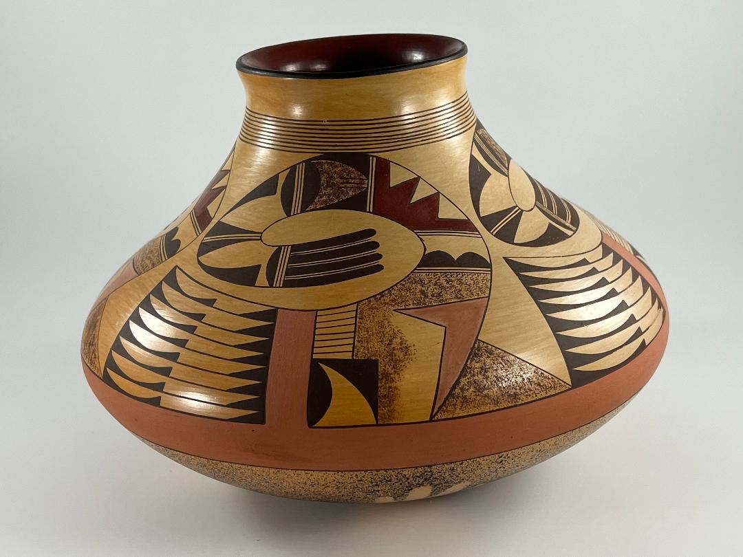
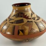
The jar is somewhat heavy for its size, the walls even and substantial. I suspect that the puki-formed base is a bit thick but the 3-inch mouth is too small for me to insert my hand to gage its thickness. From a 1.5-inch base, the walls sweep outward 3.875-inches to a narrow 0.625-inch, almost vertical, waist. From there the jar slops inward 3.6875-inches creating a palette for design before rising to form a 1.125-inch neck with a slight outward flair. Rising off that small base, the pot seems to float. I am surprised that the sloped surfaces below the waist and above the waist are essentially the same width. Most of the bottom slope is hidden by the expansive upper surface; it’s the embellished upper surface that catches a viewer’s eye. The upward thrust of the neck also draws attention to the top surface of the vase. Taken together, these dimensions create a jar that has a graceful and impressive form with an upward thrust.
Design:
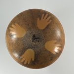
The bottom half of the jar is densely speckled with small dots of paint, perhaps darker larger dots over a layer of smaller, lighter dots. Four unpainted hand shapes (“ghost images”) mark the quadrants of the jar. Jake frequently used specking with ghost hand images on the bottom of his pots. This lower half of the jar is largely hidden when the jar rests on a table and thus contributes little to the observed aesthetic of the jar.
The waist is painted with a burnt sienna pigment that has a matte finish. Four 1.375-inch by 0.4375-inch rectangles are vertical extensions of this waist band and form the central pivot of the avian decorations on the upper surface. They can be seen as part of the core of the body of the abstracted avian form.
Four identical curvilinear abstracted avian designs fill the upper slope of the jar. A stippled equilateral triangle rests on the burnt siena waist between the bases of the avian forms, connecting them. The avian images fill the design space and almost touch, with residual unpainted surface only because the designs have curved edges. To clarify my analysis of the design, I will segment these forms into 1) a 4.25-inch wide by 1.375-inch high base (body) supporting 2) a 7.5-inch curved form (neck and head).
The base/body:
The base is bisected by the burnt sienna rectangular extension of the painted waist. To the left of this intrusion is a large “almost rectangular” section with a curved upper edge. This area is cut by 9 horizontal lines into 8 identical strips of design. Each strip displays a curious painting format called “foreground/background reversal” (see Appendix F) where the foreground and background shapes seem to change places. It’s easiest to see each layer here as substantially unpainted with two black elements intruding into this space. To the right a solid-black right-angle triangle lies on its side. At the left lies a thin black rectangle except that its top surface sags in the middle, thus creating pointed hills at each end. Alternatively, the eye might see each strip as painted solid black except for a residual white form that seems somewhat like two knife blades pointing in opposite directions but joined at their handles. The two views keep switching places as a viewer examine the pot, thus enlivening the design. These 8 layers of design form the tail feathers of the abstracted bird form.
To the right of the burnt sienna rectangle is a jigsaw of irregularly-shaped design elements. Set along the lower right edge of the sienna intrusion is a rectangle that is easiest seen as black with an imbedded and unpainted tooth, a triangle with one concave and one convex side. Alternatively (foreground/background reversal) this element can be seen as an unpainted area with a black “gumdrop,” its base along the left wall, and a right triangle occupying the upper right corner, its hypotenuse curved. Again, the tension between these two views enliven the design. Above is an unpainted rectangular space with a curved upper edge containing nine horizontal lines that form an 8-lane “highway.” This image reflects the 8 tail feathers to the left of the sienna intrusion.
The next element to the right is a notched, irregularly-shaped area that spans the width of the design base. Its top and bottom left are stippled with brown paint, leaving the bottom right of this space unpainted. To its right a form in burnt sienna points to the right, one of its wings shorter than the other. At the top of the stippled form is the base of the neck of the bird.
The curved form/neck:
The neck bends sharply twice, almost completing a full circle. Between the stippled form on the base and the neck is a thin unpainted strip contain ing three parallel lines, a two lane “highway” often also used by Nampeyo to segregate her design elements. Above is an unpainted rectangular segment, except that at its base are two solid black “gumdrops” with their bases along the highway. Foreground/background reversal is also at play here since the space can also be seen as painted black with the intrusion of an unpainted mask at its top. Following a second two-lane highway is a fan-shaped segment that again displays foreground/background reversal, though here dark-red paint substitutes for the usual black paint. If the background is seen as unpainted, this space is largely occupied by a red “W” form, though its central point is bifurcated. If the space is seen as having a dark red background, two unpainted and wider issoleces triangles flak a narrower triangle, all three bases against the upper wall.
After another two-lane highway, we find a rectangular space with a large stippled, right-pointing arrowhead set against a black background. Notice that the residual black area adjoining base of this arrowhead is a large black hill with its base against another three-lane highway. In the next segment, also with its base against the highway is an identical black hill. The two remaining black elements in this section are right triangles with long tails. This segment also contains foreground/background reversal. If seen as a white element against a black background, I am not sure how to describe the form: it’s a bit like the profile of an old plow blade. Another two lane highway follows and then —curiously— the same design seen in the prior segment is repeated in this segment. If their common highway element is seen as a hinge and the prior segment is folded down over this segment, the elements of design in the two segments would overlap. As usual, this last segment ends with a three-lane highway.
Following is a set of four solid-black linear feathers. In the narrow space between the feathers is a single line that runs from the base of the feathers until just below their rounded tips.
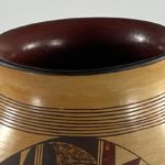
The neck of the jar is encircled by 9 thin framing lines, the lowest of which just touches the avian forms below. Although only 0.5-inches wide, within this band the encircling lines do not touch. The 0.5-inch space above the framing lines on the neck is the only unpainted surface of the pot, aside from the required unpainted residual space between the four renditions of the design caused by their curved edges.
The black edge of the mouth of the jar reflects the black elements below, especially those four linear black tails. Similarly, the wide expanse of interior of the mouth is colored the same dark red as the red “W” elements below
Design analysis:
Curvilinear avian motifs have an ancient history at Hopi. In this collection the oldest pots with this design are a Polacca ware bowl (1999-09a) and a slightly younger bowl by Nampeyo (1993-04). Somewhat closer in design to jar 2020-20 is a bowl from the 1930’s (1991-09) and a tall vase made more recently (2011-25). Closest to Jake’s design on jar 2020-20 are the circular motifs on jar 2011-08 and small Nampeyo canteen 2020-17. In short, the basic format of the design on jar 2020-20 is not exceptional.
Nampeyo used unpainted space to highlight her design. Jake used a different strategy on jar 2020-20, packing four energized designs into a limited space. Trapped between the 9 framing lines around the neck of the jar and the thick burnt sienna band around the waist, these energized birds threaten to explode out of their confinement. They are held in place only by the stippled triangle at their base, like a chock holding back the wheel of a plane ready to take flight. While compose of many design elements, the unity of the overall avian figure is most easily seen by following the black line that is the top edge of the tail figures as it spirals around becoming the lower edge of the great arc and then the upper edge of the set of four linear black feathers.
The basic source of energy in the design is the contrast between the heavier linear base and and the soaring, curvilinear neck above. Together they create dramatic counterclockwise motion in their confined space. Moreover, Jake loved color and technique. A typical pot made at Hopi would display two colors (black and red) against a background blushed in the firing. On jar 2020-20 Jake used two textures, ghost images, splatter-painting, stippling and 5 different colors: black, dark red, burnt sienna, stippled-brown and unpainted surface. This range of color, texture and technique enlivens in the design. Five sections of background/foreground reversal in each figure add more vibrancy. Aside from residual unpainted spaces cause by the curved edges of design, the only unpainted surface on the jar is the 0.5-inch strip below the lip. This jar is packed with color, texture and design.
Countering these sources of centrifugal energy, several design decisions increase the coherence of the design. Among these integrative strategies are the two panels that reflect each other and the pair of black hills in adjoining panels. In the base, the eight large linear tails to the left of the siena rectangle are visually linked to the small rectangle with eight lines forming a “highway” to the right of the rectangle. The placement of color encourages a viewer’s eye to sweep over the whole design: a) the burnt sienna winged form is paired with the nearby waist and intruding rectangle painted the same color; b) the dark red interior of the jar’s mouth visually links to the “W” element of the same color below; and c) the circular black lip of the jar reflects both the thin black circular bands on the jar’s neck and the black elements in the design, particularly those four linear tails. These patterns increase the internal coherence of design.
Jar 2020-20 is a catalog of Jake’s abilities. The great range of color and painting techniques on jar 2020-20 reminds me of vase 2013-03 by Nampeyo, which serves as a catalog of her design motifs. Pondering the design on jar 2020-20 I am unable to settle on a single statement that summarizes its character. The design is powerful, as are some of the colors. The avian forms are dramatic and seem huge when confined in a relatively small space, from which they threaten to explode. Yet elements of the design are linked, consolidating the avian forms, and many of the colors are muted, toning down the impact of the design. The elements of design are often of odd shape, but they fit together to form a distinctive pattern. Contradictory statements about the design seem justified and accurate. Overall these contradictions are intriguing and attract and unsettle the eye. It’s like looking at a great crazy quilt.
The year he created this jar (2005) Jake won “Best of Show” at both the Santa Fe Indian Market and the Heard Museum Market, the only potter to ever achieve this status. Jake’s mastery of form, innovative designs, use of color, precise painting and controlled fire blushing set him apart from other potters and justify his acclaim. Jar 2020-20 displays a variation of an ancient Hopi design and demonstrates the continuing power of this Sikyatki aesthetic. Take an exceptional ancient design tradition and apply it with exceptional modern skill and the result is jar 2020-20, an exceptional pot.

