

The Polik’Mana imagery on this canteen has been popular with collectors for about 150 years and is still seen on pottery made at Hopi. Indeed, before I bought this canteen, the collection already had over a dozen representations of this Corn Grinding Maiden, from renditions by Nampeyo (2014-10) to a reproduction by a great, great granddaughter of Nampeyo of a huge canteen by Nampeyo (2014-15), to renditions by a modern master (2013-08) to a simplified version by a talented young artist just now learning his trade (2019-03).
The basic form of this canteen and its imagery are not unusual but Jean has modified both. The result is an unusual double-faced form displaying a boldly-colored design drawn with precision using an unusual format. Jean has taken an old image, added a large dose of talent, and created a spectacular pot.
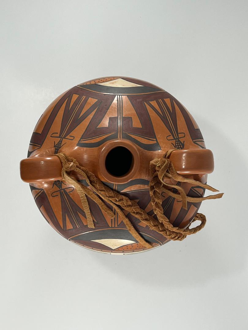
Form:
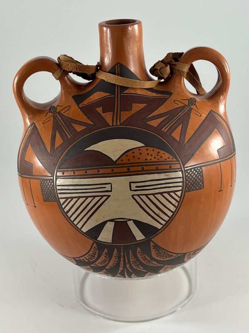
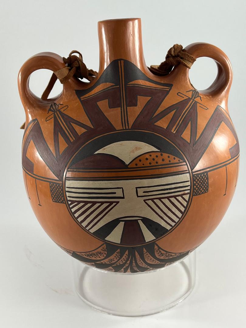
Some of the two dozen Hopi canteens in this collection were made for use, most were made to be sold, and all but two retain a flat back reflecting their utilitarian function of fitting against the body of a user. The two exceptions reflect older Polacca ware forms (2010-03, 2013-02) and were made about 1880 to 1900. Modern canteens for sale also often have a flat bottom so the buyer can easily display them upright on a shelf, but this is not the case here. Other than those two Polacca pots, canteen 2021-13 is the first canteen from Hopi I have seen without a flat side. This canteen is completely spherical in shape, except for its spout and added handles. This canteen was intended to display design, not mimic a utilitarian or convenient form.
Two small handles are mounted unusually high on the body. The spout is straight and judging from its thickness and the overall weight of the jar, the walls are substantial but not thick. The surface is well-polished using only vertical strokes of a polishing stone, whose striations can barely be seen. The result is an “onion skin” reflection that subtly shimmers. The surface of the jar is a rich reddish-tan color indicative of “sikyatska” yellow clay that turns red after firing. It’s difficult to tell if sikyatska was used for the body of the vessel or applied as a slip over a grey clay core, but careful examination reveals that it is applied as a slip, including about an inch into the narrow spout.
Design:
The Polik’Mana depicted here is variously called “ “Corn Grinding Maiden” or “Butterfly Maiden” although she is also a companion to the Poli Kachina of Third Mesa and (with slight modification) is the partner of the Salako Katchina (Wright, 1973:106). She also carries the name “Water Drinking (or Bearing) Girl and is not a katchina but rather a woman’s dance personage (Wright, 1977:54). The name seems to change with her function in a particular dance. In any case she is one of the most beautiful personages to appear at Hopi dances. Although a Mana, this dancer can appear in either its male or female form. Female gender is indicated by a red circle on the cheek (as on bowl 2009-17). Lined triangles on the cheeks represent a male persona, as on the canteen discussed here.
If you use the “Category” list to review depictions of the Polik’Mana in this collection, you will quickly notice that the image is quite static. Renditions of this Mana made more than 100 years apart are conventionalized and indistinguishable except for variations in slip, the exactness of drawing, and patina. Jean’s rendition has all the expected parts, but she has varied the color and details of the design to great effect.
Head:
Jean painted the Polik’Mana image on both sides of canteen 2021-13 and these renditions are close to identical. Central is the Mana’s round face. Below the forehead the face is painted white. A small black-edged lunette is the mouth. Flowing downward from it are three expanding wedges of design. The outer two wedges are black, the central wedge a rich dark red. Covering the two cheeks are equilateral triangles, though one edge is curved by the border of the face. Inscribed inside the triangles are seven parallel dark red lines. (One of the four renditions has only six lines.) These triangular designs indicate the Mana’s male status. Above are the expected slit eyes, two rectangles with a central line.
Above the eyes the forehead is bordered by four parallel lines, a “three-lane highway” with the central lane much wider than its flanking lanes. Above this highway Jean has painted three lunettes against a black background. Nampeyo also painted lunettes on the foreheads of her Polik’Manas (cf 2014-10), but only two, unpainted, and always separated by a vertical highway. On canteen 2021-13 Jean uses the same iconography but changes the format. In Jeane’s version there is no central highway but rather a grouping of three lunettes, each with a different pattern of design. The left lunette is the rich dark red, the right lunette is the redish-tan color of the pot’s surface over-painted with 15 to 21 black dots. (The renditions vary.) Seemingly behind these two front lunettes, and partially obscured by them, is a central white lunette. The black background of the forehead is reduced to a black arc over the three lunettes.
Just above the level of the eyes, but exterior and perpendicular to the white face, are two thin parallel lines, a one-lane highway. This element occurs on both sides of the face and varies in length from 2.5-inches to 3.5-inches in length, depending on which of the four renditions you measure. While seemingly a minor detail, these lines serve to support more visible elements. Traditional pueblo earrings are made by covering a small square of wood with pinion pitch and then embedding small pieces of turquoise it it. Such square earrings are represented on this canteen by cross-hatched squares that hang from the two-lane highway close to the Polik’Mana’s head. The earrings are about 0.5-inch square and the crosshatching is formed by 7 to 10 diagonal lines. Except where they intersect, these parallel sets of lines do not touch. Spaced further out the one-lane highway hang three fairly long vertical lines caped with a short line. These don’t seem to have any meaning until you look at other renditions of the Polik’Mana by Nampeyo in this collection (2014-15 and 2017-04) or her descendants (2012-01) where these elements are more fully-developed into sprigs of spruce, often used by kachina to indicate growth and bounty.
Tableta:
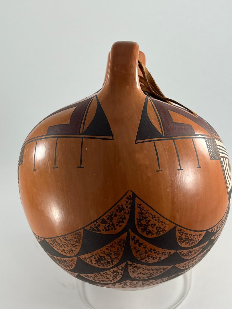
The same one-lane highway from which the earrings and spruce boughs hang also serves as the support structure for a tableta that arches over the head from ear to ear. Most of the tableta is painted using the same rich dark red color we saw on the face. Imagine the capital letter “W” with its flanking tips bent outward and then downward in crook-like ends. Two such forms, side by side, form the basic structure of the tableta. The line that forms the double-W design is wide, about 0.375-inches. One terminating crook of each “W” lies on the supporting one-lane highway. Where the two “W” shapes meet at the apex, the two crooks almost touch, separated by only a thin black two-lane highway. The point at the center of each”W” is bifurcated by another two-lane highway, its outer edge a dark-red stripe. As a result the center of each”W” appears to be filled with two right-angle triangles facing each other. At their peak grows a black ear of corn, the central foodstuff of Hopi life and Jean Sahme’s clan name. At the base of the corn stalk is a delicate black oval, one side breached by the intruding points of the right triangles. At the apex of the tableta the vertical two-lane highway cuts across a horizontal black line (sort of an incomplete one-lane highway) and extends about an inch. On either side of this highway is a black element, not very accurately described as sort of dumbbell-shaped with unequal ends. When angled side-to-side these form the black peak of the tableta. One final tableta element needs mention. At the base of the tableta, on the horizontal two-lane highway, are right angle black triangles. Inset into these triangles are unpainted wide hill elements.
Shoulder cloak:
Sometimes when the Polik’Mana was drawn by Nampeyo (2009-17) or is drawn by modern artists (2016-02) a cloak is shown around the shoulders of the dancer. This appears to be a subordinate design element, drawn to fill out the available space towards the lower edge of the design. Jean draws such a cloak on canteen 2021-13, using as her design stippled lunettes set into black bands. When viewed at an angle from above, this pattern covers the neck of Jean’s Polik’Mana and seems “lovely,” though not central to the decoration of the canteen. Eight strands of lunette forms descend from below the Mana’s face, cross the length of his neck, and disappear below the lower edge of the canteen.
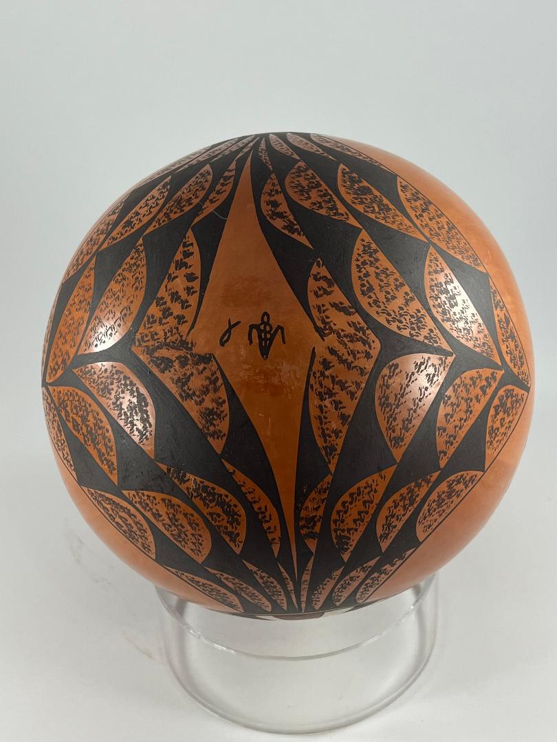
A radically different view is offered when the canteen is examined from the bottom. From this perspective it becomes apparent that the eight strands of design separate into two groups of four. With the canteen oriented so that the Mana designs are at the top and bottom (the 12 and 6 o’clock positions), the bands of design curve outward to the left and right (the 3 and 6 o’clock points). As they curve away from the Manas’ necks the lunette shapes increase in size and the bands of design grow wider until they reach an apex on the left and right, where the strands from the two depictions of the Mana join. As the strands of design separate and curve, they leave a diamond-shaped unpainted section at the center of the bottom of the canteen and Jean has placed her identification marks in this space. Looking directly at the bottom, the lunette cloak covers all the visible surface of the pot.
Turning the canteen spout up and looking at the canteen from the sides, the wide apex of the lunette design is slightly visible, its point aimed directly at the space between the two renditions of the Polik’Mana. It is not clear to me what the lunettes represent: leaves perhaps, but more likely feathers, though I am not sure.
Design analysis:
The canteen is carefully created and both its form and design are innovative, but it is Jean’s dramatic use of color that makes this pot spectacular.
It’s clear that Jean took care and time when making this canteen. One bit of evidence is her polishing the pot with vertical strokes of her polishing stone to give it a subtly shimmering “onion skin” finish, a more difficult procedure that polishing a pot with random strokes. She also took the time to slip the first inch of the interior of the canteen’s narrow spout, a detail most people would never notice. Similarly she painted the four earrings with parallel sets of lines that do not touch except where they are intended to intersect. She was careful also in creating almost identical renditions of the Polik’Mana on opposite sides of the pot.
Innovation partnered with Jean’s care. The unusual spherical shape of the canteen allowed Jean to innovate her painting. Like her great, great, great grandmother Nampeyo (2014-15) Jean used the bulbous form of the canteen to give depth to her painting, thrusting the face of the Polik’Mana forward in front of its tableta. Unlike Nampeyo, Jean accomplished this twice on the same canteen.
The unusual white face of the Mana is the same color as the top lunette above, integrating the design of the face. The form of the lunette cloak and its placement are also unique. Dorothy Torivio at Acoma was known for her op-art, repeating designs that covered the surface of her pots and conformed to their shape, but this cloak is the first time I have seen this technique used at Hopi. Jean’s expansive rendition of the cloak gives it great impact, especially when looking at the bottom of this canteen.
Such care and innovation are noteworthy, but it is Jean’s dramatic use of color that makes canteen 2021-13 spectacular.
First, her slip and paints are particularly dense and vibrant. Second, her pairing of colors is dramatic, sophisticated and elegant. The reddish-tan color of the pot’s surface complements the darker, richer colors of the design. The dark red color below the mouth, on the forehead, and more extensively on the tableta integrates the design. Because this red has almost the same intensity as the pot’s slip, the colors blend well while still preserving the richness of the red. Against these muted tones, the white sections of the mouth, face and forehead lunette seem brilliant, “pop” to the foreground, and integrate the design of the face. Notice that form and color are working together here. The bulbous surface of the jar thrusts the face forward and sets the tabula behind it. The same effect is created by brilliance of the white face elements and the reticence of the red tabula. Finally, Jean is able to take three colors of paint and combine them with the reddish-tan slip to make the forehead of the Polik’Mana polychromatic, almost flashy. This colorful pattern combines with the unusual white face to emphasize this circular form as the center of the design. In short, it is the richness of the colors and their patterning that makes this canteen extraordinary.
Innovation within tradition: it’s no wonder Jean was named an “Arizona Living Treasure” in 2014.
