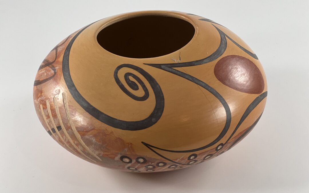
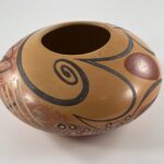
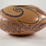
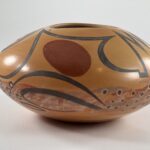
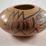
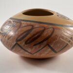
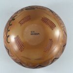
This seedpot is exuberance. Abstract forms in black, red, white and grey swirl over its surface forming a dramatic crazy quilt. There are elements of Hopi design here, but the influence of Miro predominates. A pot that encourages you to smile while you dance to is worth remembering.
Form:
The form is that of a traditional Hopi seedpot (1986-01) which is often modified to provide a broad expanse for painting (2006-15 and 2021-18). Jar 2023-05 has a particularly low waist, leaving about two-thirds of the height above the waist, and thus creating a broad upper shoulder for design. The mouth of the jar is slightly oval and has an uneven lip. The walls of the pot are unusually thin, only slightly thicker at the base and somewhat thinner at the lip.There is some variation in the golden blush of the vessel, the lightest color being near the lip and the darkest color near the base. When struck by a finger the resonance is a dull “thunk.” This color variation and resonance suggest an outdoor, traditional firing, a rarity for Les, who began kiln-firing his pots in the late 1990’s.
A 0.75-inch wide section of the lip is cracked free from the body, forming a triangular chip. From its tip a 1.5-inch crack points downward. The triangular chip may have been glued back on the lip or perhaps the trauma that created the chip never dislodged it. In any case the chip and slight crack are stable. However this damage might account for the “thunk” when the lip is struck by a finger and the sound might not indicate an outdoor firing.
Design:
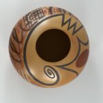
The top and bottom views of the jar incorporate unpainted areas. The broad middle section of the jar, both above and below the waist, is densely painted.
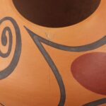
A black curlicue“eagle wing” like those found on Nampeyo jars (2005-16) and those of her descendants (2008-10 and 2008-16) dominates the upper surface of the jar. The curlicue end terminates with a black oval ball. The wing floats in a wide unpainted space. The tail of this element encircles the pot and then reverses direction for another 10.5-inches. The circumference of the pot is about 21-inches. If the eagle-wing element were to be lifted off the pot and straightened out, it would be over 33-inches long. From the curlicue end it sweeps smoothly back half-way around the jar, then forms a tightly-drawn zig-zag with 6 points. From there it drops straight down, makes a short linear jog to the left and then forms a series of 4 graceful curves, one of which brackets the back side of the curlicue, thus completing its circumnavigation of the jar. Reversing direction but still forming graceful bow-like curves, the element thins until it almost vanishes, then expands to form a substantial curve parallel to the waist and finally ends.
Given that this extended eagle wing more than encircles the pot, it defines the placement of many of the other elements of design. For example, when this design reverses direction a gap is created between sections of this element. Into this space Les has place a large red egg, as if the design framed an Easter-egg hunt.
Below the extended eagle wing is a band of densely painted elements that is draped over the jar’s waist and occupies surface both above and below this widest point on the jar. This band of design has 6 layers. The lowest is red and defines the space covered by the five upper layers. This lowest layer appears to have been very casually applied. Its color is mottled, its edges ill-defined, and its width has great variance. The second layer is a series of dozens slanted white lines that encircle the pot almost perpendicular to the waist. These lines are somewhat parallel but are so casually drawn that this pattern is not exact. The white paint used seems to have been watered down so that the lines are indistinct. The third layer of design are rather thick strokes of light grey paint irregularly applied and often perpendicular to the white lines beneath. This grey paint often obscures the two lower layers of design.
These 3 indistinct base layers of design form the base color for 3 top layers of design that are both bolder and more-clearly drawn. There are a number of distinct black elements on the pot that seem to have been painted as a fourth layer of design. These are the most numerous of the designs on the pot. They include a cluster of five casually-drawn vertical lines directly below the tightly-drawn zig-zag discussed earlier. Below these lines, and spanning almost half the circumference of the pot, is an elongated zig-zag with 10 points. Above it is a large squiggle of loops drawn with thin black paint. Below one end of the 10-point zig-zag is a more-tightly-drawn and darker black squiggle of smaller loops. Close to it is a cluster of 15 small black circles followed by a stack of three black curvilinear elements (just below the red egg). Following is a swarm of 16 black dots. A fifth layer of design contains only one black element. At the left end of the large squiggle drawn in layer four, Les has drawn 8 dark vertical lines cross-cut by a zig-zag with 6 points, giving the overall appearance of the gate of a jail cell. The upper right corner of this dark black element is painted over the end of the neighboring light-black squiggle. The final and sixth layer of design contains a variety of forms that appear white but are actually inscribed into the surface of the pot revealing the light color of the clay body. Starting below the curled end of the eagle wing, the 15 black circles have excavated centers. To their left is a series of four inscribed, large, parallel and sloped lines. To their left another egg shape is inscribed over that jail cell door. To its left 3 small inscribed zig-zag lines are interspersed between the 5 vertical black lines. (An expected 4th inscribed line is missing.) The 16 black dots to the left are each contained within an inscribed circle.
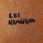
Finally, encircling the bottom of the jar are four rafts, each composed of four broad brush strokes of red, each red stroke inscribed with a squiggly white line. These rafts are surrounded by substantial unpainted area. The center of the bottom displays the artist name “Les Namingha,” and is undated.
Design Analysis:
- The uneven and not quite circular lip adds subtle energy to the jar.
- The solid red egg shape and the inscribed white ovoid on the opposite side of the jar help unify the overall pattern of design.
- One egg is painted over a crosshatch of linear elements. The other (red) egg is both close to and bounded by linear forms. As with Nampeyo’s design strategies, the association of curvilinear and linear elements adds tension to the design.
- In the band of design around the waist of the jar, one inscribed line is missing between the set of 5 vertical black lines. Either Les was not paying attention when he inscribed these lines or the expected line was intentionally omitted to create asymmetry and energy.
- Note also that the paint used for white lines on the second layer of design around the waist was watered down so that these lines seem to fade into the background.
Looking down on pot 2023-05, the design is dominated by the extended “eagle wing.” This element is a standard Tewa-Hopi and Hopi motif at least since its revival by Nampeyo around 1900 (2005-16). On these traditional renditions, the wings are limited in size, are always a pair, and have a specific symmetric placement. On seedjar 2023-05 Les started with this form, but made his eagle wing singular, free-floating and of such length that it more than circumnavigates the pot, thus redefining its appearance and function.
The great majestic sweep of this dark, crisp wing is highlighted by the unpainted surface that surrounds it. As it circumnavigates the pot, this eagle wing transmutes, becoming more abstract, and creates the context for other design elements. For example, portions of the eagle wing surround the red egg with curved bow-shape elements, creating a graceful pattern.
The design around the waist of the jar has 6 layers of elements, giving it depth and richness. The bottom three layers are casually applied, while the top three layers are more formally presented. The result is a pattern that is visually rich, engaging and exuberant: motion on top of motion on top of pattern. This accumulation delights the eye. Nathan Begaye is the only other Pueblo potter I know of who layered his designs (see 2022-15 and 2023-02), though Rachael Sahmie inadvertently did so when copying an ancient design (2020-09).
The three sections of design on pot 2023-05 play off against each other. The top eagle tail is exact and formal Below is the muddied, layered, and casually-drawn band of design encircling the waist of the vessel. Below it are four precisely-drawn rafts serenely encircling the base of the jar. These alternating and contrasting patterns energizes the overall design. It should be noted that the lowest layer of design is not visible when the pot sits on a surface and thus has little overall impact.
Although its size is modest, the visual impact of this jar is large. Form and color, simplicity and richness: the design on this jar is a carnival of energy, both dramatic and playful.

