


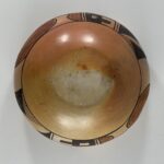
Both humorous and frightening, the creatures on this pot create an enormously engaging tableau. Quadrupeds are infrequently depicted on pottery from Hopi, though ironically within the last month I added such a plate to this collection (2025-10). The other two examples in this collection are by Nampeyo (2012-08 and 2019-19). Bowl 2025-11, discussed here, is especially-well-crafted and displays the most humorous-fierce images of these four pots. As such, it is a particularly memorable addition to the folk art tradition. As collector demand for “perfection” has increased along with the prices of pottery from Hopi, this folk art tradition has about disappeared from the three mesas. Jar 2025-11 is a reminder of what we have lost.
Form:
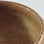
From a 1.875-inch wide base, the walls curve outward 2.50-inches to the waist and then curve inward only slightly for about 1-inch to the 4.125-inch mouth. The walls are about 0.25-inches thick, which gives the pot a substantial feel. Unusually, the piki-formed base is the same thickness as the walls, the mark of an accomplished potter.
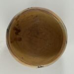
What is notable about this form is the extra coil of clay on the interior of its rim. This form is likely unique to Nampeyo and is a diagnostic marker (Blairs, 1999:91). The coil is difficult to see in a photograph (photos 1 and 8 above), but is clearly distinguished when the pot is observed directly.
Design:
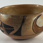
Varying from 1.75-inches to 2.0-inches below the rim of the jar is a single, thin, framing line drawn with “one sweep” around the circumference of the jar. A slight thickening of the line directly below the open-mouth creature indicates the start and finish of the brush stroke.
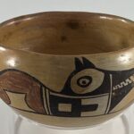
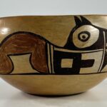
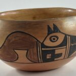
The almost-vertical wall above the waist allows all of the design to be seen when the pot is sitting on a flat surface. The design is simple, just 2 design elements, each repeated twice, sitting on the framing line. The major design is the two creatures each 5.875-inches long in their curled posture. They are identical, except that one has his mouth only slightly-open showing its fangs, while his brother’s mouth is substantially-open with its mouth full of teeth on full display. The secondary design is geometric: a large triangle with elements added to its apex and bottom. The verticality of these designs completely fills the space between the framing line and the rim.
The creatures:
The heads are painted entirely black and are just under half the body length. They rest on the supporting framing line and are composed of a complex set of elements. The 1.0-inch snouts are equilateral triangles split from peak to base by a mouth. The creature with its mouth almost closed displays 11 teeth, his ferocious brother an even dozen. The base of the snout is marked by two parallel lines, a “one-lane highway.” Another one-lane highway connects this highway to three parallel lines [a “two-lane highway”] that mark the neck.
The result is that the face has a section above the connecting highway and a section below. The design below is all linear. A large box fills the left half of the space, its center an unpainted box. Protruding from its right side is a similarly thick rectangle that protrudes into unpainted space. The residual unpainted surface is thus a squared-off “U” shape, its mouth rearward pointing. The space above the connecting highway is irregular but somewhat lens shaped. Hollowing out its center is a large, unpainted, lens shape. At the center of this space is the eye, a circle with a dot at its center. Immediately above the eye are the ears, two conjoint isosceles triangles.
The body behind the neck is a sinuous red form without internal design. A somewhat hourglass-shaped unpainted section hollows out its midsection. The top and bottom edges of this unpainted space are linear; the left and right walls are curved. The creature does not have defined feet. To the right of the unpainted cutout there is the beginning of a red support section that is where one might expect feet, but this red form is truncated by the black linear section of the head. To the left of the unpainted cutout the red form touches the framing line where rear feet might be expected, but again without any indication of such limbs. From this point where rear legs might have been, the edge of the design curves 3-inches to the point of the tail and then continues to curve downward to the humped back, ending at the neck 5-inches later. These 8 inches are all curve.
The triangular shape:
This element is drawn with black paint, its core a 1.375-inch high isosceles triangle tipped on its right corner. Because the triangle is tipped, there is a wedge-shaped empty space beneath the triangle. In this space the painter has drawn 7 to 12 slanted, parallel, lines, the number depending on the rendition. The peaks of the triangles are crossed by three parallel lines and then caped by a solid black ball, from which three additional lines sprout.
Design Analysis:
A reader of this website will notice that I have developed six criteria for helping decide if a design was painted by Nampeyo. I believe these strategies are typical of Nampeyo’s mature Sikyatki-Revial work. However, these design strategies were not mechanically-applied in every case. Instead, they represent a kind of toolbox of techniques that Nampeyo could draw on when constructing her designs. Generally the more of these strategies I find on a pot, the more confidence I have that the pot was painted by Nampeyo.
Lets see how these criteria apply to pot 2025-11:
1) A tension between linear and curvilinear elements, often represented as a contrast between heavy and delicate elements;
The pattern of design in the heads of the creatures evidences this pattern: the design below the dividing highway is emphatically linear, the lens-shaped unpainted space above and the eye emphatically curvilinear. Somewhat more subtly the floor and ceiling of the unpainted area in the red tail are linear while the vertical walls of this area are curvilinear, as is the dramatic arc of the body above.
2) A deliberate asymmetry of design;
None of the designs are symmetrical. Although each of the designs is repeated twice, each rendition is unique, The jaws of the creatures obviously are different, as are the number of teeth displayed. One of the triangular elements shows 7 lines of rain, the other 12.
3) The use of color to integrate design elements;
A solid red form occupies more than half of the curled body of these beings, but it is the only red used and thus does not integrate the design. However, occasionally Nampeyo seems to have used red to focus a viewer’s eyes and not integrated the design. Two other Nampeyo pots in this collection display this focusing function: 2015-12 and 2025-05. Jar 2025-11 may be a third example.
4) The use of empty (negative) space to frame the painted image;
All four design elements are surrounded by enough empty space that the design is highlighted.
5) The use of a thick above a thin framing line on the interior rim of her bowls.
This is not a bowl, so the criteria does nopt directly apply. There is one thin framing line on jar 2025-11, but it does not meet this criteria. It’s only speculation on my part, but with less than 2 vertical inches available to paint the design, there was no room for thick-over-thin framing lines.
6) Nampeyo’s painting is confident, bold, and somewhat impulsive compared to the more-studied, plotted and careful style of her daughters, descendants and other Hopi and Hopi-Tewa potters.
Every time I get to this design criteria, I remind readers that while this is the most important criteria for defining a pot as “by Nampeyo,” it is also the most intangible. Let’s examine these three dimensions separately:
Confident:
This criteria is most directly seen in the exact sweeping uses of her yucca brush. The thin framing line is precisely-drawn, with only one slightly thicker section, marking the point where she first applied her brush and then removed it. The black border of the red section of the creature’s body has four curved sections, all cleanly-drawn without an indication of where the artist started and stopped her paint strokes. Such long, clean, sweeps demonstrate extraordinary confident talent that is characteristic of Nampeyo.
Bold:
Imagining such fierce creatures is inherently bold. The design space between the rim and the framing line varies a bit, but is never more than 1.875-inches wide. As with another bowl in this collection (2021-09), drawing an energized (in this case fearsome) design on such a narrow canvass is a tour de force, a bold undertaking.
Somewhat impulsive:
Tipping the two black triangles slightly differently so that a strikingly different number of rain streaks (7 vs 12) could be drawn underneath seems unplanned and impulsive.
Often this tendency shows up as an interruption in the pattern of design, an uncalled-for deviation. On bowl 2025-11 the evidence overlaps the “asymmetry” standard above. One creature has one more tooth than his brother. Displaying one creature with his mouth closed while his brother shows an open jaw is scary and certainly adds energy to the design. Perhaps this was planned rather than impulsive, but –like impulsivity– it certainly adds an emotional dimension to the design. We get a whiff of the artists humor and character here, though “impulsive” might not exactly fit.
To summarize, bowl 2025-11 clearly meets 4 of the six design criteria we expect of Nampeyo. Of the two remaining, the lack of thick-over-thin framing lines is reasonable since a) this is not a bowl, and b) the lack of design space prohibits a thick framing line. The most challenging omission is criteria 3: the use of red to integrate the design. On jar 2025-11 the majority of the design is red, so it focuses a viewer’s gaze rather than integrate the design. As noted above, this use of red is an unusual, but one that Nampeyo occasionally used. The extra coil on the rim is a clear marker that Nampeyo formed the jar. Considered together, our review of Nampeyo design strategies supports the conclusion that Nampeyo painted jar 2025-11.
The disproportionally large heads, just under half the coiled creature’s body length, makes their fierceness more emphatic. Notice that the red hump on the back of the creature is reflected/echoed by the unpainted curved area next to it that is formed by the sweep of the great tail. Such a dialogue between painted and unpainted design areas adds a subliminal yet powerful dimension to the design and is characteristic of Nampeyo (cf 1993-04).
Guided by some friends at Hopi, I do not believe that all —or even most— abstract elements on Hopi pottery can be meaningfully interpreted. Generally they are just attractive forms. However, the triangular design on bowl 2025-11 seems to directly announce its meaning. The ball and whisker form at the apex of the triangle is the recognized symbol for a pathos, prayer feather (Smith, 1952:189-196). I believe that the dark triangular form is a rain cloud with slanted rain emerging from its base. Desert people pray for rain and here both the request and answer are incorporated into a single image.
Jar 2025-11 is more aesthetically complicated than a first glance would suggest. Most obviously it displays frightening creatures, but the contrast between the two renditions and their folky nature also makes me smile, like a scary tunnel of horrors at an amusement park. With its many single-stroke curved lines, the jar is also a display of painting virtuosity. Fitting such a dramatic tableau into a space less than 2-inches high is also a measure of extraordinary talent. Finally, the simple triangular design incorporates the totality of Hopi cosmology, both a prayer for rain and a blessing answer in one simple image.
That’s a lot of gravitas for a humorous jar.
