Width includes two 2″ handles. Height includes the 1.5″ sloped spout.
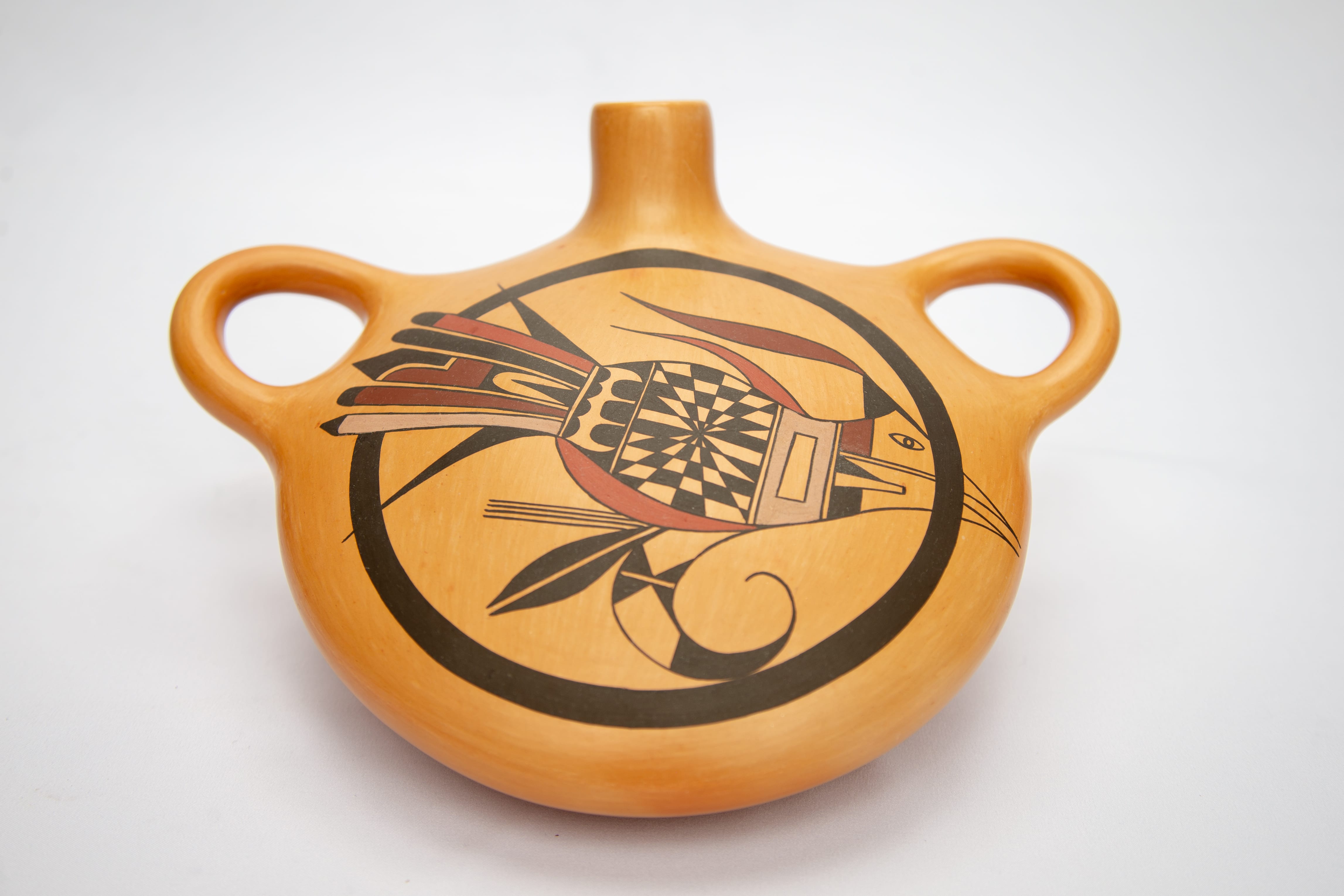
Although this canteen has only one painted surface, the image is three-dimensional, only the second Hopi pot I know of with such a visual construction. The other pot (2020-09) by Rachael Sahmie displays a design somewhat similar to this Mark Tahbo canteen. They may both have been inspired by the same ancient Sikyatki canteen (Moulard, 2002: Plate 88 facing page 147).
The design is also a narrative that becomes particularly poignant given Mark’s recent death.
A traditional Hopi utility canteen for home use has one flat side to steady it against a person’s body and an opposite bulbous, pregnant side to maximize its capacity (cf. 1995-02, 1998-01 and 2003-09). Sometimes Nampeyo used this traditional form for decorative canteens, the protruding side a canvass carrying a design of great aesthetic impact (2014-15). However most Hopi canteens made for sale to tourists were more symmetrical with two parallel, slightly convex sides. (See “canteens” in category listing.) On canteen 2018-01 Mark has devised a third shape. Here he radically narrowed the distance from front to back. Resting on its back, the form below the handles is a shallow broad bowl; covering the bowl is a slightly convex lid that creates an expansive 8.5″ wide surface for design. The technical challenge of covering a bowl with a disk of wet clay is akin to the task of forming a traditional Hopi seedjar (1986-01 and 2015-04), except that here Mark has added a spout and handles. Although canteen 2018-01 was never intended to be used to carry water, the spout tilts upward above the surface of the pot, so that if it were filled, the water would not flow out, a convention also characteristic of Nampeyo’s work.
The walls of this canteen are substantially thick and thus the pot feels solid when lifted. The surface has an even orange glow, lacking the dramatic blushing that characterizes many of Mark’s pots. (See “Artists” index.) The entire decoration can be seen with a glance at the broad top surface. An inky-black thick framing line encircles this space, creating a circle with an internal diameter of 5.5 inches. Cutting across is an abstract roadrunner, 7.5 inches long from beak to tail.
The design is drawn using four colors plus unpainted areas and is a complex puzzle of colors and internal shapes. Note that elements of the roadrunner that I describe as squares, triangles and parallelograms are not pure forms since one edge is often curved to fit the outline of the body. It’s all very sensuous.
The beak and face of the bird are outlined, but not filled in with paint, thus allowing the pale tan color of the burnished clay to show through. The eye is simply outlined. This design scheme has narrative meaning that will be discussed below. A black topknot crowns the head with a two-pointed maroon ribbon flying from its tip, like a flag. At the base of the upper jaw is a maroon parallelogram. The base of the lower jaw contains three shapes: an unpainted central pillar flanked by a black square below and a black triangle above. Behind the head is a large mauve rectangle, its center a smaller unpainted rectangle. The central core of the body would be a simple checkered space of black and unpainted squares, but Mark has distorted this pattern by pulling the center into a disappearing point, thus stretching the outer squares. The result is a trompe l’oeil illusion which pulls a viewer’s eye to the center, like a M. C. Escher drawing. The downward direction of this optical effect also has narrative meaning. as discussed below. Above, between the body and the topknot maroon “flag,” a red ribbon emerges forming a flag with a single point. Behind the checkered core is an unpainted strip, a single-lane highway. Behind it is an unpainted area with intruding black elements. The space is framed by two black triangles with two curved sides. Between them three tall black pillars rise with their rounded tips pointed towards the rear. Facing them are four black rounded gumdrops. Spanning the belly of the bird, from the mauve neck to the emerging tail, is a red crescent that ties together the diverse elements above.
The tail is a complex series of five multi-colored linear feathers flanked by two thiner solid black feathers. The top flanking feather has linear sides; the bottom flanking feather has a lower edge that is curvilinear. The difference between these two elements adds energy to the design. Each of the central five tails feathers is unique. The top feather is solid red with a black tip, followed by a feather of the same shape that is all black. The central feather is wider than the others and contains a series on interlocking elements. At the base is a black triangle intruding into an unpainted area with a black arch framing the far end. A maroon element that follows is L-shaped, but distorted. The base has a curved upper edge, the vertical area rectangular but stubby. The tip of this feather is solid black and pointed, with its base keyed to fit into the curved section of maroon form behind it. The fourth feather is maroon with a rounded black tip. The last of the five feathers is mauve with a black pointed tip. For comparison, see a somewhat similar bouquet of feathers on the set of interlocking tiles that Mark made and that are part of this collection (2014-19).
Finally, emerging from the red belly crescent are three monochromatic design elements. Closest to the body are a series of four parallel black lines. Next is a solid black leaf, its center split by an unpainted line. Last is a counterclockwise curved form with an outside length of 4.5 inches. The first half of this length is wide and largely unpainted. Set into this unpainted space are two large solid-black triangles with their points touching, except that the tips are split by a unpainted line that divides the form into four smaller triangles. The second half of the curve is painted solid black and narrows into a thin line.
Part of the power of this design derives from Mark’s adherence to a strategy parallel to Nampeyo’s mature work. Additionally, Mark is able to create a vertical motion of design perpendicular to the surface of the canteen, something I have never seen before on a Hopi pot. Together these painting techniques interact to create a powerful visual experience.. Additionally, much of the impact of this canteen derives from the story it tells, particularly given the tragic death of its maker who passed “to the other side” shortly after this canteen was made. Let’s discuss each of these characteristics in turn.
Nampeyo treats the design surface on canteens as if they were bowls made convex (cf 1999-03 and 2010-11). We can look at canteen 2018-01 from the same perspective. Appendix B defines six design strategies that are characteristic of the mature Nampeyo. When trying to decide if a particular pot is “by Nampeyo,” I use these criteria as a standard of judgement. Mark seems to have adopted much of Nampeyo’s strategy of design on this canteen, and where he differs is instructive.
When Nampeyo paints a pot she creates:
1. A Tension between linear and curvilinear elements, often represented as a contrast between heavy and delicate forms.
This technique is fully-developed on canteen 2018-01. The mouth, topknot flag and particularly the five linear tails give the design great linearity and forward thrust. The four parallel lines below the bird provide added linearity. The massive thick framing circle and the curvilinear element below the body of the bird provide contrasting circularity.
2.. A deliberate asymmetry of design.
There is nothing symmetrical about this design, no axis on which the design could be folded and coincide.
3. The use of color to integrate design elements.
There are four dispersed areas of color in the design plus the four colored tails. Four areas of the design are painted maroon, three are painted red and two mauve. Thus a viewer’s eye connects multiple areas of the same color as well as using colors generally to integrate the overall form. The design is busy, but coherent because of its dispersion of color.
4. The use of empty (negative) space to highlight the painted design.
Except for the front design, the canteen is unpainted. Within the framing line there is sufficient empty space that the bird has room to fly across the canteen.
5. The use of thin above thick framing lines on the interior of her bowls.
Here Mark uses one framing line rather than the thin/thick pair favored by Nampeyo. As expected, the thick circular framing line sets the design off from the rest of the surface of the pot, thus focusing the viewer’e eye. On this canteen the framing line is also integral to the design, a dual function that may be unique to this pot. This framing line is also part of a narrative, as explained below.
6. Confident, bold and impulsive painting.
Mark has fully-developed his painting technique on canteen 2018-01 and his painting is both confident and bold, as witnessed by his trompe l’oeil checkered design at the center of the bird. Unlike Nampeyo, however, Mark’s painting is not “impulsive,” but is careful. Nampeyo’s brush often crossed a line when she “should” have stopped; the current younger generation of Hopi potters has learned to decorate without error. Indeed the effective trompe l’oeil image on this canteen needed careful planning and could not have been drawn “impulsively.”
Four of the six design strategies that are characteristic of Nampeyo’s mature bowls are directly used by Mark on this canteen. As they did for “The Old Lady,” these strategies lend power to Mark’s design. The two differences –a single framing line and precise painting– are essential to the story Mark wished to portray. Mark internalized the lessons of Nampeyo’s design strategies, but modified them as needed.
Note that the central checkerboard pattern is a device also used by Nampeyo. See 2012-08.
The Narrative:
An understanding of the narrative incorporated into the design on this canteen requires some knowledge of Hopi beliefs. The Hopi live in this Fourth World, having escaped upward from the corrupt Third World through the circular sipapu (opening) connecting the worlds. The Hopi believe that a person has both a physical body and a breath-body (hik’si), which is roughly equivalent to the Christian concept of soul. After death a person’s physical body is ritually dressed and buried almost immediately. For three days the breath-body remains near the burial and then then begins its
“…return to the Underworld through the same sipapu whence mankind first climbed to the earth’s surface. There they carry on an existence which is nearly identical with that of the living. On some occasions they may revisit their former homes in the form of clouds or Katcinas, bringing rain and other benefits to those who are still alive. (Stephen, 1936: 151, 824-828 and Titiev, 1992: 108. Also see Bradfield, 1995:274).”
I believe the great circle on the surface of canteen 2018-01 is only incidentally a framing line. More significantly it represents the great sipapu through which we return to the underworld after death.
Roadrunners (“ho’spowi“) live on the grass flats below the Hopi villages and are known by the Hopi for the speed with which they travel. Mark gave the title “Roadrunner moving from one world to the next” to this canteen when he sold it to Garland’s Indian Jewelry in 2015. On canteen 2018-01 the roadrunner is diving down through the framing circle as does the spirit of a dead person as it transforms from the Upper world of the living through the si’papu passage to the Underworld. This direction of motion is clear since the tail feathers are above the framing line, still in the Upper World, and can thus be fully seen. In contrast, the beak and face of the bird have passed through the si’papu and are thus obscured by the framing line as they enter the land of the dead below. They are now hik’si breath body and thus are painted as an outline but not filled in with color because they no longer have their physical substance.
The checkered trompe l’oeil pattern at the center of the roadrunner’s body draws the viewer’e eye downward to a disappearing point, further emphasizing the downward movement of the image. I have only the fragmented and superficial understanding of Hopi beliefs that is appropriate to an outsider, so I am leery of overstating the meaning of the iconography on canteen 2018-01. Nevertheless, this trompe l’oeil pattern may suggest several other Hopi beliefs. The movement of the checkered pattern toward a central downward point is similar to the spiral eddies of water that form at the entrance of the si’papu at the bottom of the Grand Canyon. According to Alexander M. Stephen (Patterson, 1994: 27-29) these downward spirals of water are associated with Ho-bo-bo, the source of wind and keeper of breath. The si’papu is also seen as the home of Masau, god of the dead. The confluence of downward motion, breath (body?) and death seem more than incidental to me and so the trompe l’oeil pattern may also reference the complex meanings surrounding the si’papu. I have no idea, of course, if such an understanding was shared by Mark Tahbo.
Rick Dillingham introduced me to Mark in the late 1980’s, when Mark was relatively unknown and still mostly copying the Siitalpuva butterfly design of his great-grandmother (1995-01, 1997-08). Shortly thereafter he was accepted into SWAIA Indian Market and became well-known. I did not know him well, but when we saw each other we would tell Rick stories since we both missed him.


