
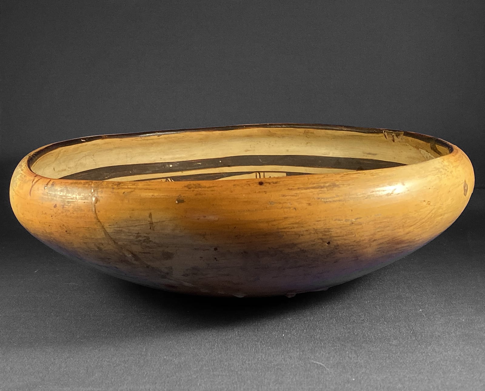
The painting on the exterior of jars is more constrained by the shape of the vessel than the painting on the broad interior of bowls. While this collection has eight other pots by Fannie, this is the first bowl and the largest piece by her in the collection. As a result, the painting on the interior of bowl 2018-07 has more energy and has greater visual impact than other work by Fannie found on this website.
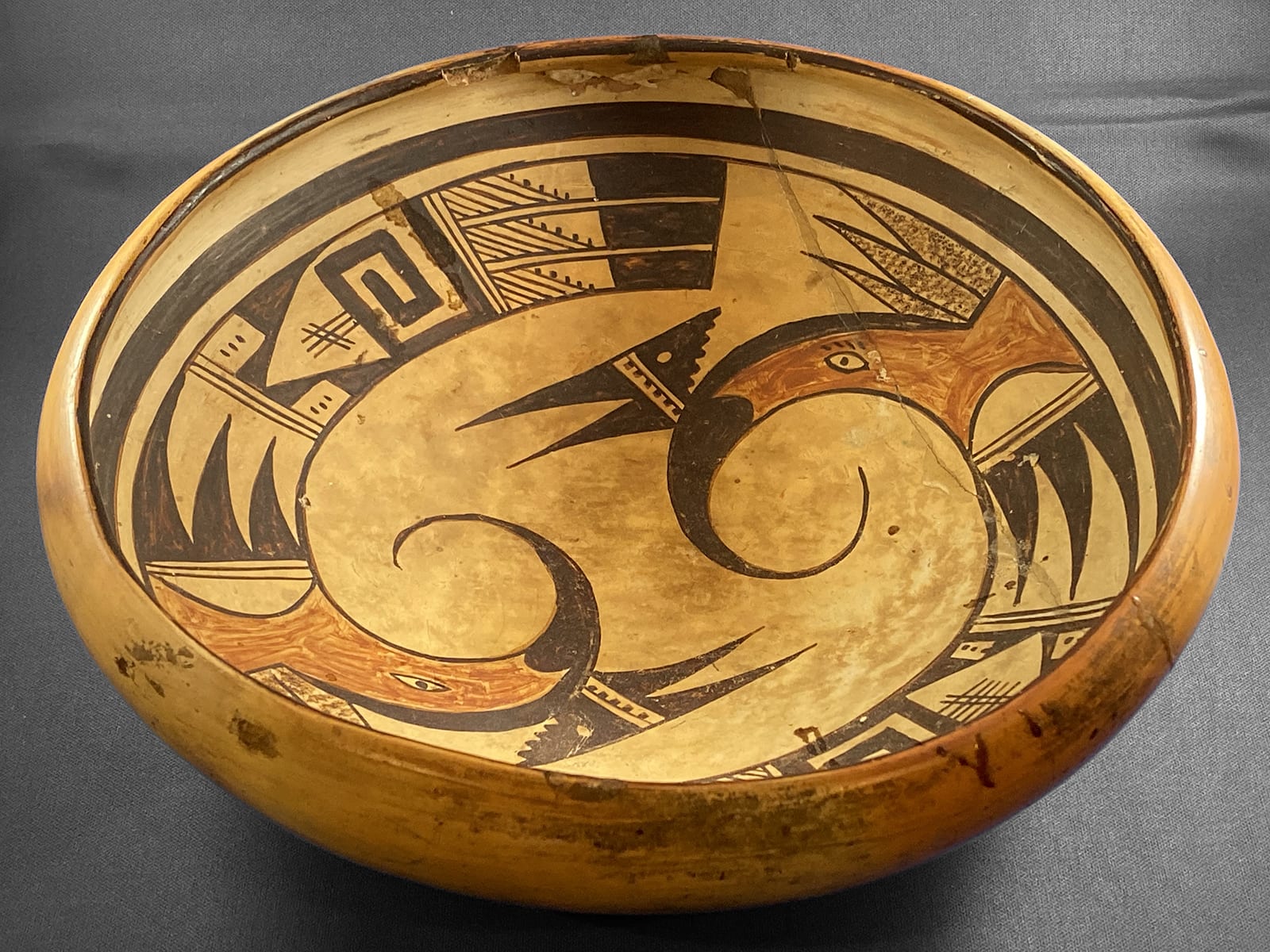
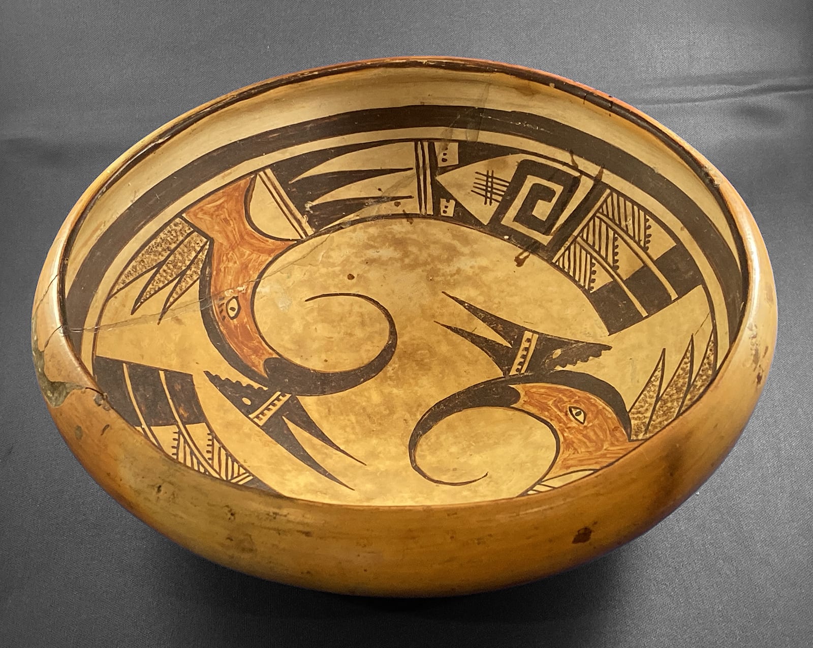
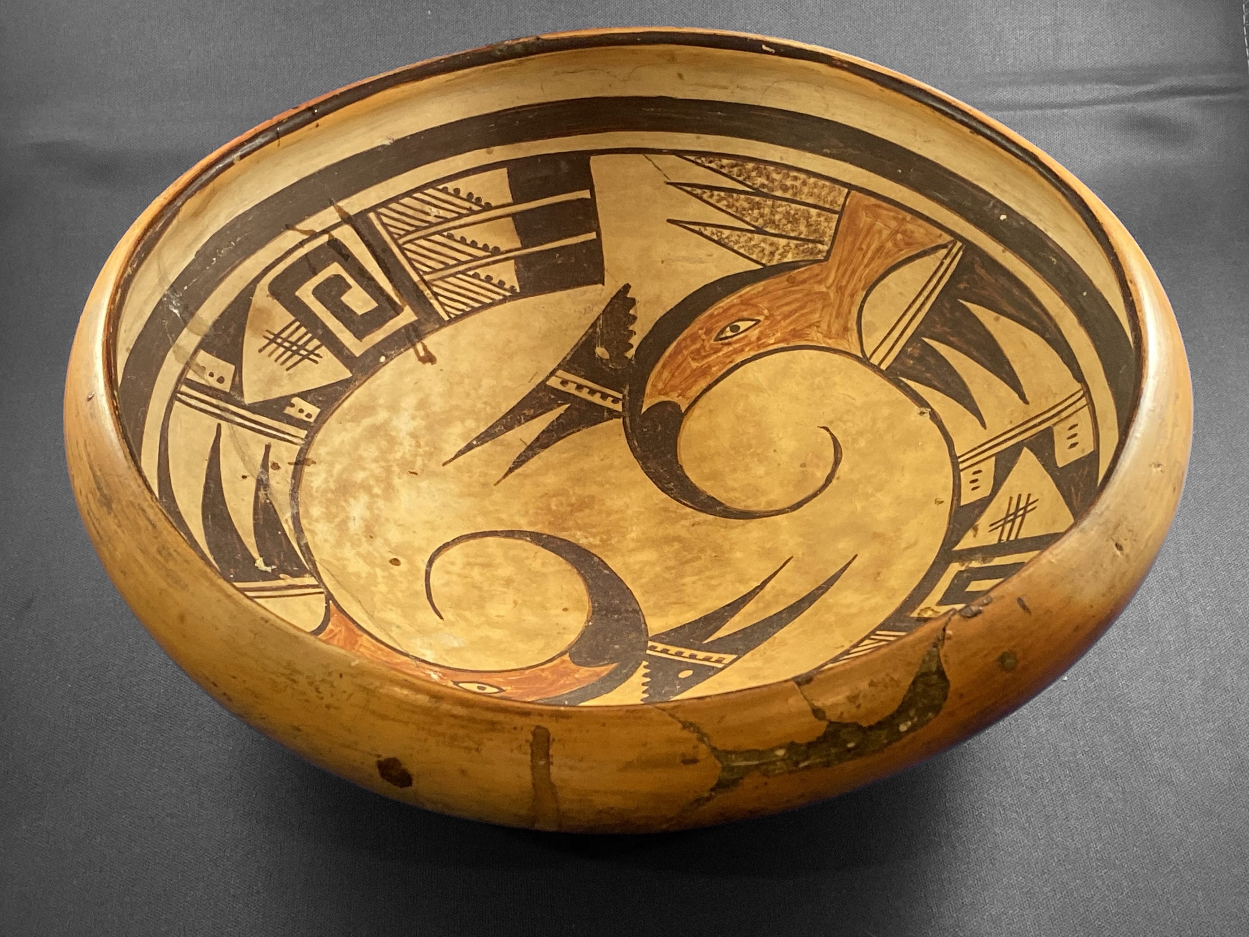
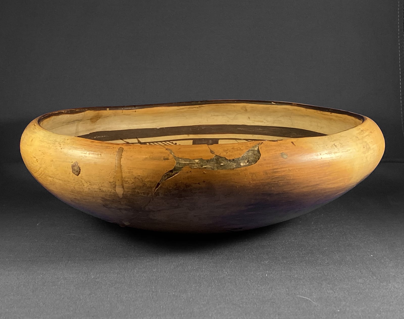
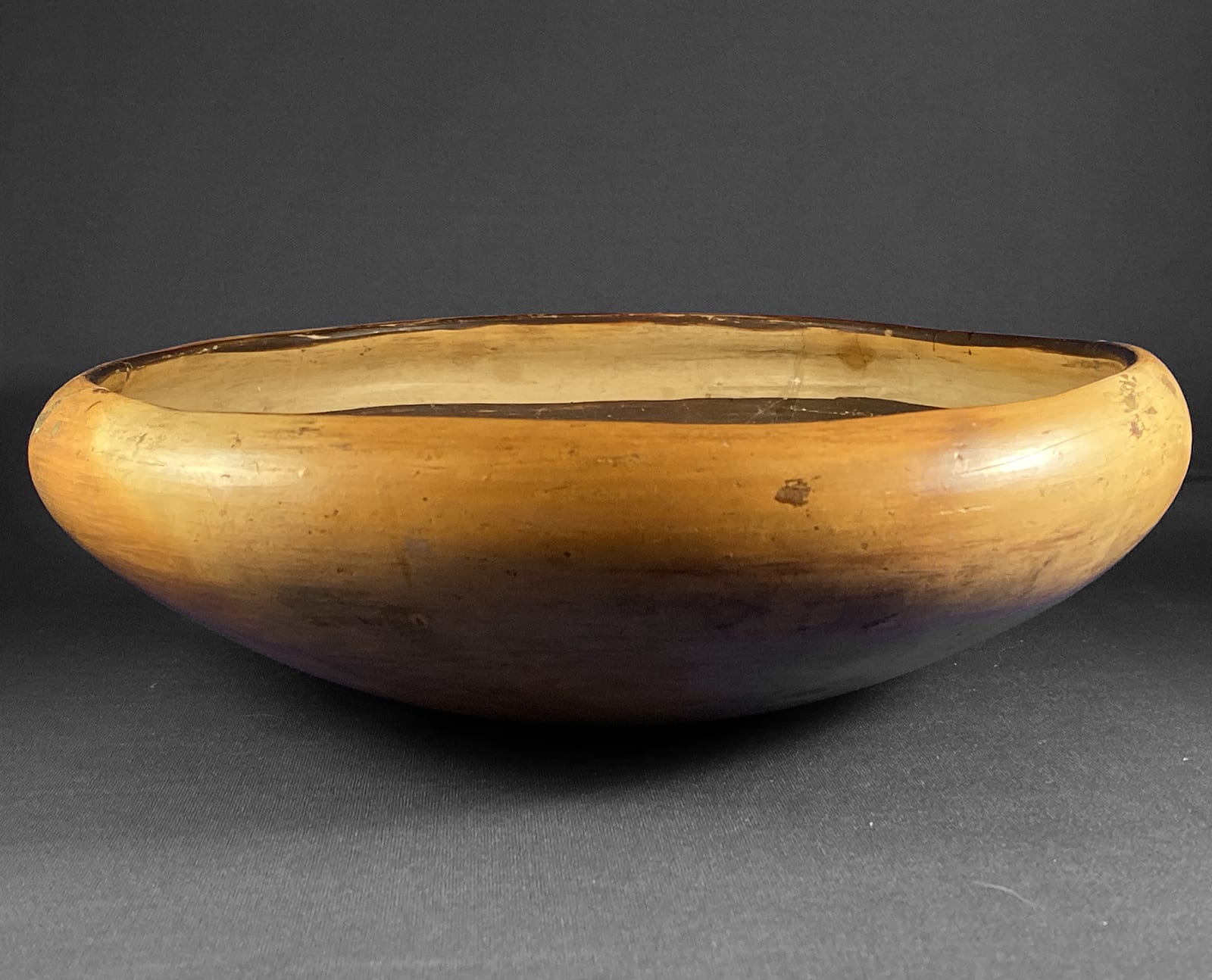
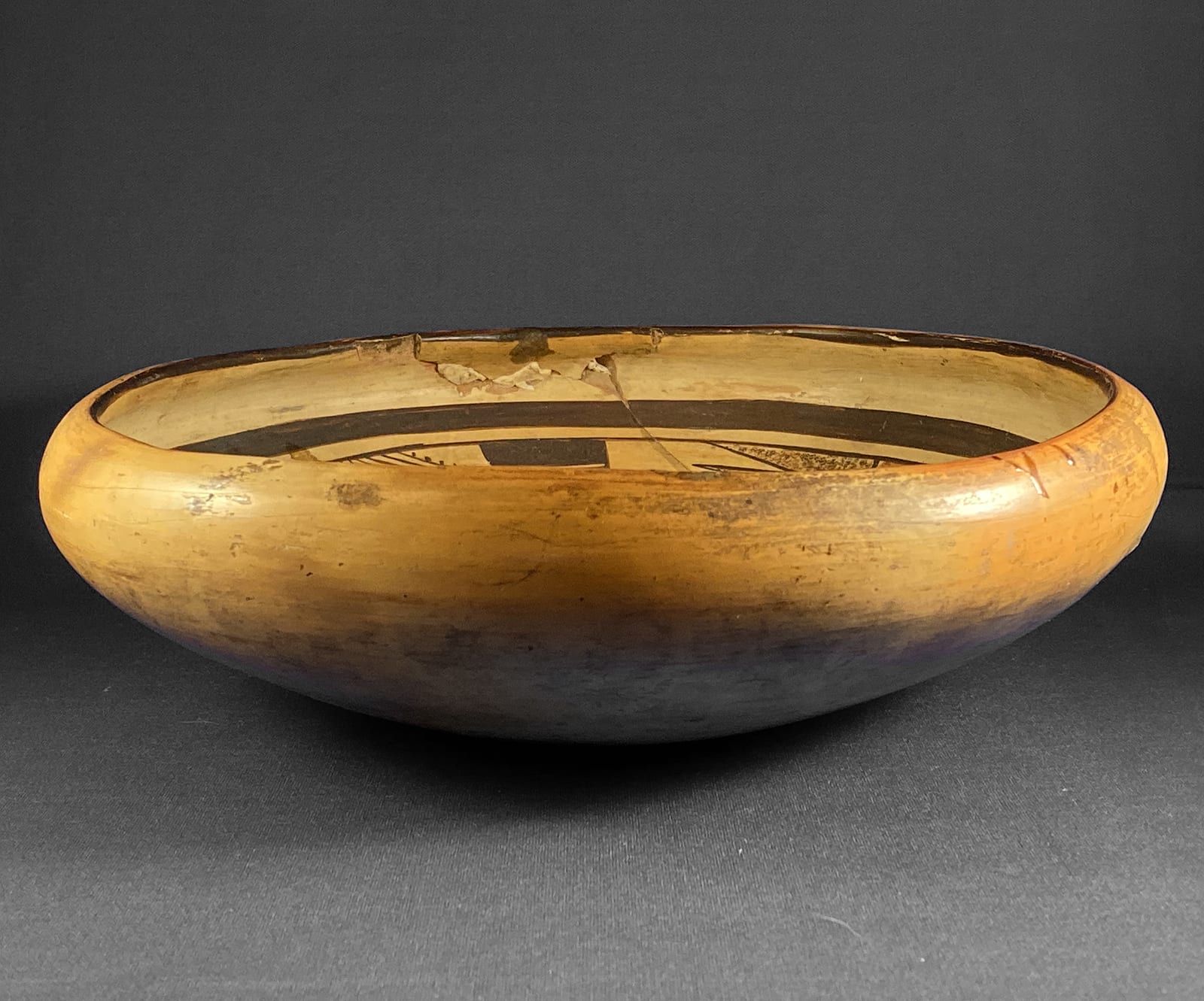
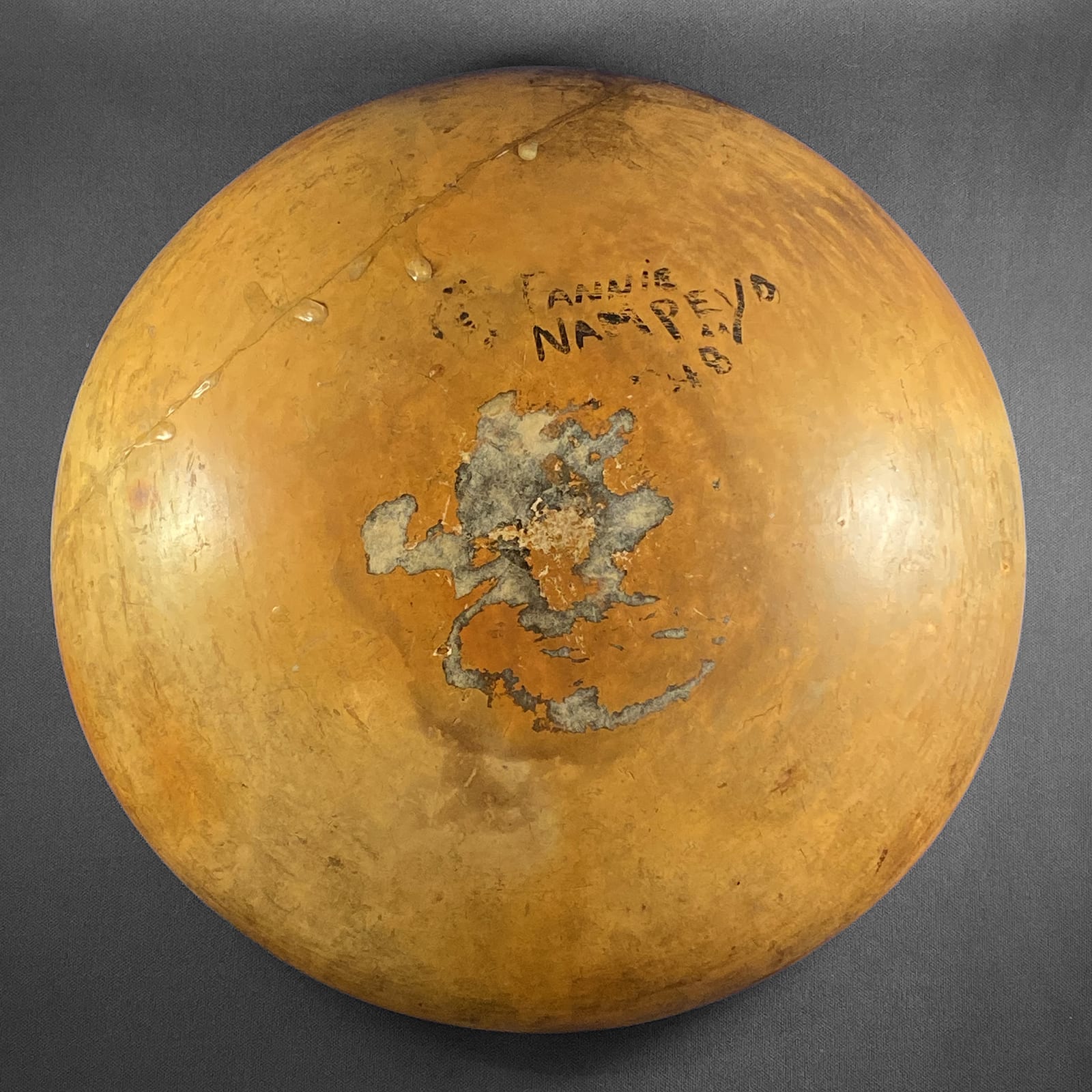
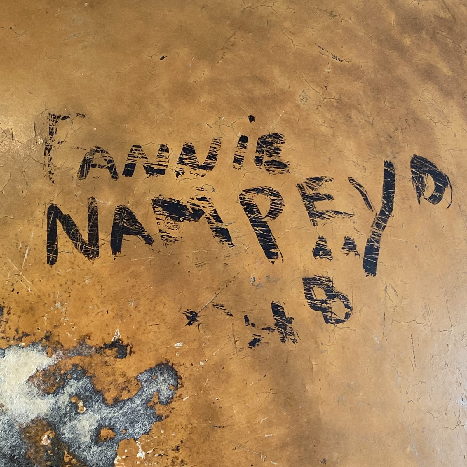
Bowl 2018-07 is perfectly spherical and has substantial but even walls. The widest point on the bowl is about one and a third inches below the rim. The bowl then incurves to its top edge. Prior to my owning this bowl it was broken with about 25% of the bowl separating into one large and two small shards plus some minor fragments. A clear glue was used to reattach the broken pieces with some glue oozing and dripping out of the cracks and hardening. This extra glue is most noticeable on the unpainted exterior of the bowl. The two smaller shards are edge pieces.
The small fragments below the edge shards were lost and the filler is particularly noticeable on the exterior. The missing fragments are above the interior framing lines, leaving the design intact. Because of the incurving lip, when viewed directly from above, this damage is invisible.
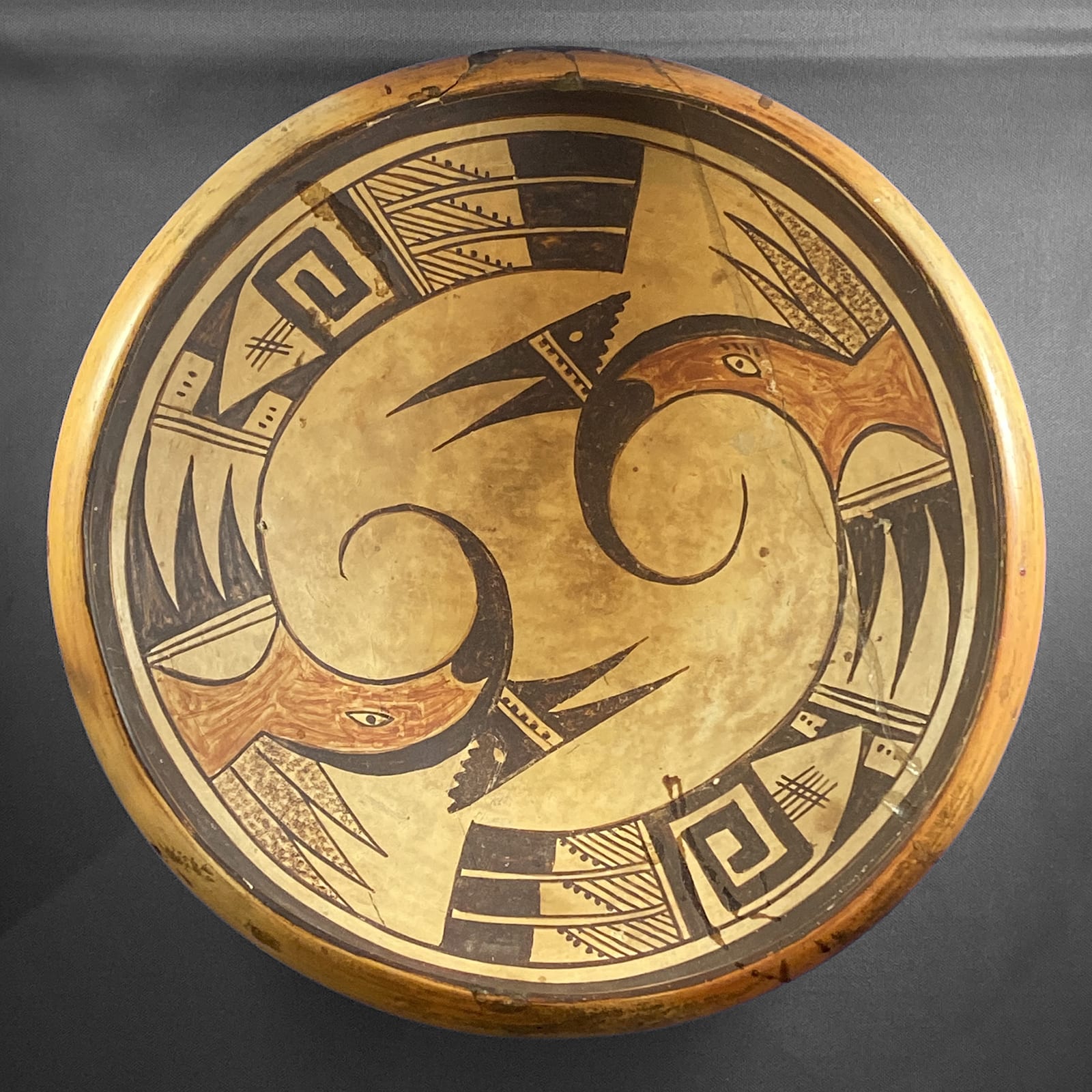
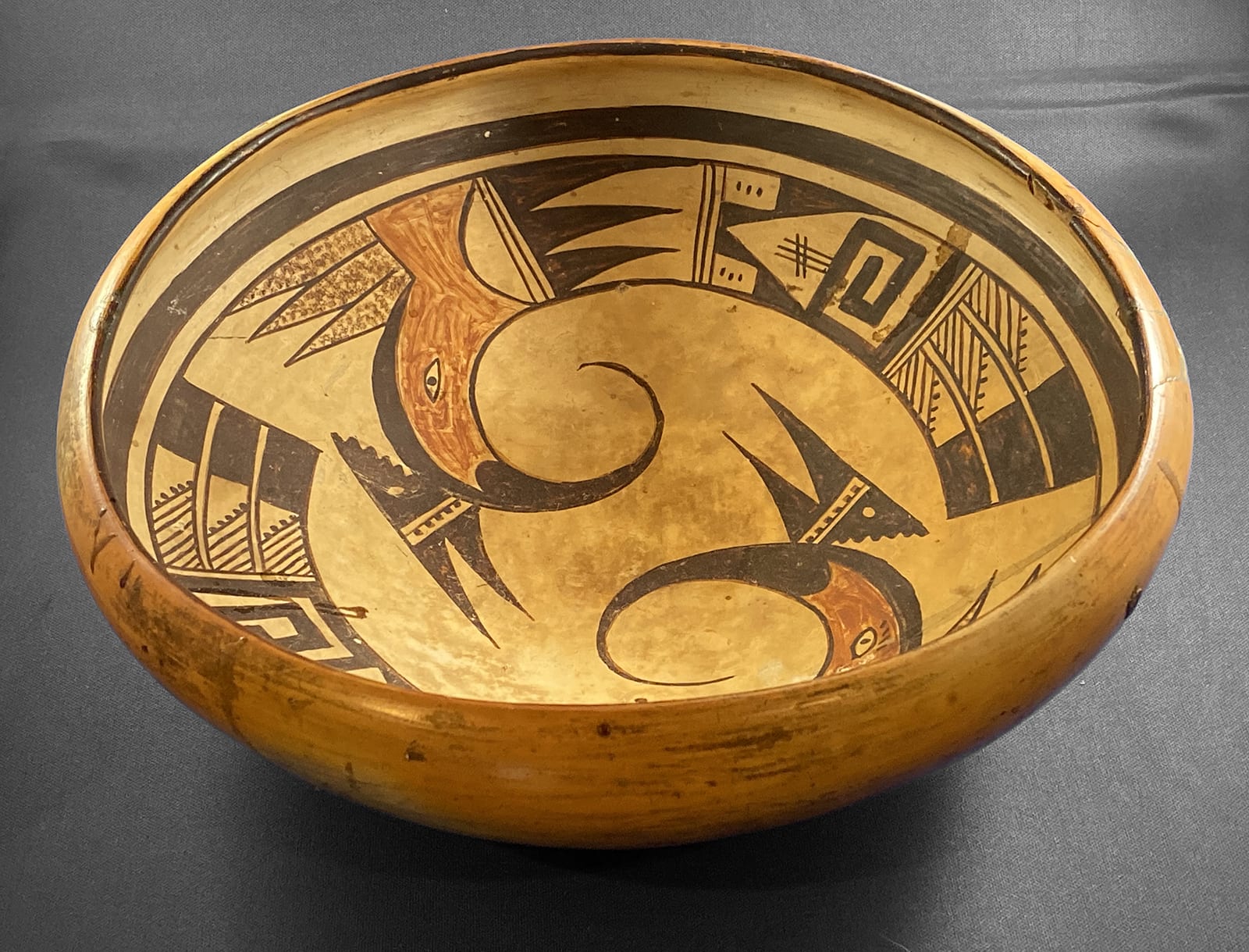
The interior is a mottled light color that is likely the result of a cooler irregular interior temperature during firing but may be an intentional light slip. Bowl 2006-11 by Nampeyo has a different oddly patterned interior color and I am equally unsure of the cause on the pattern on either bowl. As it happens, however, the mottled pattern on the interior of bowl 2018-07 resembles clouds in the sky, always a good Hopi omen and a fitting background for the two birds that tumble across it.
Early in her career Fannie’s pots were painted with a black that is strikingly inky dark, as on seedjar 2001-07. That same paint is seen on bowl 2018-07. The two areas of red are streaked, an “imperfection” that was discouraged by buyers for the Museum of Northern Arizona Hopi Show beginning in 1930. Thereafter the red paint on Hopi/Tewa pottery became more uniform. Based on this tenuous evidence and the confidence of the painting, I suggest bowl 2018-07 dates from the late 1920’s or early 1930’s when Fannie was in her 20’s. but that is just a guess.
As her mother did, Fannie framed the interior design with thick-over-thin lines. Rather than remaining distinct, however, the thin framing line forms the upper limit of the design.
The crested bird that appears two times on this bowl is often refered to as a “parrot,” though other identifications are also given. This is a frequent motif on Hopi and Hopi-Tewa pottery and is seen on bowls by Nampeyo (1988-01), Nampeyo and Annie (2006-01) and pots by other artists (cf. 1998-06, 2001-02, 2010-18 and 2014-18, among others). The two renditions on this bowl are identical except for seven minor variations that are only noticeable if one is compulsively examining the design.
The black beaks are about 4 inches long and curve dramatically back toward the red head, threatening to close off a circle. If completed this circle would be about 6 inches in circumference, two-thirds being the beak and the remaining 2 inches the gap between beak and the head. The base of the black beak is convex and intrudes into the red area that follows.
A black crest arises from the thickest part of the beak. Central to it is an unpainted area with a single line running perpendicular to the head, forming a two-lane “highway.” The left lane of this highway is painted with a string of either 5 (in one case) or 6 black dots. (First design difference.) Oddly these round dots have been carefully extended and squared off with a thin brownish paint. Apparently Fannie returned to this small detail with great intent and care. Forward-pointing on the crest are two isosceles triangles. The rear of the crest is a right triangle, its hypotenuse a series of 5 or 6 steps. (Second design difference.) The crest with 5 dots also has 5 steps; it sibling has both 6 dots and 6 steps. Embedded in this triangle is a small unpainted oval.
Note that the shapes I describe below only approximate pure forms due to the curved edges of the birds.
The head and upper body of the bird are a single red space, the only red on the bowl. Embedded in the head section of this red is an unpainted oval eye with a black border and a black pupil. On one bird the eye features a four-dash eyebrow; the second bird has no eyebrow. (Third design difference.) As this red section flows into the body, its upper border is flat and the bottom concave. Fixed to the upper flat border are three isosceles triangles in a row, their interiors filled with stippled brown paint, the same color used to square off the black dots in the crests.
The lower boundary of the red area is dramatically concave, the space filled by an unpainted “gumdrop,” its base two-lane highway. Rising off this base but pointing towards the tail are another set of isosceles triangles, these painted solid black. They occupy an otherwise unpainted rectangular area and thus the residual section forms three unpainted isosceles triangles pointing forward.
At the mid-body of the birds is another two-lane highway and then a rectangle of complicated design. Central to this space is an unpainted element that looks like a cross-section of a simple house: walls and a roof, with the peak pointed toward the head of the bird. Below the base of the house is a thick black line that continues up the lower wall of the house and then cuts 90 degrees right to form a square Greek key that rotates clockwise to fill most of the unpainted house. Rising perpendicular to the top of this design are 3 or 5 short lines crossed by two short lines. (Fourth design difference.)
Set in the residual black areas on either side of the roof are small unpainted rectangles, each containing three dots. In one bird the long side of the rectangles face forward; in the second bird the short side leads. (Fifth design difference.)
Below the Greek key are two lines enclosing an unpainted space (a one-lane highway), followed by three tails with black tips that abruptly end at a connecting straight line. The base of the tails is unpainted, but set into this base are sets of parallel lines that slope toward the center of the bowl, the rear-most line in each of the six feathers carries a line of 5 black dots, except that the bottom feather on one bird has just four dots. (Sixth design difference.) The number of parallel lines in each of the six tail feathers varies from 5 to 8. (Seventh design differences.)
In Appendix “B” I define six design strategies that characterize the mature work of Nampeyo. On bowl 2018-07 Fannie uses many of these strategies and this accounts for the power of her design.
1) A tension between linear and curvilinear elements, often represented as a contrast between heavy and delicate elements.
Most obviously, the great curve of the beak and the black curve above the eyes contrast with the linear top line of the crest. While the black-tipped tails are slightly curved, relative to the beaks they provide linear tension. The various isosceles triangles provide similar “almost linear” contrast to those great curving beaks and black curves of the heads.
2) A deliberate asymmetry of design.
The seven differences detailed above between the two birds make the designs asymmetrical, but they are so subtle that they were likely not deliberate. I argue that Nampeyo used asymmetry to keep her designs from being static and give them energy. The great tumbling energy of the two birds here obliterate any static concerns and make any other device for creating dynamism unnecessary.
3) The use of color to integrate design elements.
While there is only one red area on each bird, a line drawn across the bowl would bisect each., thus drawing together these two elements. Moreover this linear pull contradicts the circular tumbling of the overall design and adds visual tension and therefore interest.
4) The use of empty (negative) space to frame the painted image.
The bodies of the birds are nestled along the thick framing line; only the bird heads intrude into the center of the bowl. Thus there is substantial empty space in the center of the bowl to allow the birds motion.
5) The use of a thick above a thin framing line on the interior rim of her bowls.
As noted earlier, Fannie has drawn such framing lines, though the thin line becomes the upper edge of the design. By incurving the edge of the bowl, however, Fannie has visually set off the design, a similar function.
6) Confident, bold, and impulsive painting
This is the most subjective of the six criteria. The painting on bowl 2018-07 seems confident: look at the long controlled curves of those beaks, for example. Fitting such a dynamic design into a circular space seems both confident and bold to me, a feeling reinforced by the inky black of the design. Following Dextra, a modern master Hopi/Tewa potter would have made the two birds carefully identical. The seven minor difference between the two birds indicate at least a small amount of impulsiveness by Fannie.
On 3-5-19 I spoke with Ed Wade about Fannie’s painting:
“Especially on her bowls, Fannie is characterized by big, bold, blocks of color. These are not subtle designs. She was the most commercial of Nampeyo’s three daughters and especially toward the end of her career turned out dozens of jars with more delicate, repetitious designs.”
The design on bowl 2018-07 is representative of Fannie’s earlier, bolder and energized production.
The details of this discussion allow us to see this bowl more exactly, with more understanding. However, what ultimately counts is its aesthetic power, its ability to emotionally move us. The design is a simple conception, two traditionally drawn birds curved to fit a round pallet, Yet the robust painting, circular energy and spacious layout startle my eye and grab its attention. Bowl 1988-01 by Nampeyo has the same elements of design as Fannie’s bowl 2018-07, but the Nampeyo bowl is far more static and less interesting than the bowl discussed here. The Nampeyo bowl gains some energy when the bowl is turned so the facing birds are not vertical. That same trick works in spades with bowl 2018-07. As I turn the bowl in my hands, pausing every few inches, the design is energized and grabs my eye, like two flamingo dancers swirling around each other
As the most prolific of Nampeyo’s daughters and the one who lived most recently, Fannie was well known to collectors as a leading Hopi potter. Bowl 2018-07 confirms her as a great potter.
