

-
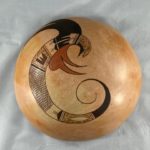
- Rachael Sahmie 2021-21


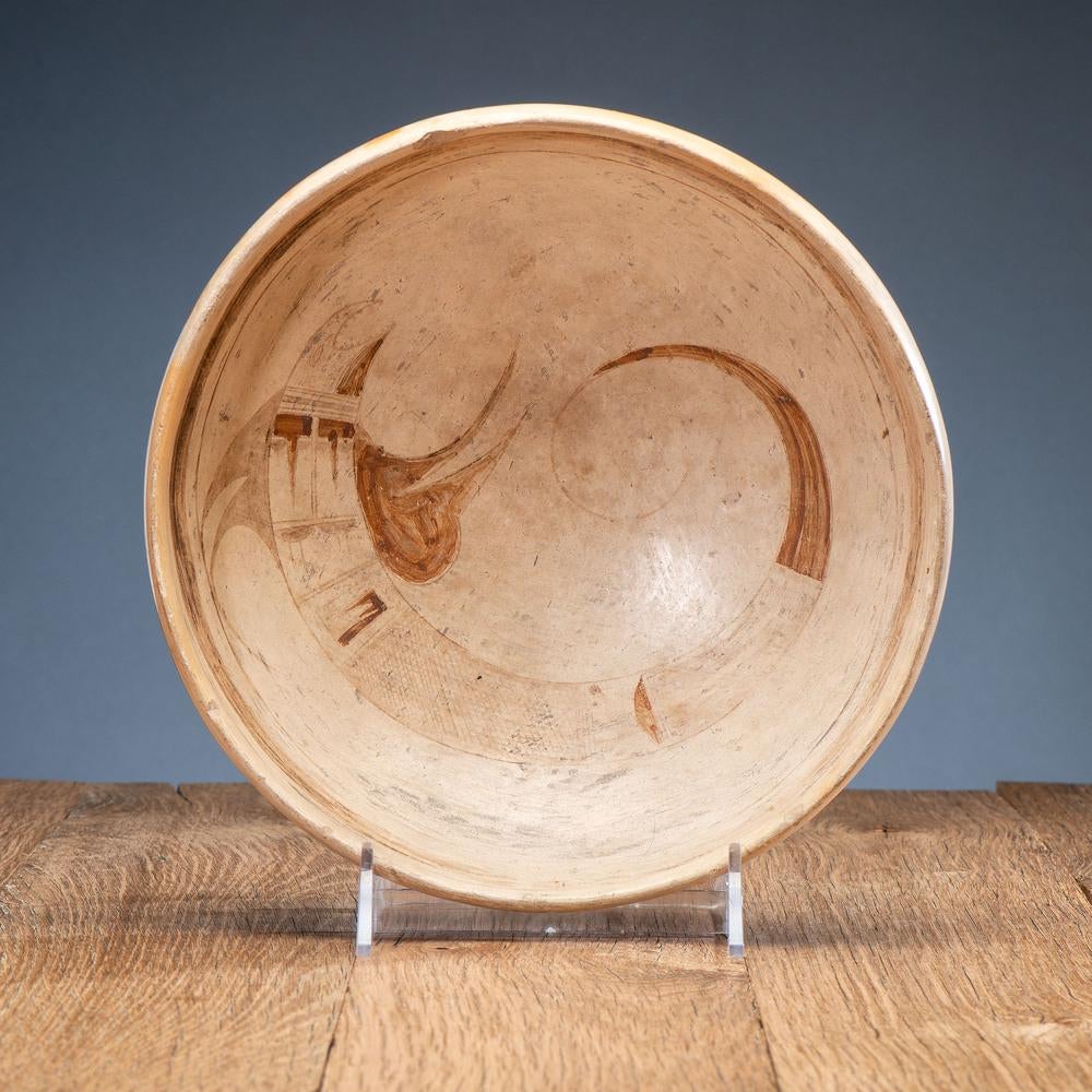
This is a plain bowl with framing lines and a single, washed-out design. Yet the design is so powerful and unusual that, even in its imperfect state, it is an important example in Nampeyo’s oeuvre. This collection now has 63 pots that Nampeyo either made herself or produced with the help of a relative. These pots range from elegant (2002-03), to kitschy (2011-32), modernist (2006-11), folky (2012-21), eccentric (2014-17), and one is close to unique (2015-11), but bowl 2020-11 is the only Nampeyo pot in the collection with a fierce design. The imperfections of the bowl also tell us something about Nampeyo’s priorities and the limitations of her technique.
Form:
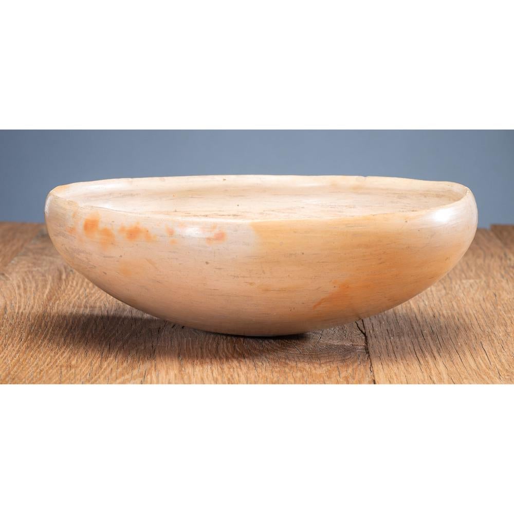
With its round bottom and perfectly spherical shape, this bowl has the usual Nampeyo form. The extra internal rim coil is characteristic of her work (Blairs, 1999:91). The interior slip is a very light tan color and is unevenly streaked. In Appendix B, Section 3b I discuss an unusual Nampeyo white slip: “white kaolin slip with intermittent, streaked coverage.” I concluded that this slip was the result of Nampeyo applying only one coat of slip to her bowls. Several coats of slip, I believe, resulted in an even, unblemished surface. In a 9-26-20 email to me about this bowl, Ed Wade had a slightly different explanation for the intermittent slip coverage: “The pigment on your bowl was quite viscous when applied thus the streaking and clumping (email on file).” Both theories might be true at the same time; both tell us something about Nampeyo’s priorities. She was a master potter who knew her materials well. Nevertheless, she did not take the time to slip this bowl carefully. I infer that the slip finish was not her primary concern; her excitement was in the unusual design on the bowl.
Faded design: speculations:
Sometimes the central design on the interior of a Hopi or Hopi-Tewa bowl is worn because of use. That is not the case here since a large section of the thick-over-thin framing line in a protected position just below the rim is also obliterated.
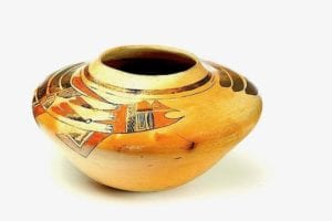
While one can regret that this 120-year-old design is not clearly visible, it is fortunate that only a limited sector of the bowl is so faded that the design is indistinct; otherwise the design, though light, is still clearly discernible. Look at the section of the framing lines that is almost completely erased. If you look directly below this gap towards the center of the bowl, it is this central section of the serpent image that is the most indistinct. The extremities of the creature are faded but more easily seen. Rachael Sahmie has seen photographs of this bowl and read the verbal description offered here. Based on this evidence, she has reproduced this design on the exterior of bowl 2121-21. Thus it is possible to see what Nampeyo’s design would have looked like had it been clear. See photograph above and the catalog entry for bowl 2121-21 for Rachael’s rendition.
The faded design interior to bowl 2020-11 suggests a misfiring of the pot. As Ed Wade wrote: “This vessel has been over-fired thus the pinkest slip color and russet fire clouds. The black and once red painted motifs have been burned (9-26-20 email).” Tellingly the russet golden blushes on the exterior of the pot, which indicate where the fire was the honest, are in he same position as the obliterated central section of the creature on the interior.
There is an alternative explanation for the fading. The black paint on this pottery is made by grinding a small piece of the boiled-down and dried juice of beeweed with a hematite (iron ore) pestle. When fired, the organic material serves as a fixative and the iron oxidizes to black. If the artist does not grind long enough, there is insufficient iron in the paint to create a solid, dark color. If an insufficient amount of the dried beeweed was used, the black paint also does not adhere. Red paint is simply ground yellow clay (sikyatska) mixed with water that fires red. If the mixture is too thin, the resulting red is blotchy. That may account for the reddish-brown, washed out color. The heat-induced blushing on the exterior of the bowl is modest, which suggests that the fading was not so much heat as a sloppy preparation of the paint. Or perhaps both theories played a role in the production of this bowl. I’m just not sure.
Nampeyo was born about 1858 and probably began making pottery as a young teenager. Bowl 2020-11 was made about 1900, when Nampeyo was in her 40’s. I know pottery production doesn’t work this way, but if she made about one pot a day, she would have produced about 9,000 pots by the time she fired bowl 2020-11. I’m sure that this is an imperfect estimate, but it does suggest the magnitude of her production and certifies that Nampeyo was very experienced at the firing process by the time she made this bowl. Yet either the preparation of the paint or the firing of the bowl went poorly, evidence that even for a master Hopi-Tewa artist, pottery production can be problematic. To avoid firing problems numbers of younger potters at Hopi –especially descendants of Fannie Nampeyo– fire in a kiln, sometimes using a blowtorch after firing to create the firecloud blushing characteristic of an outdoor firing.
Nampeyo is certainly worthy of the 125 years of accolades that have been bestowed on her. (See Appendix C.) Yet the slipping and firing of bowl 2020-11 were imperfect, the product of what great-great grandaughter Rachael Sahmie called one of Nampeyo’s “PMS days” (Kramer, letter XXXX).
Design:
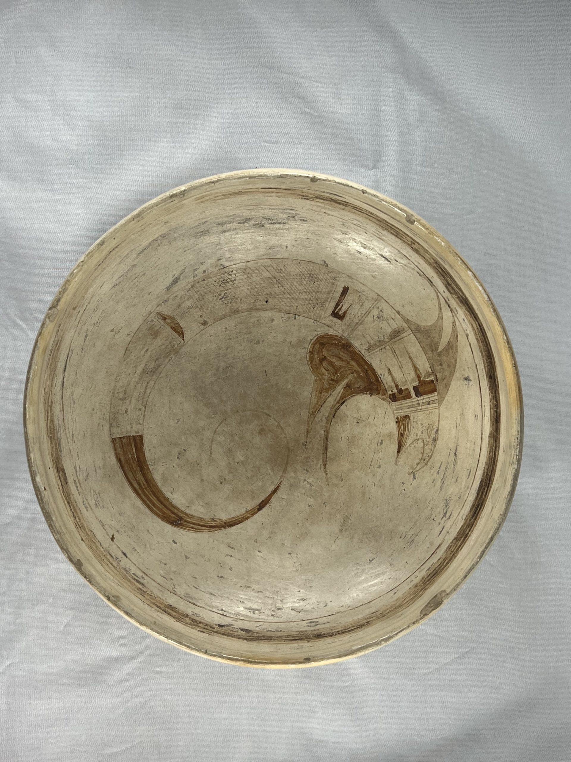
The head of the creature is dominated by a ferocious open C-shaped mouth bristling with 16 teeth. Below the mouth and extending to the neck is a reddish-brown wattle. The top edge of the head is severely curved so that as it reached the open mouth it forms a sharp, dangerous-looking point. The head may have been stippled but the design is so faded and the surface so rought that I am uncertain. Set into this area is a lens-shaped eye with a dot for the pupil. A version of this same creature with a fierce head was drawn by Nampeyo on a huge jar that was once owned by Ed Wade:
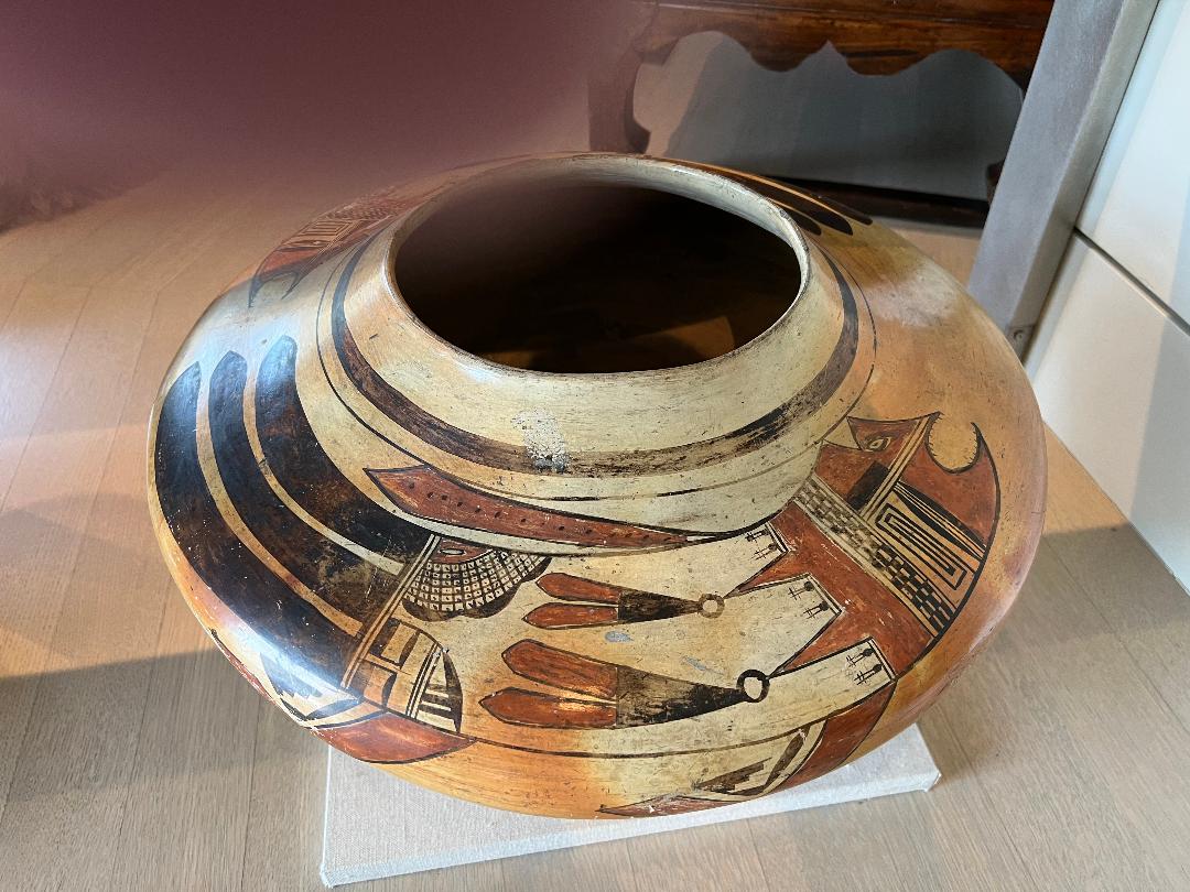
Behind the head on bowl 2020-11 is a design of six parallel lines, a 5-lane highway that Nampeyo generally used to separate sections of her design. Here the middle lane is darkened, like the median strip of a highway with two-lane roads on either side. Since the creature is curved, each section is slightly wedge-shaped. The next section is then divided horizontally by a single-lane “highway,” each of the resulting sections displaying the same design. Known as a “clown face” (Kramer, 1996:188) or ‘Kilroy,” the version presented here is its simplest form of an element frequent used by Nampeyo (Appendix F, xxxx): a wide bar with a long, thin isosceles triangle attached at right angles. Probably intended to be red, the color here fired to the same reddish-brown color seen earlier. The rest of this section is left unpainted.
External to the core of the body and rising off both the upper and lower edge of this section are reddish-brown fins. Each fin has two wave-like sections with the upper set of fins pointing toward the rear and the lower fins pointing forward. The tops fins are roughly symmetrical, but the lower of the bottom fins has a bulbous protrusion on its bottom edge.
Following a one-lane highway, the third section of design has two gumdrop-like low black hills affixed to the leading wall, two parallel lines emerging from their apex, another element characteristic of Nampeyo’s work (“Gumdrop hill, whiskers”in Appendix F). Following another two-lane highway, the next section appears to be decorated with a crook. Emerging from the lower edge of the creature, an unpainted bar rises, then turns sharply left, like the letter “L” inverted. and rotated. Pendant from its end is another form in the shaped of an “L” painted reddish-brown but with two thin isosceles triangles rising from its lower arm.
At this point the design is quite washed-out and I will do my best to describe what I see. A three lane “highway” is drawn before the next section of design, its middle-lane painted black. The next section is the longest in the design and consists of about 50 sloped parallel lines crossed by a second set of about 50 parallel lines, The result is a field of diamond-shaped (rhombus) elements that form snake-like scales on the creature. As we approach the tail, the scales are terminated by yet another two-lane “highway.” Similar crosshatching is seen on Nampeyo’s “Rectangular medicine bowl with creature,” 2017-15.
The next section is largely unpainted but is horizontally bisected by a single-lane highway that terminates at the apex of a reddish-brown hill, its base affixed to the far wall of the space. A two-lane “highway” follows and then a section that is the least discernible in the design. I think what I am seeing is a series of four parallel, long and thin isosceles triangles that rise from the boundary highway and point toward the tail. Perhaps this section is terminated by another two-lane highway, but the design is so eroded that I am not sure. Following is a spectacular long curved tail, reddish-brown, that narrows to a single black line that curves back toward the body in a perfect, elegant circular arch. No Hopi or Hopi-Tewa potter other than Nampeyo was capable of drawing this delicate, perfect form and we have seen it before on pots 2002-03, 2014-07 and 2018-13 (variation) in this collection.
Six Nampeyo strategies:
For her mature work, Nampeyo generally drew on six strategies that defined her design (Appendix B, Section 4). These strategies help us certify if a pot was designed by Nampeyo and variations from these criteria can give us insight into her thinking. Applied to bowl 2020-11, these strategies are:
1) A tension between linear and curvilinear elements, often represented as a contrast between heavy and delicate elements:
There are few linear elements internal to the serpent and, of course, only one overall design on the bowl. Taken literally, this criteria is largely absent from the bowl. However the creature displays strong clockwise direction in contradiction to the long, thin and elegant tail which twists in a counterclockwise direction, this contrary motion providing visual tension. Also notice that the set of lower red fins point sharply to the right. They almost collide with the red section of the tail that is similarly-shaped but pointed to the left. This near collision is visually at the center of the bowl and thus the tension of this contradiction is central to a viewer.
Thus Nampeyo creates the tension in her design that we expect, but using an unusual strategy.
2) A deliberate asymmetry of design:
The design is a single beast and there is noting symmetric about it. The two sets of red fins arising behind the head each display two red “waves,” but the lower wave of the lower set has a bulbous protrusion, thus distinguishing this lower fin from its companion and making the two sets of fins unbalanced.
3) The use of color to integrate design elements:
Ignoring the discoloring due to the misfiring, both the head area of the creature and its tail were intended to be red, thus drawing a viewer’s eye along the full length of design. Moreover, the lower red fins reach out to almost touch the red tail, both pulling attention toward the center of the bowl. Two small red elements along the body use color to keep some attention on the midsection of the serpent.
4) The use of empty (negative) space to frame the painted image:
Even for a Nampeyo bowl, the design leaves an unusual amount of unpainted area, both enclosed by the curved body of the creature and to its right. This fearsome creature is free to move through that space and attack.
5) The use of a thick above a thin framing line on the interior rim of her bowls:
Although eroded, such lines were drawn on the bowl.
6) Nampeyo’s painting is confident, bold, and somewhat impulsive compared to the more-studied, plotted and careful style of her daughters, descendants and other Hopi and Hopi-Tewa potters:
As always, this is the most subjective of the six criteria but also the most important. The fading of the design makes such evaluation particularly difficult.
The criteria of “confident” is clear, however. As noted above, thin-over-thick framing is characteristic of Nampeyo and her skill at drawing a continuous thin line without interruption is a sign of her “confident” painting. On some of her bowls one can distinguish a juncture in this line where Nampeyo has lifted her yucca brush, refreshed both her paint and the position of the bowl and then continued the line to completion. On bowl 2020-11 this framing line is about 16.75-inches long and (from what can be seen) is a single, uninterrupted line drawn at a consistent distance below the thick framing line. Framing lines are a simple form, but to draw them 360-degrees without error is an act of confident painting.
Even more compelling are the lines defining the body of the creature. Notice that the upper edge, from the tip of its snout to the end of the long curved tail is a single curved line that covers more than 360 degrees. This line is 22.25-inches long and is thin, smooth and uninterrupted, drawn without any observable junctures where the yucca brush was lifted from the surface. Either the bowl had to be turned more than a full circle or Nampeyo’s hand had to move in a circle of more than 360 degrees to draw this line. To accomplish this without hesitation and error is extraordinary. Moreover a second curve forms the lower edge of the creature, starting from the upper line at the snout and eventually joining the upper line at a point two-thirds the length of the tail, where the two lines merge to form a final tight turn. This lower line is 21.5-inches long and again is drawn without interruption and at a smooth varying distance from the upper edge to create the body.Of the more than five dozen Nampeyo pots in this collection, these two curves are the longest yucca brush strokes. Runner-up would be the 13-inch curve that forms the outer edge of the arc on canteen 2019-12.
Finally, from what can be seen, the crosshatch of 50 X 50 lines that form the creature’s scales are drawn so precisely so that none of the parallel lines touch, all this in a curved space of about 3.5-inches by 1.5-inches. Thus there is ample evidence that the brush work on bowl 2020-11 is “confident.”
The design on this bowl is certainly “bold,” scary even. If the bowl had fired clearly, the two contrary-moving sets of fins would seem bold, as does the drama of that open mouth and long curved tail. Having only one dramatic design set along one edge of the interior is also dramatic. This speaks to the boldness of the form of the design, but not the boldness of the brush strokes which is indeterminate because of the fading.
I do not find the detailed evidence usually used to assert the “impulsiveness” of the design. Generally this takes the form of a disregard for detail so that (for example) one line will cross another when the logic of the design indicates that they should meet but not cross (cf EXAMPLE). Since impulsivity is a matter of detail, the fading of the design prevents this level of analysis. The six strategies discussed here are about decoration, but if we extend the concern to the slip, it might be said that Nampeyo’s willingness to leave the slip imperfect was “impulsive,” or at least of little concern to her, which is not exactly the same thing.
In short, Nampeyo accomplished one design effect using an unusual technique (#1), fully employed the next four strategies, and clearly met only a portion of the last strategy, as near as I can tell given the condition of the bowl. The cumulative evidence strongly indicates that Nampeyo painted this bowl. Moreover the general form of the bowl, and particularly the extra rim coil, support this conclusion. Further support is offered by Marti Struever.
Marti was a very respected dealer of Native arts in Santa Fe with a particular interest in Nampeyo. On September 1, 2004 she evaluated three Hopi pots for Mr. Gary Jensvold of Glendale, AZ. One of these vessels was bowl 2020-11. Her illustrated evaluation of this bowl reads:
“After examining the bowl illustratrd below, I am convinced this is the work of the great Tewa/Hopi potter Nampeyo of Hno.
The near perfectly executed round bowl shape with the rim widened by the application of an added coil of clay highlights her ability to form exceptionally fine pottery. The vessel as the typical wide framing line below the thickened rim, paralleled by a second fine line below the wider element prefered by Nampeyo during the 1895-1915 period.
The painted image appears to be a form of serpent, or bird, derived from Sikyatki imagery. Here Nampeyo has used some design motifs that are signatures of her work: the two elongated horizontal V-like motifs in the head and the rather strange pair of feathery patterns that descend below the bottom of the head into the bowl interior. Even the fineness and powerful movement of the painting of the tail of the creature are signatures that say Nampeyo.” (Evaluation and a letter on file.)
Often there is reasonable doubt about the maker of a 125-year-old Tewa-Hopi or Hopi pot, but I have no doubt that Nampeyo both formed and painted bowl 2020-11.
Meaning:
Speaking of the large Nampeyo jar that he had owned (pictured above and below) and then referring to bowl 2020-11, Ed Wade discussed the identity of the creature on both pots:
“The disturbing visage of the Thunderer ( Um-tok-ina ) as it is depicted in Hopi legends soars around the upper-body of (my) huge jar. True to the anatomical features of this fierce beast it is armed with razor sharp claws, teeth, and horns. Your bowl (2020-11) is of the same being who is a lighting and rain bringer. It is an infrequently used image perhaps owing to ferocity of the creature. As you noted the composition dates back to the Jeddito period….A date of 1900 is correct.” (Email 9-26-20, on file.)
The design is known from an ancient Sikyatki polychrome jar (1375 to 1625 CE) in the Keam Collection at Harvard’s Peabody Museum and a close copy of that jar produced during the Polacca D period (1890 to 1900 CE), also in the Keam Collection. Both jars were part of the “American’s Great Lost Expedition” exhibit and are discussed and illustrated in the accompanying catalog (Wade and McChesney, 1980b). Alexander Steven was an ethnologist who lived at First Mesa during the 1890’s and was a perceptive observer of Hopi life and ritual. These two Keam vessels are also discussed in Patterson (1994:230), which is a reprint and explanation of a pottery catalog written by Steven.
Of the ancient Sikyatki jar, Stephen wrote:
“The subject, repeated four times, is the mythic Um-tok-ina, the Thunderer. It is depicted with the head of the serpent genius Baholikonga (whose) body is a rain cloud with lightning darting through it, which discloses the origin of the angular cloud symbol so universally depicted upon all classes of their pottery. The tail is that of the eagle; the wings carry storm clouds and attached to the lower wing are the clouds conveying the rain. The singular horn shaped object upon which the hail annulets are incised, passing behind the neck and curving over the head, is the source of thunder. The nature of this singular mythic animal is obscurely defined. It has never been seen, but is known to be the active element of the thunder storm. It emanates from Baholikonga and is painted upon the altar when the men invoke the aid of that genius, which is only in time of continued drought (Steven 1890:49-51 and Wade and McChesney, 1980b:26).”
The Polacca D jar in the Keam Collection is a very close copy of the ancient Sikyatki jar described by Stephen. The design on the ancient jar is beautiful and compelling and has thus been adopted by modern Hopi/Tewa and Hopi potters. In this collection a seedjar by Karen Abeita (2010-24) is an almost perfect reproduction of the ancient vessel and the Um-tok-ina creature also appears on pots 2006-07 and 2007-01. It is notable that all of these reproductions of the Sikyatki design adhere exactly to the form of the serpent on the original Sikyatki jar.
In contrast, Nampeyo has varied the form of the creature on the two examples known to me. On the large jar once owned by Ed Wade, the serpent has a larger and stocker body with a different form and internal design than the ancient example:
The Wade pot
The second example by Nampeyo is bowl 2020-11 and this is a sleeker and by far the most fearsome depiction of Um-tok-ina known. Perhaps Nampeyo saw the Keam pot before it left the reservation in 1893, but she did not copy that design onto bowl 2020-11. Instead she processed the ancient creature through her creative imagination and rendered a more ferocious vision.
Somewhat similar images were known on ancient Jeddito pottery and this collection contains an example, bowl 1997-05, though the creature on that bowl may be of a different species.
The imperfections of bowl 2020-11 are obvious, but the faded design we can discern is still powerful. As a rare example of Nampeyo’s ability to imagine scary creatures, I am delighted to add it to my collection. Had the painting been more vivid it might have encouraged night fears.
