

The most accomplished Pueblo potters today produce work that is both innovative and precise (cf 2018-08 and 2020-02). Categorized as “fine art,” such work can sell for a great deal of money.
Seedjar 2021-16 belongs to an earlier era when pueblo pottery was defined as “women’s craft” and sold for very little money. A note that came with it suggests it was made about 1925 to 1950, which seems like a good guess. The pot’s size and the conceptualization of its design are exceptional, but the pot does not have the exactness and perfection that characterizes the work of many of today’s best potters.
This not to say that this pot is in any way inferior to today’s master work; it is simply of a different tradition and spirit. Although a commercial pot made for sale, it is rooted in a folk art tradition that is often less self-conscious and looser than the fine art of today’s best pueblo potters.
Form:
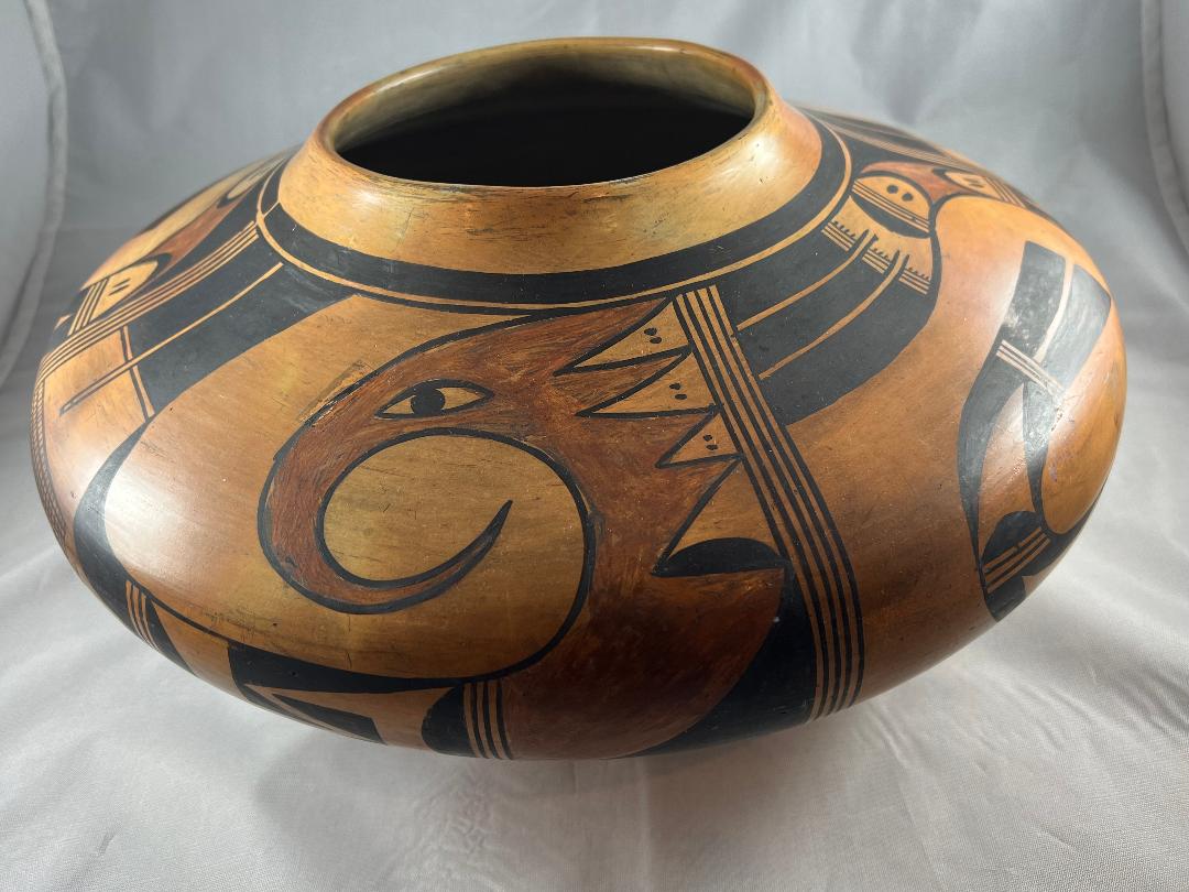
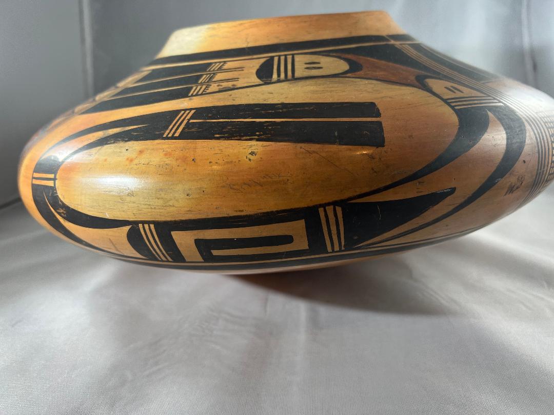
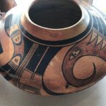
Seeing this jar is a bit like getting on an elevator with a 7-foot tall person. It’s size is striking. The jar has a rounded bottom that curves slowly upward for 9.0-inches before rising vertically for 2.5-inches, then sloping inward for another 4 inches, then rising to form a short 0.75-inch neck. The mouth is 5.25-inches wide. About 2.0 inches of the interior of the mouth is polished. The base may be a bit thicker than the upper walls, but the variance is not great. The walls are even, the lip smoothly curved. When I purchased the pot at auction, it was badly cracked:
[Double click images to enlarge,]
I had the pot shipped directly to Andy Goldschmidt (Ceramicare) and he returned it repaired so that the damage is no longer visible.
Design:
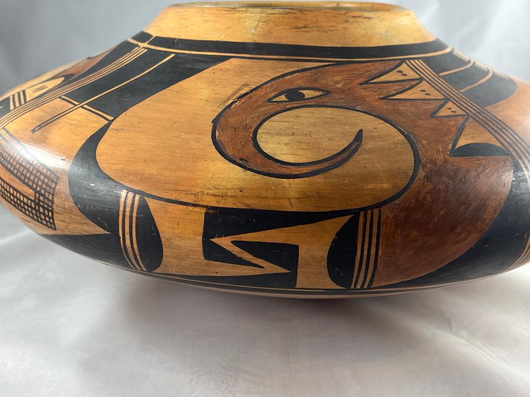
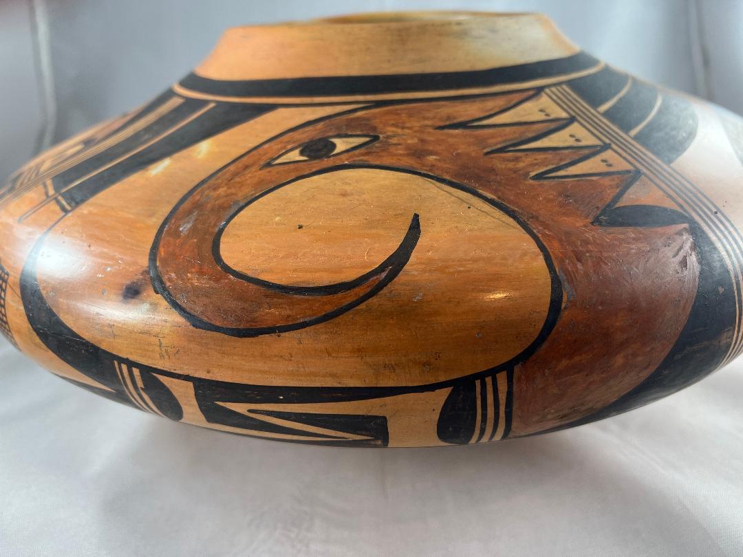
The painted surface begins at the point where the underside turns and becomes vertical, continues vertically for 2.5 inches, then covers the 4.0-inch top slope. Within the framing lines the panel of design encircles the jar and is 5.50-inches wide. Potters at Hopi generally use sets of parallel lines to separate different panels of design. Two parallel lines form a “one-lane highway” with one lane added for each additional line. On jar 2021-16 Cora employs 5 parallel lines to this purpose, four-lane highways. Four such highways appear on this jar and divide the design panel into four segments. The four segments display two designs presented alternately, thus panels of the same design are on directly opposite sides of the jar.
The expected thick-above-thin framing lines are drawn 1-inch below the lip of the jar. Thin-above-thick framing lines are drawn below the waist, just as the underside changes its slope to vertical, and are largely hidden from view. In both cases the thin framing line is subsumed into the panel of designs.
The bird:
The two bird images on the pot are identical and fierce. The head is fearsome because 1) it is red, 2) it has a long, curved, dagger-like beak, 2) its large, elongated eyes have a penetrating gaze, and 3) the rear of the head evolves into four triangular points that seem to provide forward thrust, like afterburners. These four red triangles create four reciprocal unpainted triangles. Together they create “foreground/background reversal” where objects in the foreground and background are perceived as changing places. The base of the lowest unpainted triangle supports a wide, solid-black hill. The head of the bird is big. Coiled its height is the full 5.50-inch height of the design panel and it has a width of 5.0 inches. Uncoiled the bird’s head would be just over 12-inches long. The head narrows into a neck as it turns to join the body. The gap between the head and the lower right corner of the segment is a solid black right angle, its hypotenuse curved by the red head.
The juncture between the head and the body is marked by a three-lane highway. The following section has two elements, each repeated twice. Based against both near and far walls are two solid-black hills, like the one we saw earlier behind the head. Between them are pointed crooks formed by one large elongated right triangle and a smaller triangle of the same shape. In each rendition, the peak of the larger triangle emerges from the edge of the hill, its right angle against a framing line. At the point where the short leg and the hypotenuse of this larger triangle meet, it joins the same corner of the smaller triangle. The resulting configuration is a crook. The point of the crook growing out of the right wall curves downward. The crook growing out of the left wall curves upward. They interlock at the center of the segment.
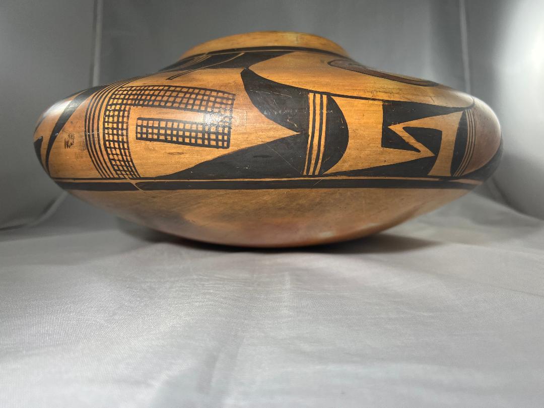
Following another three-lane highway, two adjoining and solid black pointed elements point into the next segment. The top element curves upward like a large tooth. Next to it is another very large elongated triangle, its right angle against the lower framing line and its point extending 80% of the way across the segment. Rising out of the remaining 0.5-inch of the segment is a 2.0-inch tall cross-hatched crook that makes three 90-degree turns as it hooks right.
Finally, above the crook is a 1.5-inch (mostly) empty space. At its far end is a one-lane highway followed by two 2-inch black rectangles, rudimentary tails. The tails are separated by a single-lane highway that extends down past the base of the tails into the otherwise empty space out of which the tails grow. If this single-lane highway is seen as defining the edges of the feathers, then the feathers can be seen as having an unpainted base which terminates with a single-lane highway, the black sections representing only the long tips of the feathers.
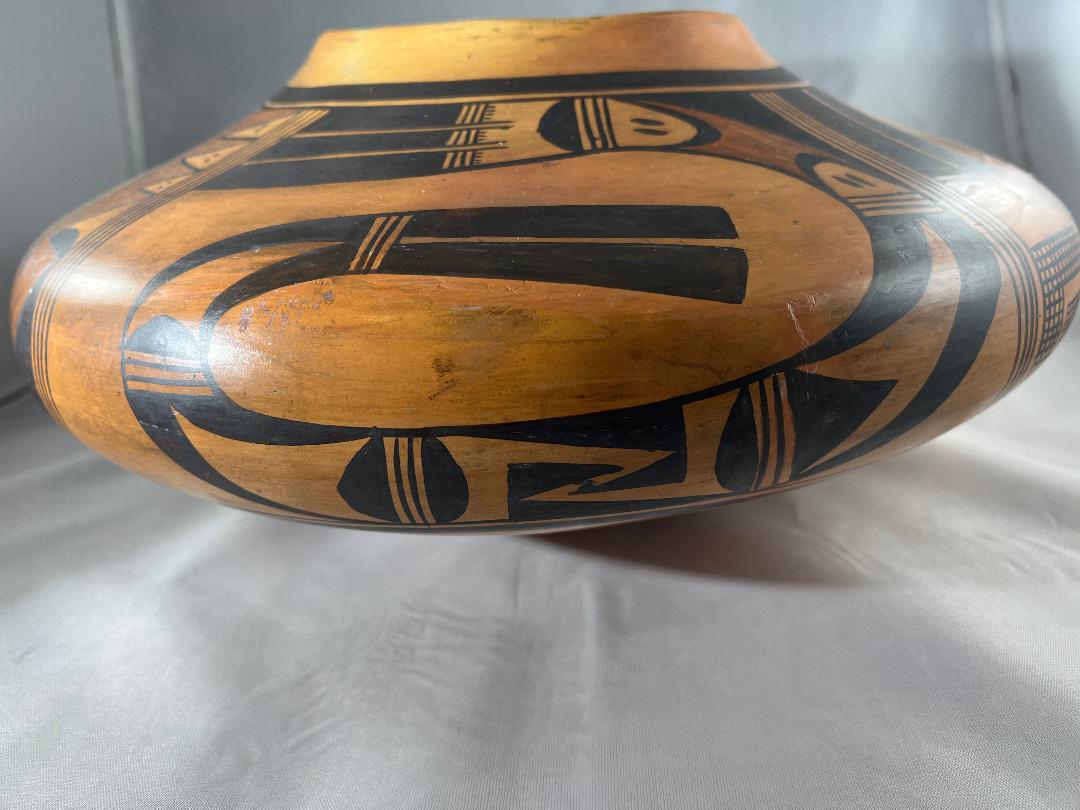
The Um-tok-ina curved serpent:
The second design on pot 2021-16 is a single creature that curves around itself about 1.5 times. Variations of this design were drawn by Nampeyo and first entered this collection on a canteen by her (2020-17) The version on this jar has 7 segments. Starting at the top end, they are:
- Three parallel black tails with squared left ends. The right end of each tail is caped by a three-lane highway and these sprout four short parallel lines (in one case three). The tails are separated by two narrow one-lane highways and the lines that define these highways extend beyond the base of the feathers and more than halfway across a wide empty space. Based against a three-lane highway and facing the intruding highways is another example of a wide black hill.
- Each end of this section sprout a casually-drawn black arc, its apex thicker than its feet. The unpainted area inside each arc is marked by two short, parallel, lines, like large quote marks. The residual space between that arcs is painted red. It and the bird’s head are the only red elements on the jar.
- This section shows foreground/background reversal. Most simply it is solid black with a large white, bent tooth form at its center. The space can also be seen as basically unpainted with two long blade black shapes based on the upper wall and a black equilateral triangle based on the far wall.
- This segment is the central design of the seven on the Um-tok-ina, but differs between the two renditions of the serpent. In one rendition a thick black line begins at the lower left corner of this section, rises, and almost encircles the perimeter. About 0.375 before completing its circuit it turns 90 degrees, rises vertically a short distance, turns another 90 degrees and extends 1.25-inches before ending in midair. The result is an elongated crook. The second rendition duplicates the design in the second section of the bird: two interlocking triangular crooks occupy the center of the space while black hills are based on opposite walls.
- Like section #3 this section shows foreground/background reversal with a curved white tooth element pointing left at its center. Alternatively it can be seen as a large black “gumdrop” based on its right wall. Emerging from its left wall are two long and bent black blade forms.
- This section has the same design as section 5.
- Two solid and square-tipped feathers emerge from the three-lane highway. A thin unpainted space separates them.
In their 2022 book, which features Nampeyo pottery in the Cooke Collection at The Museum of the West, Scottsdale, Ed Wade and Allan Cooke dedicate several pages to Nampeyo’s feathered serpent images, alternatively designated as either Paluliikon or Um-tok-ina (2022:105-109).
Design analysis:
The pot is physically big and so is the visual impact of its design. It’s so large that it was probably special-ordered as a presentation piece. The average tourist of collector would have had difficulty getting something this large home.
Pot 2021-16 is part of the “Sikyatki Revival,” whose best-known artist is Nampeyo of Hano. It is said the Nampeyo taught her pottery techniques to other women at Hopi. Apparently Cora lived in Polacca near the home of Annie, Nampeyo’s oldest daughter. (See below.) There is every likelihood that Cora was familiar with Nampeyo and her pottery. Whatever the personal relationship, Cora learned many of Nampeyo’s painting strategies. In “Appendix B” I defined six design strategies that often characterize Nampeyo’s mature style. When a pot that might be by Nampeyo enters this collection I review how well its design fits these design framework and thus assess how confident I am that a pot is by Nampeyo and not some other accomplished potter from Hopi. This is the first time I have applied these six Nampeyo standards to a pot I know is not by her. The result is a double-edged test. If jar 2021-17 meets all the standards, then these six strategies do not distinguish Nampeyo’s pottery from other accomplished potters at Hopi. If jar 2021-17 does not meet these standards, then it will clarify the distinction between Nampeyo’s work and that of other potters at Hopi. Here are the six Nampeyo standards applied to Cora Andrew’s pot:
1) A tension between linear and curvilinear elements, often represented as a contrast between heavy and delicate elements.
The curved shape of the bird and its beak contrasts with the substantial pair of linear tails at which it stares. The five linear tails of the Um-tok-ina contrast with the severe curvilinear form of its body.
2) A deliberate asymmetry of design.
Nothing about the design is symmetrical.
3) The use of color to integrate design elements.
Each of the four design panels contains red elements, though the red head of the bird is much larger than the other.
4) The use of empty (negative) space to frame the painted image.
The head of the bird is surrounded by space. The curved body of the Um-tok-ina surrounds substantial unpainted surface.
5) The use of a thick above a thin framing line on the interior rim of her bowls.
Such framing lines exist on this jar.
6) Nampeyo’s painting is confident, bold, and somewhat impulsive compared to the more-studied, plotted and careful style of her daughters, descendants and other Hopi and Hopi-Tewa potters.
Based on the first five design strategies, Cora’s jar 2021-17 seems to have a design equivalent to Nampeyo’s work. Trained by the standards of Nampeyo’s work, my eye delights in the tension between linear and curvilinear asymmetric designs, color that integrates a design, sufficient space to see each design individually and lines that frame the painting. No wonder I was attracted to this jar. Note that the first five criteria are objective standards.
If I am able to distinguish Cora’s work from Nampeyo’s, it will have to be with strategy #6. Every time I begin to discuss strategy #6 I feel compelled to remind readers that a) of the six criteria this is the only one that is subjective, and 2) this is the most important criteria. Its subjectivity makes it subject to bias. When applying this standard to a pot that I know is not by Nampeyo, my perception might be biased and I might fool you (and myself) with my reasoning. I join with many others to feel that Nampeyo was a genius, the most important pueblo potter whose name we know. I recognize her work like I recognize the face of an old friend in a crowd. Only later do I figure out what details led to the recognition. The process is subject to error. 1) Assuming a pot was actually by Nampeyo, but poorly conceived, I might not recognize it as by Nampeyo. I would be in error, like not recognizing a friend in disguise. 2) If I thought I recognized Nampeyo as the marker of every well-made pot I saw, I would also be in error, like greeting every stranger as if they were an old friend. In short, this sixth design strategy is open to a variety of errors and I need to be as explicit about my reasoning as possible.
Here’s what I think:
Cora’s painting has a number of strong qualities. The shape and size of the jar provide an expansive canvass on which to paint and Cora has created a panel of design that bursts with energy and motion. The bird with its large eye, curved beak and dramatic pointed head fringe looks fierce. This coiled Um-tok-ina creature design is wound tightly in its confined space. The top tail of this creature is wide, then narrows as it begins its sweep around the curve, giving a sense of motion and energy. Most of the design elements are curvilinear. As a result, the design boldly swirls across the upper surface of the jar and yet is constrained within its framing lines. Several design sections display foreground background reversal. These strategies add tension and interest to the design.
Segment #4 of the Um-tok-ina is the central design of the creature but differs between its two renditions. Note that for both renditions its flanking sections (#3 and #5) contain the same unpainted arrow and both point away from section #4, thus framing this central design.
Like Nampeyo, Cora was skilled at drawing her framing lines. The upper thin framing line is 15.75-inches long and seems to have been drawn without lifting her brush. She did lift her brush several times drawing the lower thin framing line, but this line is about 24-inches long and requires unusual dexterity as well as a good deal of paint. As noted above, the design panel begins at the top edge of the lower surface, climbs vertically for 2.5-inches, then slope away from the viewer 4.5-inches on the upper slope of the pot. Since the bottom of the design is vertical while the top slopes away from the viewer, the design has an unusual three-dimensional quality to it.
Other aspects of Cora’s painting are less strong and distinguish her work from Nampeyo’s. The overall composition and layout of Cora’s designs generally are compelling, but specific sections of the design are less satisfying. For example, the small section with the cross-hatched crook and vertical tails in the bird panel does not seem to flow organically from the bird and seems introduced as a place filler in front of the beak. The internal structure of the designs is fairly repetitious. The low black hills appear about a half dozen times. Three of the seven segments of Um-tok-ina (#3, 5 and #6) have close to the same design. These elements seem simply lined up inside the overall designs without the kind of interplay and purpose we expect of Nampeyo’s work, although at least one Nampeyo jar in this collection has an even more repetitious designs (2002-11). The painting not always precise. For example, in one of the renditions of the UU creature, the paint of the red element in section #2 strays outside its black border; highway lines sometimes waver. The three sets of tails in the two designs are simple heavy black rectangles without much interest. Nampeyo occasionally used linear black tails (cf 2006-11, 2020-16 and 2020-17) but they are rare on the 65+ Nampeyo pots in this collection. Generally Nampeyo’s avian tails displayed more complexity and visual interest. (See “Tails” in Appendix F.) In short, the conceptualization of the design is imaginative, but the details of its implementation lack overall coherence and the painting is somewhat heavy. The limitations sketched here distinguish Cora’s painting from Nampeyo’s.
Still, saying of a Spanish painter that “He’s good, but not as good as Picasso” hardly seems like a fair critique. This is a large seedjar with a strong set of designs. As discussed below, we know very little about Cora Andrews, even though she was an exceptional potter. Jar 2021-16 is a reminder that generations of artists unknown in the marketplace have produced fine work. It is also proof that richness of cultural legacy is more associated with exceptional art than is popularity in the marketplace.
The maker:
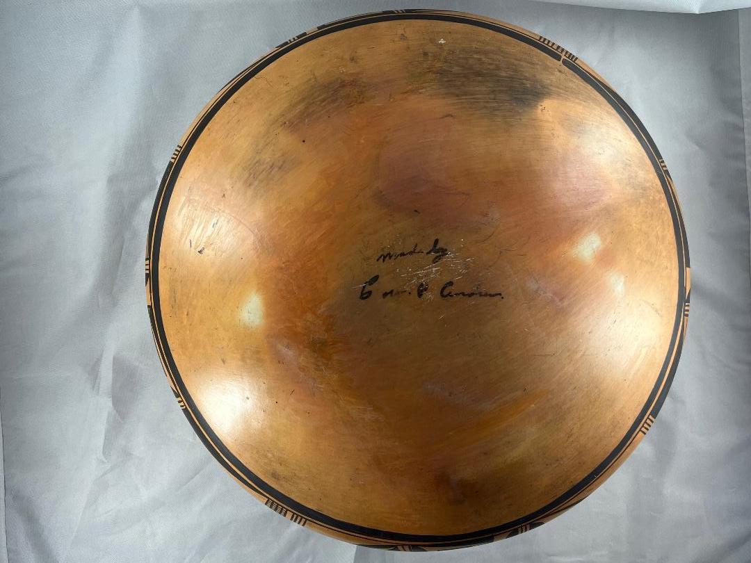
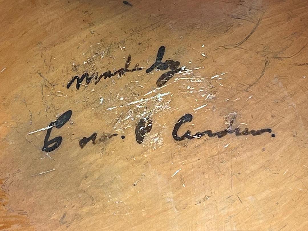
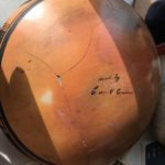
We know almost nothing about the artist, her name proudly announced on the bottom of the pot: “Made by Cora P. Andrews.” The pot, however, speaks loudly of her ability.
I asked Rachael Sahmie if she could find any information about Cora Andrews. Rachael tells me (11-16-21) that Cora was of the same generation as Rachael Nampeyo, Rachael Sahmie’s grandmother. She lived in Polacca near Annie’s home, in a small old, government-built home. Cora’s sister was also a potter named Geneive. Cora had a daughter named Inez and her daughter, Colleen Tewawinas, is a friend of Nyla. Rachael will ask her for more information. Bruce McGee, now head of the museum shop at the Heard Museum (Phoenix) grew up on the reservation since his father owned the trading post at Keams Canyon. He grew up among Hopi artists and indeed Fannie Nampeyo used to babysit him. He knew the generation that included Rachael Nampeyo, but when I email him about Cora Andrews, he responded “To your question about Cora Andrews, I do not recall ever buying pottery from her…Sorry I could not be of help. I will continue to ask around as the artists come and go (3-11-22).”
Pot 2021-16 was badly cracked when I bought it. I asked Andy Goldschmidt of Ceramicare in Corrales, NM to repair the pot and had it shipped directly from the auction house to him. There months later (2-9-22) it showed up in Houston looking as if it had never been damaged. Unbeknownst to me there was a card with provenance in the pot, which arrived with the pot from Andy. It reads:
“Cora P. Andrews—potter. Excels at making large pots….Seems to have worked from the 30s to the 1950’s. This vessel seems to have been collected 2nd qtr of 20th C. A/C (According to?) records of the Rev. John F. Howard.”
I can’t find any information about the Rev. John F. Howard and do not know who wrote the note, but it does give us some unverified information about Cora Andrews.
