
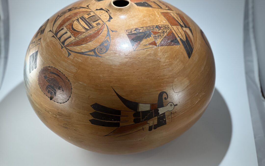
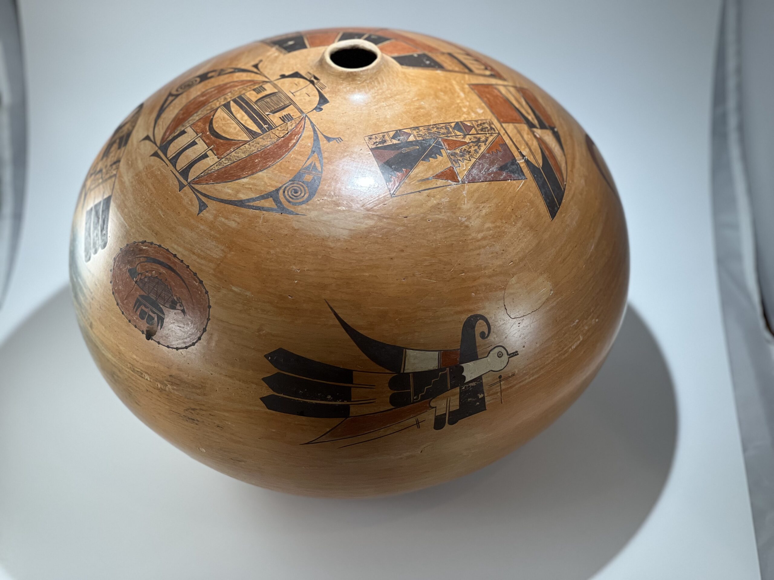
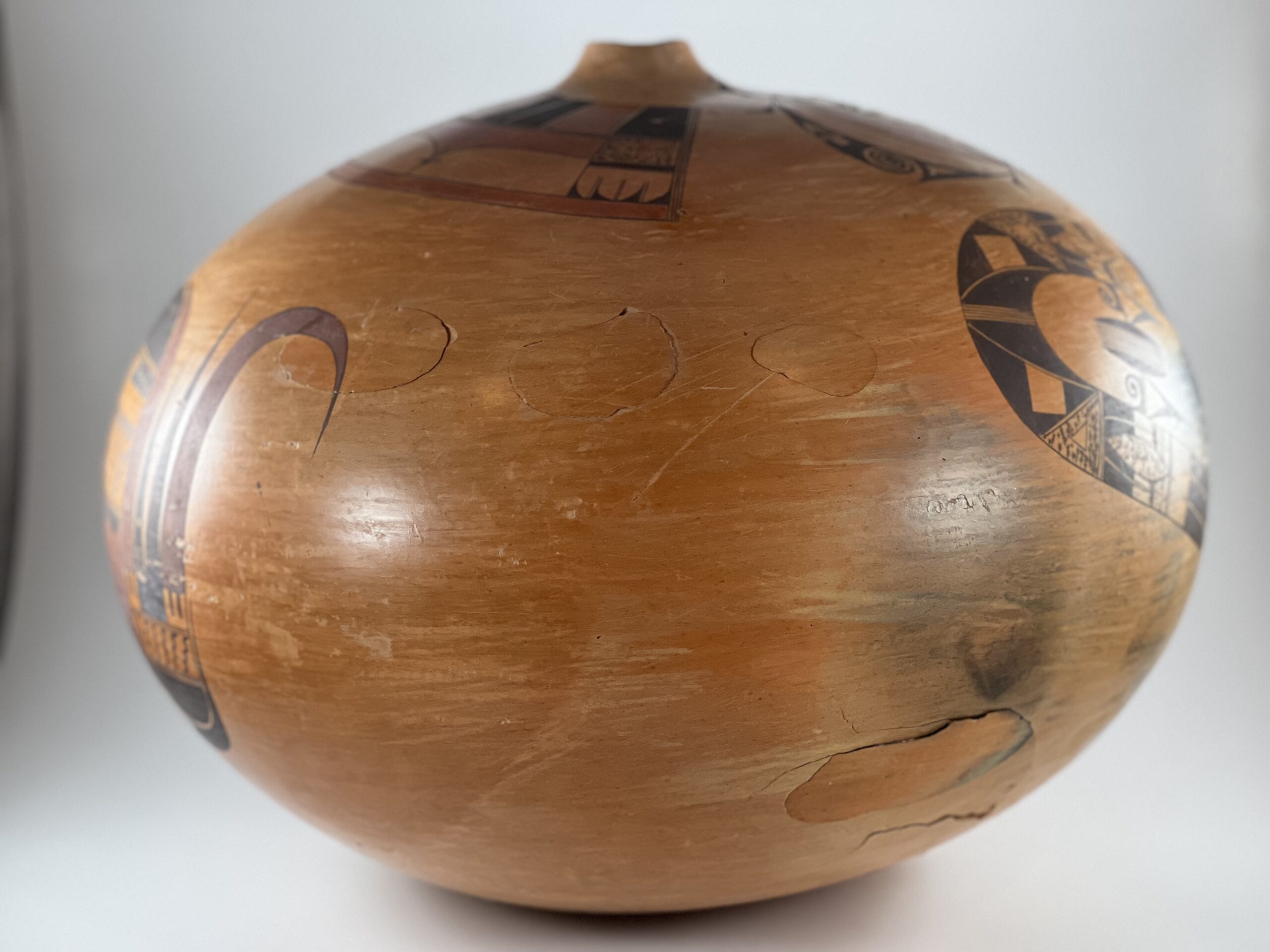
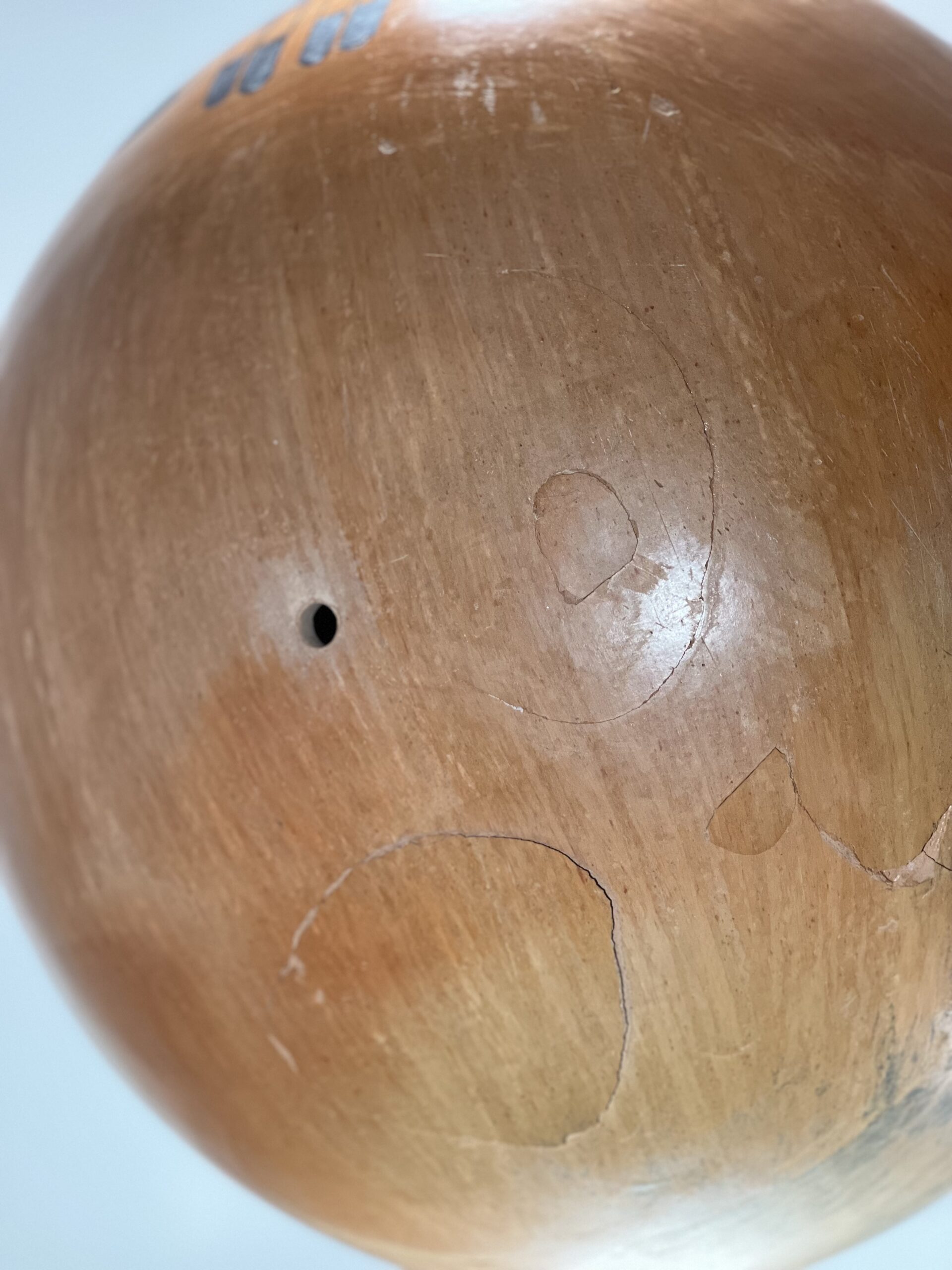
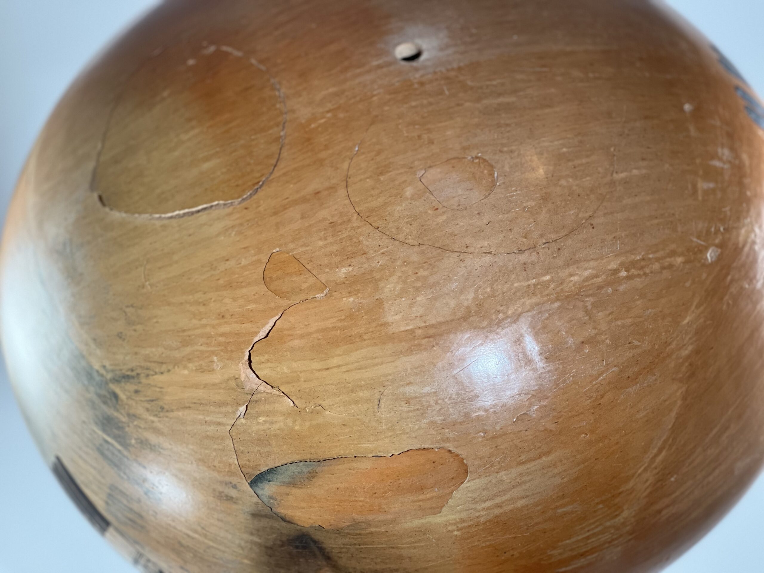
This is an extraordinarily imperfect pot, with 12 pop outs, a hole in its base, uneven polishing and a couple of dark smudges from its outdoor firing. Nevertheless, this is a unique and historically-important vessel. It is also large, sensuously-shaped, and magnificently-painted.
The vessel was created by two master ceramicists. Rachael Sahmie (1956–2022) was a fifth generation descendent of Nampeyo and was fully immersed in the traditions of Tewa-Hopi pottery. Rick Dillingham (1952-1994) was both an authority on Pueblo pottery and an internationally-recognized ceramicist. This pot was formed by Rick using Hopi clay supplied by Rachael and painted and fired by Rachael about 1986 or 1987. Rick is particularly well-known for creating bisque-fired pots that he deliberately broke, decorated the shards, re-fired them, and then reassembled them into an intact vessel, thus making manifest his idea that there is beauty in imperfection.
Pot 2023-08 is an inadvertent demonstration of that philosophy.
Rachael had been making pottery for about 15 years when she painted this pot. Its 8 designs are a dazzling catalog of Tewa-Hopi iconography and are drawn with exquisite detail, thus establishing Rachael’s virtuosity. Jar 2023-08 is a product of the cross-cultural friendship and skill of two great potters.
Form:
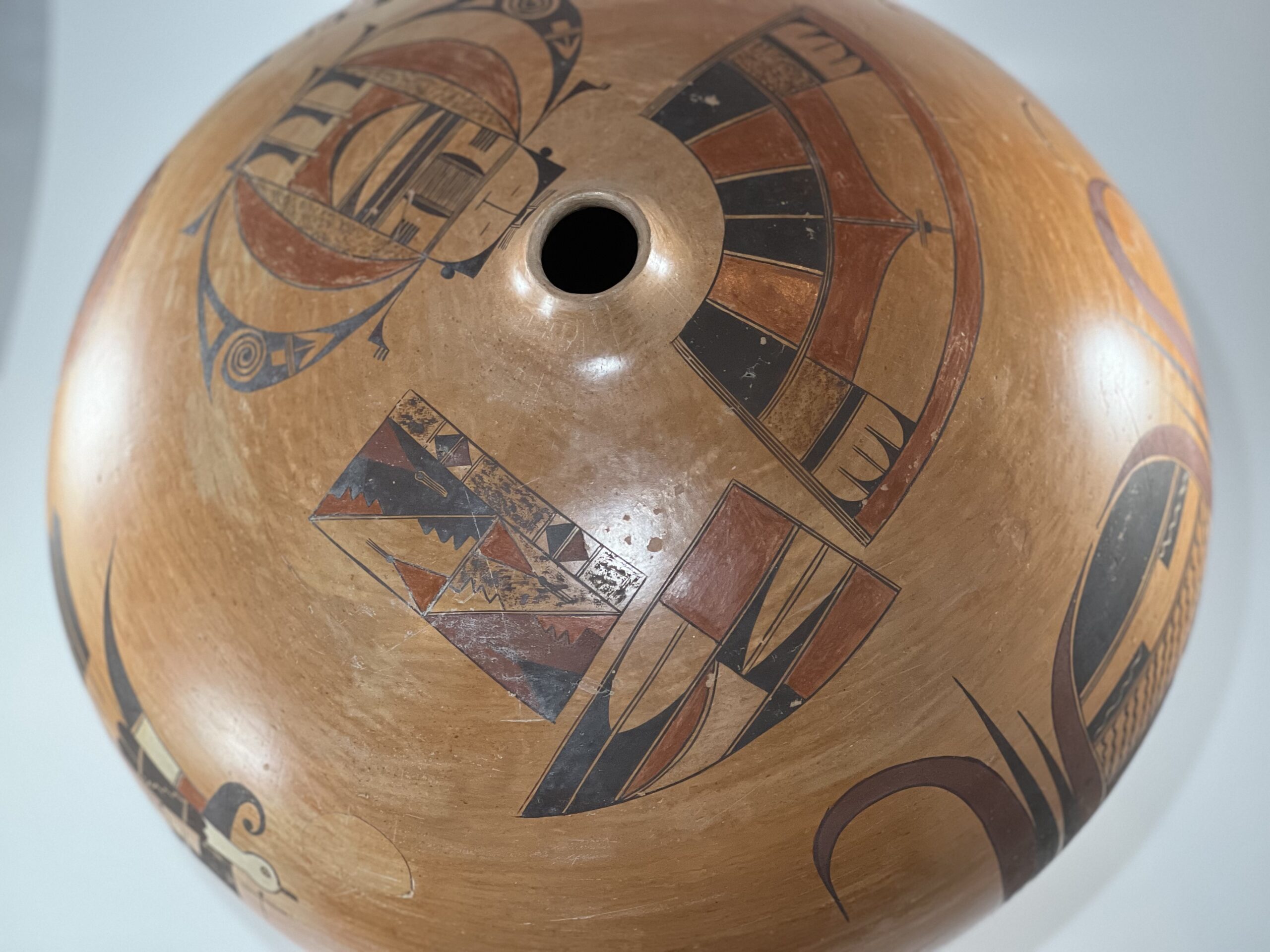
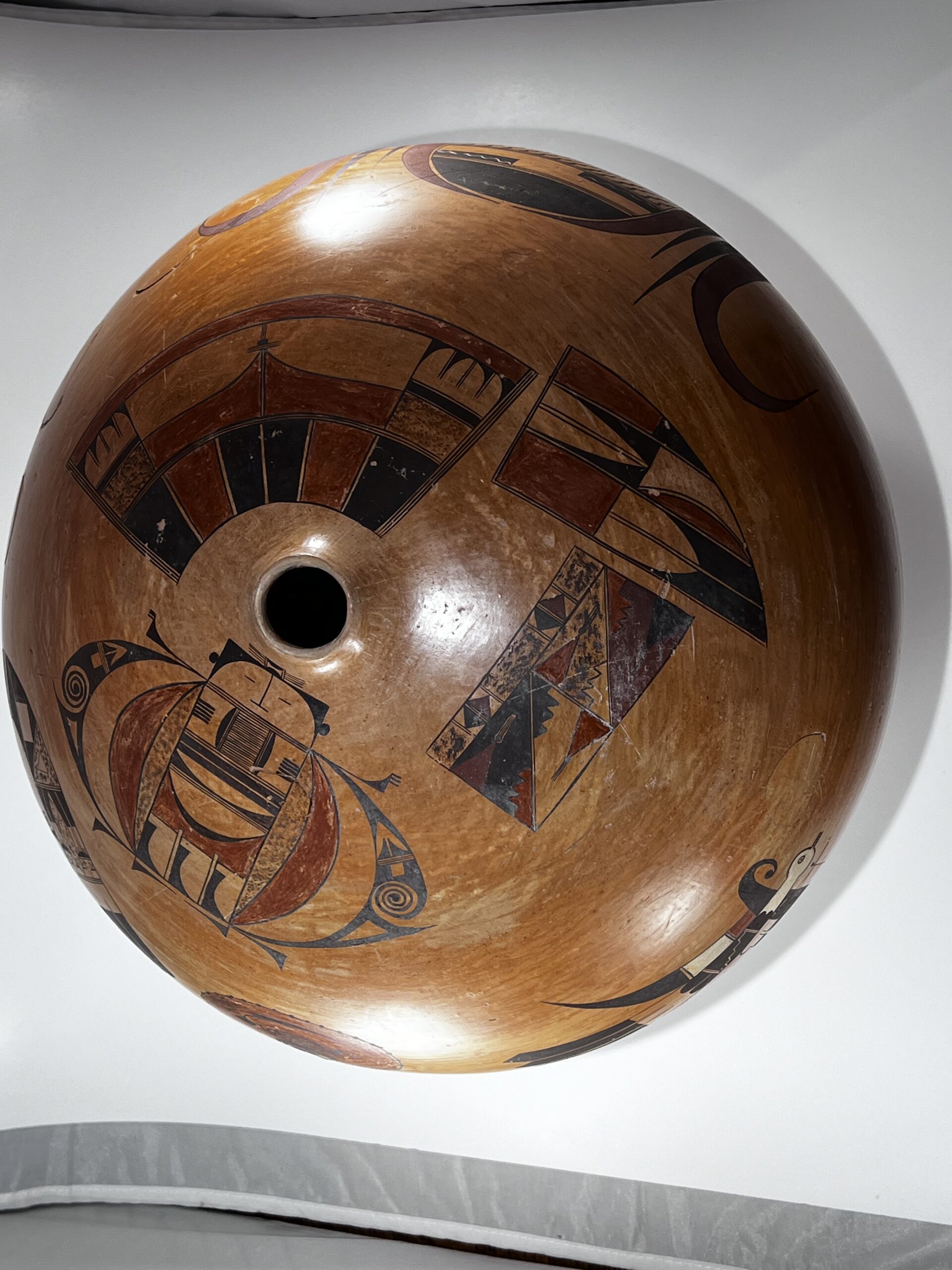
The jar is a large bulbous sphere, its height 82% of its width. It displays a small 0.5-inch lip surrounding a 1.25-inch opening. Following pueblo tradition, Rick coil-built all his pottery. The surface of this pot is imperfectly stone-polished, with streaks that are smooth but not polished. I do not know which artist polished the pot, but guess that it was Rick, since Rachael was experienced in pot polishing. One section of the surface (near “Design 5” below, shaped like a horseshoe) is scorched from the outdoor firing. Otherwise the color is a fairly dark golden color, perhaps due to the type of slip used.
About 12 pop-outs mar the surface of the vessel. The number of pop outs is uncertain, since some of the smaller pop outs are embedded in larger pop outs and one is only half-detached from the surface. The convention for counting such a pattern is unclear. Most of the pop outs are near the base of the vessel, but a string of three smaller and one isolated pop out above the waist of the vessel contradicts this pattern. There is a drilled hole in the bottom of the jar directly opposite the upper opening. None of this damage compromises any of the painting on the vessel.
Design:
Eight designs are scattered across the surface of the pot, four closely-spaced around the jar’s lip, three in a fairly tight sequence near the waist of the jar, and the final and largest design covering one side of the pot in isolation. Starting from the surface near the mouth of the jar, these eight designs are:
Design #1:
The form is a 2” by 3.75” rectangle that is subdivided into a myriad of spaces. Along the top edge is a 0.5-inch wide strip divided by parallel lines (“one-lane highways”) into 7 sections. The first, middle and last sections contain brown stippling. Interspersed between are two pairs of smaller sections. Against their common wall are set equilateral triangles The right triangle red and its companion black. The residual spaces form unpainted right triangles.
A vertical one-lane highway divides the space below into two square areas. Within each square a one-lane highway runs from the upper right corner to the lower left corner, subdividing each square into a pair of right triangles. The elements of design contained within these four triangles are identical, but the coloration of these elements within each triangle is different. The top triangle of the right square contains a red isosceles triangle with its base on the left wall. Its tip is a black ball with three lines emerging from it, a pahos prayer feather (Smith, 1952:189-196). Below it, wedged into the lower point of the triangle, is an unpainted form with three points, like a section of a toothed saw. The remaining space is stippled with brown paint. The bottom triangle of the right square contains these same elements in a reverse orientation. The saw toothed element occupies the upper right corner and is painted red. The triangle is affixed to the right wall of the triangle and both it and its pahos are black. The upper triangle of the left square displays a red isosceles triangle with a black pahos at its tip and a red saw tooth below, all set against a black background. The lower triangle of the left square has a black saw tooth element in its upper point with a red triangle surmounted by a black pahos below, all set against an unpainted background.
Design #2:
Immediately to the right of design #1 is a large blade-shaped form internally divided into two rows of three sections each. In the top row, the left and right sections are painted red. The middle section contains another image of a blade (unpainted) with two parallel lines (a “one-lane highway”) running from base to tip. The residual space around the tip is painted black.
The three bottom sections of design #2 have different widths. The left-most section is the widest and repeats the design we saw in the middle section of the top row: an unpainted blade with two parallel lines (a “one-lane highway”) running from base to tip and set on a black background. In this rendition, however, the two-lane highway extends beyond the tip of the blade about 0.81-inches into the black background. The middle space has an asymmetric design consisting of a wide, low red hill. Its base is affixed to the left wall of the space and edged with a one-lane highway; the remainder of the space is left unpainted. The right-most section in design #2 is much smaller than any of the other five sections in the design and is painted a solid black.
Design #3:
Adjacent to the base of design #2 is wide design with a slightly concave upper edge and a convex lower edge. The lower edge is 4.75-inches longer than the top edge and thus the sides of the design (consisting of three-lane highways) flair outward. Internally this design contains three rows of elements. The top consists of six panels of solid color in the pattern (black, red, black, black, red, black). The panels are separated by one-lane highways. The second row of row of design is more intricate, consisting of two wide panels at the center, flanked by two smaller panels at the extremes. The two, smaller, outer panels each occupy about 15% of the design’s width and are topped with one-lane highways flanking a broad black stripe. The wide space below contains unpainted forms in the shape of four blades in pairs set against a black background. The straight edge of two blades are parallel at the center, their blades facing in opposite directions. Flanking single blades also have their curved edge facing away from the center of the panel. The two center panels each occupy about 35% of the design’s width and are separated by a one-lane highway. The design is simple but dramatic. A 0.625-inch wide red stripe occupies the top of the space, its lower edge curving downward toward the two-lane highway, thus forming a 1-inch point when the mirrored designs are seen as one. Balanced on the tip, three short parallel lines cut across the one-lane highway. Suspended below is a tiny black oval. Consolidating these panels of design, a red stripe about one-third of an inch wide runs the width of the design.
Design #4:
To the right of design #3, and completing the band of designs around the neck of jar 2023-08, is an anthropomorphic figure referred to as a “beetle lady” in the literature. She is regularly drawn by potters at Hopi, particularly those in the Nampeyo family, and her design varies very little across renditions. She is 4.5-inches tall and 7.0-inches wide. She is a complicated lady formed around a central 1.75-inch by 4.00-inch rectangle set on its narrow edge and divided into 4 smaller rectangular design sections separated by two-lane highways. The figure is surmounted by a topknot 1-inch wide and a fraction of an inch deep drawn on the base of the jar’s short lip. At its center is a tiny black rectangle with bow-shaped unpainted center that looks surprisingly like a dog bone. The left and right edges of this square are caped by one-lane highways; perpendicular to these edges are fringes of four parallel lines. Below Section 1 displays the creature’s face: an arc of black fills the top of the space and hanging from its apex is a upside-down “T” forming the nose. Flanking the nose are two short lines representing eyes. Small black dots represent ears.At the center of Section 2 is a 0.75-inch square containing 20 parallel lines, their ends caped by two-lane highways and elongated black half-moon shapes. From the walls of the section fringes of 5 parallel lines point toward the central square. Section 3 is shallow and contains two wide black stripes separated by a one-lane highway. Below is an unpainted half-moon shape, with a flat top and curved bottom. This element is set against a black background. Section 4 occupies the lower half of the Beetle Lady’s body and contains a fairly complex design. In the middle of this space is a broad band of red with a concave upper edge topped by a thin half-moon-shaped black element. This black element, in turn, cradles a larger unpainted rendition of the same half-moon form. Below the broad band of red, the lowest part of Section 4 is divided into three vertical and rectangular boxes of identical design. These can be seen as incorporating versions of the unpainted knife blades we saw in Designs #1 and #2, though the renditions here have short protrusions, as if handles. The remainder of all three boxes is painted black. Because of foreground/background reversal, these designs can also be seen as curved black elements in otherwise unpainted boxes.
Bracketing the entire 4.5-inch height of the Beetle Lady’s core are a) thin speckled half moons, and b) exterior to them wide red half moons, like double sets of parentheses.
Next, two black arcs of design are set at some distance on either side of the body of the Beetle Lady. The edge facing the Lady’s body is a smooth arc; its tips coincide with the tips of thick red and thin stippled arcs already discussed. The space between this outer black arc and the red arc forms yet another (unpainted) arc so that in total the Lady’s body core is incased in four layers of arcs: a thick shell. The left and right black arcs are identical; all internal design elements are unpainted forms. The top element is an arrow with a shank, followed by a three-lane highway with a small square below. Lower in the arc, and interrupting the visual flow of the design, is a curlicue displaying more than two full circuits followed by an arrow-like triangle pointing toward the lower point of the arc. Finally off the shoulder and also below the core of the body are thin elements with a triangular base extending into a long point, sorta like stylized pennants.
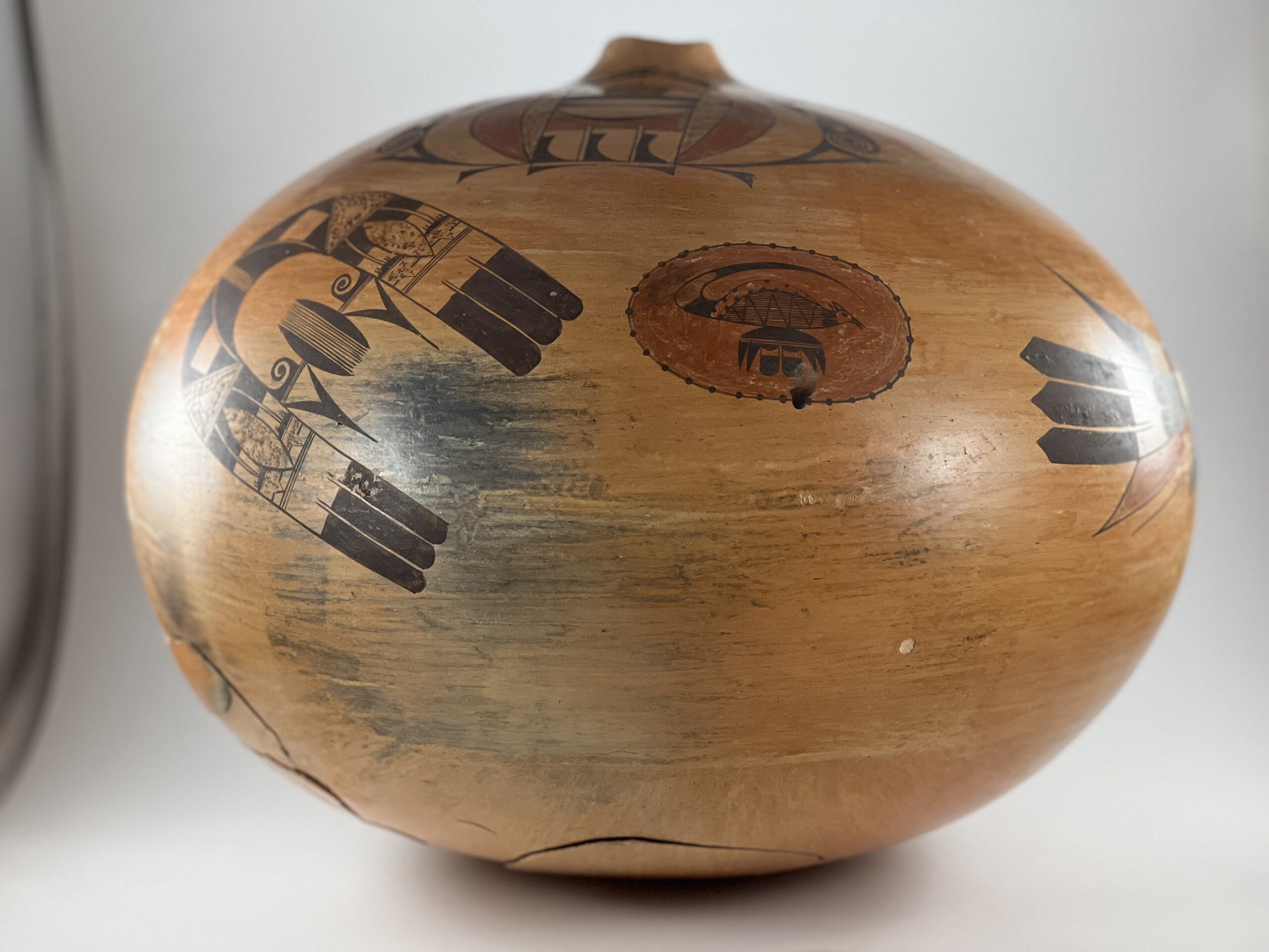
Design #5:
Directly below the left edge of the Beetle Lady is a large horseshoe-like design. At its apex is a 5-lane highway flanked by curved black forms that resemble whale’s teeth with their bases against the central highway. Nestled against their curved edges are a second pair of “whale’s teeth” with the opposite orientation, each enclosing and unpainted square. Seen together these four elements form a dark, blunt and upward-thrusting force. The design of this magnet shape is symmetrical, so I need only necessary describe one leg of the U form. Moving toward the tips of the horseshoe, the next design element is a stippled wedge with an unpainted equilateral triangle at its center.
The next section of design is particularly complex. It is 1.5 inches long and this space is divided into three 0.5-inch sections, “near,” “middle,” and “far.” The “near” section is a solid black strip, though as we will see later it is crosscut by designs originating elsewhere. The “middle” 0.5-inch section is unpainted except for two black “gumdrop hills with whiskers” (Appendix F) affixed to its far wall. The “far” 0.5-inch section is itself subdivided by four black dashes resulting in three gaps between them. One side of this section is stippled and the stippling protrudes through the top and bottom gap in the dashes to form stippled triangles, thus creating versions of the “clown face design” (or “Killroy”) frequently used by Nampeyo. As if this design was not already complex enough, a large stippled lens is set at the center of this section and runs its full 1.5-inch width, cutting across the three sections of design already described. Increasing the complexity of design, two curved whiskers arc from between the whiskers of the gumdrop hills in the middle section through the black section above.
Following a two-lane highway is an unpainted comb with three protrusions, each protrusion caped by the long black tip of a feather.
Design #6:
Directly to the right of the horseshoe design is the smallest design on pot 2023-08: a red oval with a creature at its center. The oval is bordered by a thin black line strung with 32 black dots. The creature sits on an elaborate pedestal that is bifurcated by a horizontal two-lane highway. Centered below are two feathers with “gumdrop” black hills at their base, stubby unpainted shafts, and black tips. Flanking these feathers are two pairs of curved triangles, like prehistoric teeth. Above the two-lane highway is a wide, thin, and black half-moon. The creature is balanced on the apex of its curved edge.
This fox-like creature appears on pottery by Nampeyo and her descendants, though it is identified in a variety of ways (2010-20, 2003-11). Charles King had a pot for sale in 2021 that carried an image of this animal. He quoted Dextra Quotskuyva Nampeyo as saying it was a lizard. For this entry I will follow my eye and refer to it as a fox. Overall the fox is 2.25-inches long and 0.875-inches high, including the tail. The shape of the tail is defined by two dramatically-curved 3.5-inch long arcs that meet and continue as a single, extremely thin line to the tip poised just ahead of the fox’s beak below.. The tail has a thick black base, followed by an unpainted section, followed by another black section to its tip. The body of the fox has a much more complex design, although it is tiny: just 1.875-inches long and 0.625-inches high. The round face displays a dot for an eye and a minuscule open beak. Two tiny ears sprout from the top of the head. Two thick black stripes form the neck followed by the central portion of the body, which contains two patterns of design. The lower and larger section features 16 perfectly parallel lines that run from the neck towards the base of the tail. A zig-zag with 5 peaks is superimposed over the parallel lines. The upper body design is an unpainted sickle shape with 7 black dots on its upper edge and 7 black dots on its lower edge.
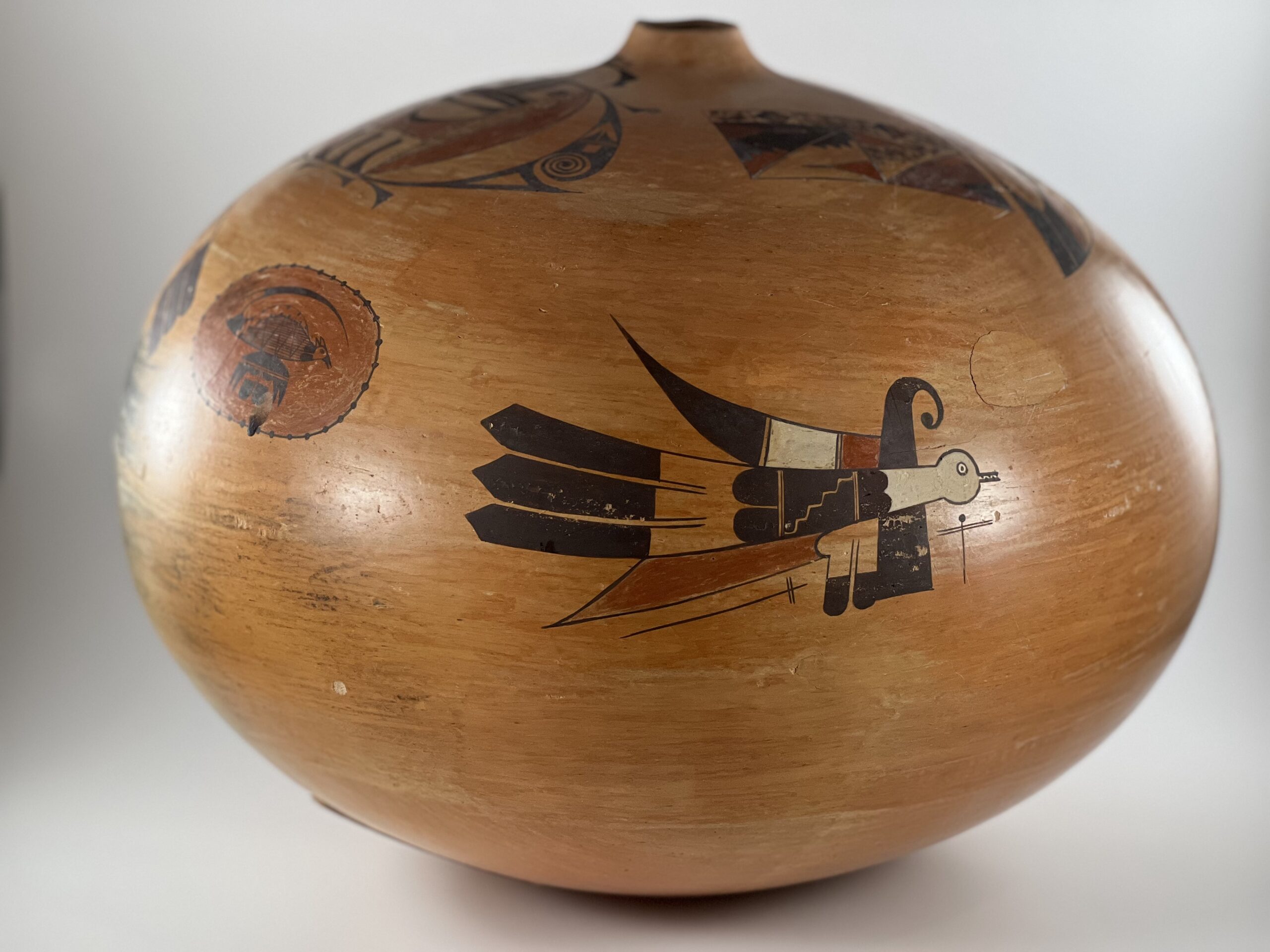
Design #7:
To the right of Design 6 is a free-flying bird [Um-tok-ina, the Thunderer] taken directly from a Sikyatki pot. The design was copied from the ancient pot as early as the last decade of the 19th century onto Polacca ware (Wade, 1980b:26) and is still used today on Sikyatki Revival pots (2010-24).
On 2023-08 the head and neck of the Thunderer are white. The head features a circular eye with a center iris; the beak is a set of small parallel lines carrying 5 tiny teeth set alternately in the top and bottom jaws. Directly behind the neck is a large black design featuring two conjoint hills facing forward into the base of the neck and two large individual hills facing rearward. The center of this square design is bounded by two-lane highways and displays a 5-step staircase running from the upper-right to the lower left corner, generally understood to represent thunder. To the rear of this central design are three feathers, their base an unpainted comb with three protrusions caped by large black, pointed, tips.
Both above and below this central body are patterns of feathered elements. A thick black pillar rises up from the white neck, thinning until it curves forward into a curlicue with a ball at the end. From the juncture of this pillar with the bird’s body, a large, thick sickle sweeps rearward and up. This form is segmented into three section separated by one-lane highways. A short red area is followed by a larger white area which is caped by an even longer curved black section. The curved black pillar that rise above the neck also extends below the neck where it expands until terminating with a flat base. To its left (toward the rear of the bird) is a unpainted area To to the rear is an unpainted comb that evolves into two vertical feathers with black tips. A bulge on the left side of the unpainted form serves as the base of a large red element taking the form of a rearward-pointing knife blade. All renditions of Um-tok-ina, both ancient and modern, are accompanied by cross-like images with double cross bars. These represent dragonflies that are found near water, essential to the lives of Southwest peoples. The bird representation here is accompanied by two such dragonfly elements.
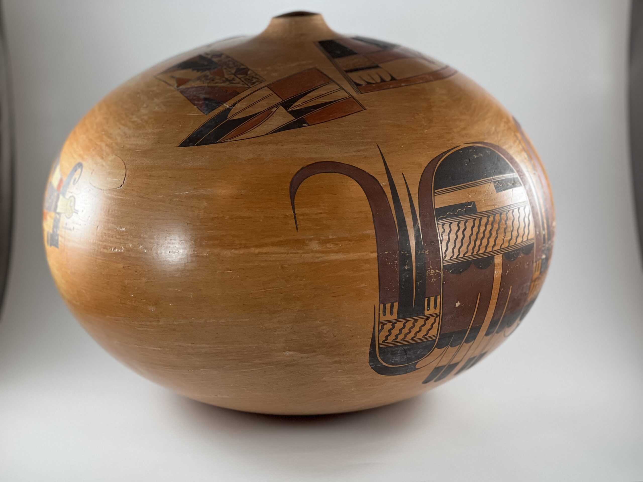
Design #8:
The final design is the largest on pot 2023-08 and occupies the entire side of the pot below Designs 2 and 3. Generally this design carries the moniker “Spider Design” (Kramer, (1996:186), but since it is abstracted, it does not have a fixed meaning. Its central element is a large domed form occupying the upper central portion of the design. I see the large black dome as the forehead of a spirit being, The largely-unpainted rectangle below contains two smaller black rectangles containing inscribed wiggly lines that I see as eyes and below them is a wider unpainted rectangle with 14 painted wiggly lines forming, perhaps, a beard. These three sections are separated by three-lane highways, Below are two wide maroon combs. The top border of each comb features two wide black hills (“gumdrops”); the bottom border forms three protrusions. The end of each protrusions supports a feather with a black base, an unpainted middle section, and a black section forming its tip. Of the six protrusions from the two combs, the central 4 are linear feathers. The outer two also have black bases, unpainted center sections and black tips, but take a different form. They are sickle-shaped: their central unpainted sections and black tips curve outwards until they point upwards, their black curved tips long, thin and pointed.
On both sides of Design 8 these curved outer feathers cradle patterns of elements that —upside-down— reflect the larger central design. These side renditions are identical; the following description will be structured as a description of one side, but is accurate for both. The curve of the outer feather of the central design cradles an inverted black dome, its upper edge bordered by three-lane highways. Above is a largely unpainted rectangle filled with 6 wiggly lines. (The layer with the rectangular eyes from the central design is missing in these side renditions.) Following are four feathers pointed upwards, but these have a different format than those protruding downward from the central design. The outer 2 feathers have square, unpainted bases, each containing two thick parallel lines hanging from their top edge. Growing from these bases are maroon sickle-shaped feathers of slightly different shapes. The large outer feather majestically rise and then curve outwards forming a hook with a long point surrounded by the unpainted surface of the pot. The feather along the core of the design also rise but curve inwards following the edge of the central black dome to its apex. Note that the tip of the right feather over the dome is just slightly higher than the tip of the left feather. Between the two curved maroon feathers, are two linear feathers. These are simply tall, black, isosceles triangles that rise straight off the two-lane highway below, but have different heights. On each side of Design 8 the maroon/black pair of feathers on the outer side of the design are larger than the black/maroon pair more centrally located in the design.
Design Analysis:
I had seen this pot in a glass cabinet in Rachael Sahmie’s home for the 35+ years that I knew her. A some point early in our friendship Rachael had mentioned its unique history. I purchased pot 2023-08 from her daughter, Carla Talashie, after Rachael’s death.
I spoke with Carla by phone about the pot on 4-25-23:
“Rick wanted to try Hopi clay so my Mom gave him some. He made the pot in Santa Fe and gave it to my Mom to paint and fire at Hopi. I think Rick just wanted to see how Hopi clay worked. There is a hole near the top and one on the bottom. Other pops also. My Mom glued these pops back onto the pot. I remember Mom talking to my grandmother (Priscilla) and laughing that Rick didn’t know how to get the air bubbles out of Hopi clay….I remember being in Rick’s studio with Mom and just running around, so that was just before I started kindergarten. So the pot was probably made late 1986 or early 1987.”
Three aspects of pot 2023-08 stand out: 1) the extensive damage caused by pop-outs, 2) its large sensuous form and 3) the extraordinary detail of the painting.
Pop outs happen when a potter fails to eliminate air bubbles in their clay. When the pot is fired, the trapped air rapidly expands and blows out a flake of clay from the surface of the pot. Throughout his acclaimed career Rick Dillingham formed his pots using the same coil method used by Native pueblo potters. He did not form his pots on a wheel. He was familiar with the clay he used for his kiln-fired pots and I suppose developed a feel for that clay that eliminated air pockets. As noted in the quote by Carla Talashie, Rick wanted to experiment making a pot from Hopi clay and pot 2023-08 was the result. Apparently the texture of this clay was different than his usual clay and Rick was unaware of the trapped air in his coils. The damage seems to have been limited to clay coils near the bottom of the pot, when Rick was just starting to get a feel for the Hopi clay, and one coil higher up on the pot, when he was about half-finished forming it. It’s fortuitous that all 12 of the pop-outs occurred on the unpainted surface of the pot. All the pop-out flakes were carefully recovered by Rachael from the ashes of the fire and glued back onto the surface. This pot was important to her.
Although pots by Rick are included in museums and collections around the world, the multiple pop-outs on this pot reveal his unfamiliarity with Hopi clay and an ineptitude in eliminating air bubbles from clay not familiar to his hands. [See the “Dedication” of this collection for details of Rick’s career and an example of his deconstructed pots.] A pot this damaged by its firing would normally be recycled as shards to protect other pots in their firing. It’s another measure of its significance to Rachael that she kept it in a display case in her home for 36 years.
Even with the surface damage, the size, bulbous form, and small neck of this jar create a sensuous impression that attracts the eye. The surface polishing is uneven, but this pattern is subtle and does not intrude on the pot’s visual impact. The one burned spot from the outdoor firing has a greater impact. The rich golden blushing from the firing or slip is even and provides an attractive background for the decoration. Commercial pots often have a hole drilled in their bottom to convert them to lamps. That seems an unlikely explanation for the hole in the bottom of this pot, but it is the only suggestion I have.
A friend commented that the designs on jar 2023-08 reminded him of a sampler used by 18th-century young women to demonstrate their domestic proficiency. Having now reviewed these designs in great detail, I think that is an appropriate way to view Rachael’s work.
Much of the pottery made at Hopi are designed with a symmetrical pattern (cf 1983-02 and 2005-16) or a design that can be seen at a single glance (2003-11). With such symmetry or exposure, a viewer can quickly appreciate the painting of a pot. That is not the case on jar 2023-08, where the placement of the 8 different designs seems almost random. Moreover, the pot is so large and bulbous that some of the design is always hidden from view. As a result the pot has compelling interest as a viewer’s eyes try to see each unrelated design and what is next, what is around the bend.
It’s not the placement of the design that makes the painting of this pot attractive, but rather its extraordinary detail.
For example:
- In Design #1 the four squares contain the same intricate pattern of elements, which is interesting but not compelling. By using different patterns of color for each square, Rachael makes the design much more exciting.
- Also in Design #1 notice the tiny unpainted area that surrounds the black pahos in the upper left square so that the pahos stands out from its surrounding black background. It’s a small detail, but preserves the pattern of elements. Without this unpainted space the black pathos would be indistinguishable from its black background.
- In Design 3, notice the tiny perfect oval off the point of the central red design.
- In Design 4, the “Beetle Lady,” look again at exactness of the painting of a) her topknot and b) the fine-line drawing in section 2 of her torso.
- In Design 5, note the extraordinarily detailed and complex painting in the “lens” sections on both legs of the magnet shape.
- In Design 6 notice how the long tail of the fox is gracefully-drawn.
- In Design 6 also see how exactly the tiny body of the fox is drawn, especially the head.
- In Design 7 notice the 5 tiny teeth and their exact placement in the mouth of Um-tok-ina, the Thunderer.
Moreover, in addition to painting with great care and detail, Rachael used a number of strategies to unify and enliven her designs:
- Pairs of blades are central in both Design 2 and 3, thus visually linking these two designs.
- The foreground/background reversal in the lowest section of Design #4, the “Beetle Lady,” adds energy and interest to the design.
- The lightly-drawn pennant-like elements on either side of the Beetle Lady’s neck and below her body core lighten an otherwise heavy design.
- Thee top element on the body of the fox in Design 6 is sickle-shaped, as is the long tail above, unifying the design.
- The top element on the body of the fox in Design 6 displays 14 black dots, thus visually linking it to the 32 black dots on the oval that borders the overall design.
- In Design 8, the Spider, curved sickle-shaped feathers emerge from both sides of the central core and cradle a pattern of design that includes two additional sickle-shaped feathers. These different sets of feathers are not the same color, but the similarity of their shapes helps unify an otherwise frenetic pattern.
The precision of Rachael’s painting and the integrating patterns of her design elements might have only subliminal impact on a viewer, but they are clear indications of the time and care Rachael invested in painting this jar, and thus a measure of its importance to her. As noted above in the discussion of Design 8, the tips of the curved maroon feathers above the central black dome are not exactly at the same height. This is the only “error” I see in the complex painting of the 8 designs on the pot. The painting on pot 2023-08 is an extraordinary achievement.
Both Rachael and Rick were in their early 30’s when they made pot 2023-08.
Rick pioneered the idea of breaking bisque-fired pots, glazing the shards, re-firing them and then reassembling the vessels. In doing so he intended to demonstrate that ceramic beauty was not limited to perfection. Inadvertently he has demonstrated the same value here. With all those pop-outs the vessel is far from perfect, yet its form, design, and story make it a vessel of beauty and importance.
Rachael’s contribution to the pot is more straightforward. The detail and exactness of her painting, the large number of design elements she painted, and their patterned integration are exceptional. Like that 18th century sampler maker, this pot was designed to showcase the best Rachael could do, and it’s magnificent. No wonder she found all the pop-out in the ashes of fire and glued them in place. No wonder she treasured this damaged pot in a glass case in her living room for 36 years. “Look at how my maker can paint,” the pot declares. “I’m wonderful.” And it is.
