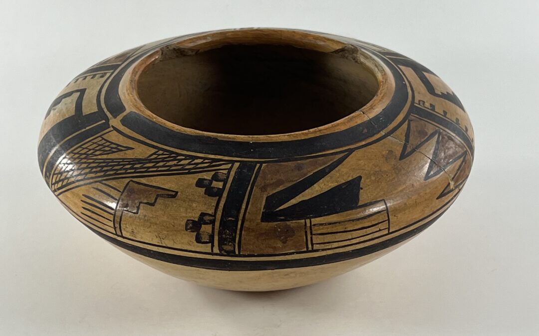
This jar must be carefully examined before it is understood. Obviously it was broken into two pieces and is damaged. Surprisingly the form remains elegant and the design is almost unaffected by this damage. Linear elements create patterns of foreground/background reversal for every panel of design; no curvilinear elements are used. The artist seems to be playing within these parameters and this makes the design visually difficult. That artist might be Nampeyo, a possibility we will examine later in this discussion. But first the jar needs to be described.
Form:
The jar has a 2-inch flat bottom, the sides then sloping upward 3.75-inches to the waist, then sloping inwards 1.875-inches to the 3.625-inch-wide mouth. The upturned rim is only a fraction of an inch tall and displays two large chips. The bottom, formed in a puki, is only slightly thicker than the sides below the waist. The upward-sloping sides above the waist are only slightly thinner than the sides below. Overall the walls are even and thin, and thus the pot seems light even for its small size.
Design:
Three different designs panels are represented on the jar, each drawn twice. One design panel is rather narrow, the other two substantially wider. These panels are separated by sets of four vertical lines that create 3-lane “highways.” Unusually the central lane of each highway is much thicker than the flanking lanes, sort of a 2-lane highway with an esplanade.
Thick-over-thin framing lines are drawn a fraction of an inch below the lip; framing lines in the reverse order mark the bottom of the painted band. Both sets of framing lines incorporate line breaks, roughly at the same point in the circumference of the jar, one above and one below the “esplanade” of one of the “highways.” Including the framing lines, the painted surface is 2.125-inches wide. The design band between the framing lines is about 1.5 -inches wide and just under 20-inches in circumference at the waist. About 20% of the design band is below the waist.
Design panel 1 is composed of four elements. From the upper right corner to the lower left corner is a net of crosshatched lines. A string of 5 or 6 horizontal lines spans the entire distance. Above the net has been breached and from 1 to 4 shorter horizontal continue the pattern. [The numbers vary by rendition.] These horizontal lines are crosscut by 17 vertical lines. Note that the lowest horizontal line is not crosscut and remains independent of the crosshatching above. The gap in the net has the form of a thick J-hook with a sharp downward-pointing point. The gap exhibits foreground/background reversal, sometimes looking like an unpainted hook and sometimes looking like a torn net. Below the netting, and based on the three-lane highway to the right, are two 2-layer pyramids composed of square bricks. Between them is a reciprocal unpainted two-step pyramid. Centered in the unpainted space below the net is 0.5-inch vertical line that turns right 90 degrees and extends 0.75-inches, an upside-down “L”. Nestled into its crook is a red element with a 3 or 4-step toothed edge, it varies by rendition. In both renditions the lowest step thins and extends to the framing line but in one panel this extension is so thin it is almost invisible and in the second panel it is wider. In both cases, foreground/background reversal creates a reciprocal set of unpainted steps. From the vertical leg of the inverted “L” 5 or 6 parallel lines extend into unpainted space , the numbers again varying by rendition. These form a fringe off the right edge of the red element or (more foreground/background reversal) can be seen as a thick-toothed comb emerging from the unpainted space, teeth against the L form.
Design panel 2 is also composed of four elements. Based on the right 3-lane highway, 3 red isosceles triangles extend into the central unpainted area. Against the left 3-lane highway is another thick J-hook with an upward-pointing point and a short shank. It is painted red. The lower edge of this hook rests on the thin framing line but is composed of two radically-different designs. The left section is solid red like the rest of the hook above, but the right section is composed of 5 parallel lines caped at their ends, a 4-lane highway. Finally, nestled in the interior of the red hook is a black hook composed of two triangles. The upper segment is a long, thin right triangle. Growing out of its base is the point of a larger, thicker right triangle. Together the they complete the hook. Foreground/background reversal is central to this design. Red and black triangles intrude from the right edge into the central unpainted space, but this space also displays four unpainted triangles pointing to the right and one unpainted triangle pointing left.
Design panel 3 is narrower than its neighbors and, unlike them, is composed of all-black paint. A thick strip 0.375-inches thick descends along the right edge of the space but quickly expands to a 0.625 thickness until it reaches the bottom. Jutting to the left off the resulting shelf is an inch-long thin line; hanging from its end is a black triangle with a 3-step toothed edge. When the thick vertical strip reaches the lower set of framing lines, it turns left and forms a thinner 0.25-inch wide strip that extends about 85% of the distance across the design segment. From the 3-lane highway forming the left wall of the segment protrudes a fringe of 7 or 8 short parallel lines, the number differing between renditions. Foreground/background reversal plays a prominent role in the design of this segment also, but it takes a steady gaze to see its full extent. Most obviously the black crook with 3-stepped triangle creates a reciprocal set of unpainted steps that is itself part of a thicker, unpainted crook. Except for that fringe of short lines, the left wall is unpainted. As this thick strip reaches to top framing lines the unpainted area turns right and is defined as a narrow strip along the upper framing lines, its lower edge the thin, black, horizontal line. Thus the black form of design in this segment is inversely reflected by the unpainted space in the segment. These inverse forms are subtle, but once seen the design in this segment can be seen as a black design in an unpainted space, or the same unpainted shape intruding into a black space.
Design Analysis:
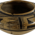
The jar has an elegant profile, all curves, with 60% of its height below the waist, which gives the form an upward thrust. The tiny upturned lip adds an additional flair to the form. The high waist and the fact that the design drapes over that waist add to the jar’s elegance. Seen in profile without a measure of its size (the third photograph, above), the jar seems grand. It is balanced, has unusually thin walls, and has an exceptionally graceful profile, all marks of an exceptional artist.
Note that the 3-brick triangles along the right vertical wall in segment 1 are both an ancient design and one used by Nampeyo on another pot in this collection (1996-05).
I find bowls by Nampeyo easier to recognize than her jars. Of the 19 other jars by Nampeyo in this collection, most are unusual in shape, age or design (cf 2015-12, 2015-03, 2019-19) or are figural (cf 2007-16, 2014-17). Only three other jars in this collection by Nampeyo are of normal shape and carry external bands of design: pot 2002-11 carries a simple design repeated around the exterior of the pot and is a bit boring and pot 2000-03 is decorated with a simple and serene band of design. Jar 2021-09 is particularly relevant to our discussion because I think it also is an experiment in design.
Unlike these jars, jar 2024-07 has a complex set of designs that keep on changing foreground and background so that the design seems dense, busy and difficult to comprehend. It is “sui generis” and I am unable to find comparables. That makes to task of determining if the jar is “by Nampeyo” particularly challenging. Unlike other potters at Hopi, except perhaps oldest daughter Annie when she was painting in her mother’s style, Nampeyo’s design elements generally interrelate into an underlying structure of dialogue. On jar 2024-07 that interrelationship is explicit in that every panel of design features foreground/background reversal. That is the central feature of this jar.
Judging if a particular pot is “by Nampeyo” is a matter of opinion and is easily open to bias. There are “expert” dealers who certify pots as by Nampeyo when clearly many are not. Collectors who want to own a pot by Nampeyo are subject to the same bias. This collection has 65+ pots that I claim are in whole or part a product of Nampeyo’s hands. I may be in error about some of the pots, so to try to make my attribution logic explicit and therefore vulnerable. I have defined six design strategies that I think typify Nampeyo’s Sikyatki Revival style. She did not mechanically apply all these strategies all the time; they were a sort of tool box of design techniques available to her. The greater number I find on a pot, the more confidence I have that the pot was painted by Nampeyo. Let’s see how well jar 2024-07 measures up to these standards.
Nampeyo’s six design strategies are:
- A tension between linear and curvilinear elements, often represented as a contrast between heavy and delicate elements;
Except for the circular framing lines, there are no curvilinear elements of design this jar. On the one hand, the lack of curvilinear elements is the central challenge to thinking Nampeyo was the maker of this jar. Given the lack of curvilinear elements, it doesn’t look like a Nampeyo pot. The ubiquity of linear elements in the design is the basis of the technique of foreground/background reversal, the central characteristic of the jar’s design. Ironically these linear forms provide a pathway that will return us to the possibility of Nampeyo as maker.
2) A deliberate asymmetry of design;
The designs on panels 1 and 2 are clearly asymmetric. The design in panel 3 is as close to a symmetric design as we see on pot 2024-07, but even here symmetry is violated by the fringe of parallel lines on the left wall of the panel. The ubiquitous foreground/background reversal offers a kind of reflected symmetry, but whichever pattern dominates at the moment is asymmetric.
3) The use of color to integrate design elements;
As can be seen in the top view (photograph 6, above), the three red elements in panels 1 and 2 are repeated on opposite sides of the jar, unifying the overall design. Notice that the red paint is somewhat “muddy” or inconsistent. This suggests the jar was made before 1930, when the Museum of Northern Arizona encouraged Hopi potters to develop a more-solid red paint.
4) The use of empty (negative) space to frame the painted image;
There is a limited unpainted space in panel 1, but it is sufficient to highlight the design elements. Unpainted space is central to the designs in the remaining two panels.
5) The use of a thick above a thin framing line on the interior rim of her bowls.
On this jar faming lines are drawn both above and below the panel of design..
6) Nampeyo’s painting is confident, bold, and somewhat impulsive compared to the more-studied, plotted and careful style of her daughters, descendants and other Hopi and Hopi-Tewa potters.
Let’s discuss the descriptors in this strategy separately:
a. Confident:
There is a high density of elements in the 1.5-inch-wide painted band. Within this narrow narrow band the artist chose to paint a detailed and elaborate design consisting of 14 diverse elements each repeated twice. When alternative foreground/background reversal patterns are acknowledged, the total number of design elements is greater than 28. Under a less-gifted hand this mass of designs could easily become a jumbled mess. Like small bowl 2021-09, jar 2024-07 is a measure of the artist’s confidence in her ability to create a detailed and effective design in a narrow band.
In panel 1, there is a set of horizontal lines vertically cut by 17 lines, but the lowest horizontal line is not horizontally touched. This small detail appears in both renditions of the panel. It is obviously intentional and shows the artist’s care, attention to detail, and confidence in her ability to control her yucca brush in a tight space. Draping the design band over the waist projects the image to a viewer’s eyes, but makes it more difficult to paint, thus also indicating the painter’s confidence in her ability.
b. Bold:
There is a strong intentionality about the design: it is an experiment to see if all elements of the design can display foreground/background reversal. As far as I know this is a singular occurrence in pottery from Hopi: Such an attempt is inherently bold.
c. Impulsive:
There is a limited amount of impulsive painting on this pot. The two red steps in the first panel do not have the same shape. One rendition has 3 steps and a noticeable extension to the bottom framing line. The second rendition has 4 steps and an almost invisibly-thin extension to the bottom framing line. Additionally sets of parallel lines emerge from the vertical edge of these red steps, 5 lines in one rendition, 6 in the other. Similarly, in the third panel, 7 or 8 parallel lines form a fringe emerging from the left wall of the space, the number varying by rendition. I equate this inexactness with impulsiveness. However I think impulsiveness of painting on this pot is constrained by the central need to allow for foreground/background reversal of the designs. Too large an impulsive deviation in design would interfere with such transmutation.
In short, jar 2024-07 exhibits 5 of the 6 strategies typical of the Sikyatki Revival style of Nampeyo. No one strategy is decisive, but the lack of curvilinear elements weighs heavily; it is the core of an argument that Nampeyo did not make this pot.
Foreground/background reversal:
Foreground/background reversal was frequently used by Nampeyo. See Appendix F for a listing of Nampeyo pots in this collection that use the technique. The technique continues to be widely-used today, but both in Nampeyo’s day and ours it is used for small elements of design embedded into a larger pattern. This scattered use enlivens the overall design, like lemon in tea.
Importantly, the ubiquitous use of foreground/background reversal on jar 2024-07 has the same design impact as linear/curvilinear tension, strategy #1 (above). The function of the tension between linear and curvilinear elements is to energize the design. On jar 2024-07 the foreground/background reversal creates that same energy. There is no need to turn to use curvilinear elements to accomplish this result. To reject this jar as “by Nampeyo” because it lacks curvilinear forms would be to insist that Nampeyo would never undertake such an experiment in design because her commitment to including curvilinear elements was greater than her commitment to expanding her ceramic experience.
Nampeyo experiments:
Nampeyo’s biographers (Kramer, 1996:XXX, The Blairs, XXX:yy and scholars who focus on Nampeyo (Wade and Cooke, 200x:YY and 2023:yy:PP) all emphasize her restless, creative mind openness to new experience. A number of other pots in this collection express her openness to experimentation (cf 2015-12, 2015-03, 2019-19, 2007-16, 2014-17).
I believe jar 2024-07 is a pure case of this commitment to pushing the boundaries of her craft.. “A bit of foreground/background reversal has a nice effect,” I imagine her thinking. “I wonder what it would look like if I made it central to a design. Let me give that a try…,” and the result is jar 2024-07. The result is so startling that it is easy to label it “inventive,” which I think is similar to the “boldness” referenced in design strategy 6, above.
This is an experiment with a cost, however. My eye is both dazzled and intrigued by the design, but has difficulty making patterned sense of it because:
- the design is done within a crowded narrow 1.5-inch band,
- it contains numerous design elements,
- the design of each panel is unique, and
- foreground/background reversal causes all elements of the painting to flicker,
I am able to describe each segment of design, but unable to formulate a summary description of each design panel or the overall design of the pot. Nowhere does a viewer’s eyes get to rest. It is a difficult and exhausting pot to view. The graceful form of the jar is its only serene characteristic.
The thinness and graceful form of the pot and the willingness of the maker to experiment with the limits of foreground/background design are the core of the argument that Nampeyo made this pot. Jar 2024-07 is not particularly attractive; aesthetically it is not a great example of Nampeyo’s work. But I think it is hers. As an experiment in design it has an honored place in a collection trying to show the full range of Nampeyo’s talent.


