
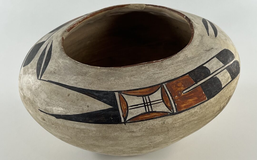

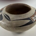

This jar is distinctive in contrary ways: 1) The shape is awkward; 2) It was slipped with white kaolin clay and has a red rim, reflecting an earlier Polacca ware tradition; 3) Its Sikyatki-Revival painting is not placed symmetrically and is longer than the space in which it is drawn; but 4) the design is magnificent, beautiful and elegant. Collectively these characteristics suggest that a) was formed either by Nampeyo, who was not focused on exactness that day, or by her daughter Annie, who was a teenager learning her craft; b) the pot was made pre-1900; and c) was casually but d) brilliantly painted by Nampeyo.
This specific aesthetic pattern offers some insight into Nampeyo’s evolution as an artist.
Form:
The curve of the bottom flattens out somewhat and this relatively flat area is about 2.0-inches wide. From there the walls of the bowl slope upward 3.0-inches to the waist, then curve inward about 1.75-inches to a 3.75-inch mouth. The bottom, formed in a puki, is quite thick with the vertical sides of the bowl only somewhat thinner. As expected, the incurving upper surface is even thinner so that when wet the weight of this clay did not collapse into the jar. Yet overall the jar is heavier than anticipated given its modest size.
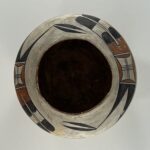
There is a 0.5-inch chip inside the rim, revealing that the body of the vessel is formed from a light-grey clay. Directly opposite this chip is a U-shaped, thin, tight crack [looking like a fine scratch] that extends about 1.75-inches from the rim to the waist of the jar. The raw interior of the jar is an unslipped dirty brown, the result of 130 years of dirt filtering inside. Pottery from Hopi is coiled with the gaps between the coils smoothed; a gourd scraper is then used to further smooth and thin the walls of the vessel. This process obliterates any signs of the coiling. Inside pot 2025-05 there are faint linear patterns that may be the residual of the original coils. I have not seen this before in a jar from Hopi. Another bowl in the collection (1995-11) has an exterior clearly showing its piki and coiled walls, but this effect was intentional. Ironically bowl 1995-11and jar 2025-05 were both bought –30 years apart– from Medicine Man Gallery.
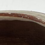
Polacca ware from First Mesa was made from about 1790 to 1900 and is characterized by a light grey kaolin slip that has a different expansion rate than the body of the pottery, leading to a crackling or “scabbing” of the white surface slip. Jar 2025-05 has a white kaolin slip, but it is not crackled. Nampeyo was born about 1858 and probably began making pottery as a young teenager. While much of her history is lost, presumably her first pots had the Polacca crackled while slip. According to Hopi-pottery authority, Dr. Ed Wade, in the 1890’s Nampeyo began to polish her kaolin slips, thus preventing them from scabbing. Jar 2025-05 seems to be one of these pots. The rim of jar 2025-05 is painted red (photo 7 above) and this is another characteristic of Polacca ware that went out of fashion before 1900, as the “newer” style of Sikyatki-Revival pottery became widespread.
Design:
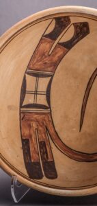
As noted above, this jar has a painted red rim. The significance of this will be discussed below, in the “Design Analysis” section.
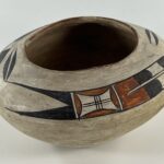
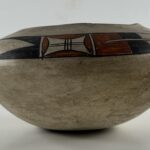
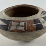
If you look carefully at the pointed ends of the linear motif, you will see that in one rendition the lower point is unblemished, while on the second rendition the black paint has a small flake. I will call the unblemished design “Side 1” and the design with the flake “Side 2.”
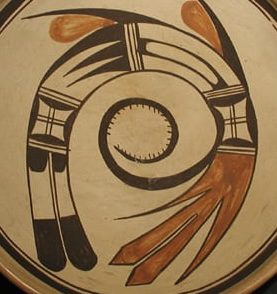
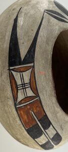
The form of both renditions is the same, except for one small detail. At the core of the design is an unpainted “window pane” consisting of two parallel horizontal black lines (a “one-lane highway”) crossed by black vertical lines. Side 1 displays three vertical lines (a “two-lane highway”) while Side 2 has four vertical lines (a “three-lane highway”). The walls of this unpainted space are concave and create acute angles at the corners which leaves the unpainted core bordered by four low red hills. This element is bounded by sets of one-lane highways.
To the left of the window-pane are two right triangles painted black, their hypotenuses facing each other, leaving a residual unpainted isosceles triangle pointing back toward the window-pane element. The top black triangle is slightly longer with a thinner point than its neighbor below. Off the thin tip of this upper triangle wave a pair of long-leaf forms with flat edges facing each other and rounded on their external edges.
To the right of the window-pane is a two-feather design, its base a red comb. Projecting from each pillar of the comb are thumb-like black elements with rounded tips. After about 0.5-inches of unpainted space, these thumb-like elements are repeated, forming the tips of two feathers
Form Analysis:
As expected, the walls of the vessel get progressively thinner from the piki-formed bottom to the rim, but at every point they are thicker than typical for a jar from Hopi. Moreover, it seems like evidence for the clay coils was not scraped smooth on the inside of the jar, an oversight that I have not seen before from Hopi. In addition, the rim of the jar is uneven. This form indicates a less-skilled potter and is below the standard we expect of Nampeyo. We will discuss the evidence for Nampeyo painting jar 2025-05 below. The strongest argument against Nampeyo being the involved in the pot’s creation is its relatively crude form. Let’s discuss that issue first.
We know that Nampeyo was capable of forming both elegant and difficult shapes (cf: 2005-16, 2015-04 and 2017-05). Nevertheless, both from examples in this collection and in the published literature we also know that Nampeyo sometimes paid little attention to the form of a pot and placed her focus on decoration.
This pattern also caught the attention of Nampeyo biographers Mary and Laurence Blair:
“Several of (these) pottery pieces attributed to Nampeyo…can best be described as poorly formed and polished, but beautifully decorated…One gets the impression that these forms were hurriedly made to allow the artist to move on quickly to the more interesting and pleasant task of painting her newly inspired designs…[Fig 2.24 shows] Two crudely formed pottery pieces (that) illustrate what appears to be a period when Nampeyo emphasized painted design over pottery structure, although it is possible that they were formed by other family members…(The pots) are painted with) well-executed and masterful designs (1999:83).”
This collection contains two other pots that fit this description: pots formed crudely by Nampeyo and yet displaying superior painting and innovation. Little pitcher 2012-08 has unusually thick walls and an irregular form, but the painting of a fox that it carries is superb. Pot 2018-04 is perhaps even more interesting. It is small and its walls are exceptionally-thick with an uneven rim. One design (an abstract spider) was hastily-applied and is awkward. And then Nampeyo showed her genius and willingness to experiment: She sanded down one thick wall to form a flat surface. While most of the pot was unslipped and blush golden, the flat surface Nampeyo covered with a white kaolin slip and on this canvas painted an endearing image of a Hopi maiden.
I surmise that when Nampeyo was focused on the design of a pot, she was capable of forming the clay without much caring about a pot’s form. This is all supposition, of course, and may be the product of my imagination, but this theory fits the data we have about well-painted Hopi pots by Nampeyo that a relatively crudely-made. Such an argument would justify us as accepting Nampeyo as the maker of jar 2025-05.
After I bought pot 2025-05, I sent Ed Wade photographs. He replied:
“Very interesting piece for which I cannot provide any facts but ample supposition. Early use of Polacca-like white Keoline slip like that used by Nampeyo pre-1900. Also the red painted rim echos back to the Polacca Tradition however the composition is pre-historic revival and executed by Nampeyo as evidenced by the kerfed rectangular motif from which feathers project. The extended feather projections flanking either side of the neck is also a Nampeyo trait. However, the vessel form which is lopsided is poorly executed and not of the quality of Nampeyo’s skill but could very well be a starter piece of a daughter, presumably Annie.”
—Ed Wade, 6-5-25 email
My thanks to detective Dr. Ed Wade for suggesting this plot.
So here is a second possibility: Nampeyo painted the pot but it was formed by a daughter still learning her craft, and thus producing fairly crude pots.
Crackled white slip is characteristic of Polacca ware. When I recently counted I was surprised by the number of white-slipped pots in this collection that were painted by Nampeyo, though usually her while slip is not so crackled. (See “Category” and then “White-Slipped Nampeyo” on this site’s homepage.) The kaolin white slip, combined with the Sikyatki-Revival design, indicate that jar 2025-05 was made during the transition between the Polacca tradition and the newer Sikyatki Revival style. Thus the slip also dates the jar to probably the late 1890’s to 1900.
Nampeyo’s eldest daughter “Annie,” was born in 1884 and would have been a teenager during the late 1890’s, the normal time for a woman on First Mesa to learn how to make pottery. The next oldest daughter, “Nellie,” was born in 1896 and would have been too young to form pottery. As Ed suggests, jar 2025-05 may have been formed by a relatively unskilled Annie and painted by her mother.
Design Analysis:
Jar 2025-05 is notable in that it is a hybrid characterized by both Polacca-ware and Sikyatki-Revival features. As noted above its kaolin white slip and red rim are characteristic of Polacca-ware while its design heralds the beginning of the Sikyatki Revival.
The red rim is a holdover from earlier Hopi ceramic traditions:
“The practice of painting rim tops red gained popularity among seventieth-century Hopi potters. San Bernardo vessels from this period….(sometimes displayed) a variety of reds in imitation of the Pueblo ceramics made to the east and south. Eighteenth-century Payupki Polychrome was characterized by the use of red, as were early Polacca Polychrome until the mid-nineteenth century…After 1850 black rims continued to gain popularity until the near-total displacement if red (rims) in the turn-of-the-century (Sikyatki) Revival ware (Wade and McChesney, 1981:103).”
Nampeyo seems to have occasionally harkened back to this tradition. Two other pots by Nampeyo in this collection carry red rims. Pot 2009-17 is Polacca-ware, so the red rim is more expected. Her little red-fox pitcher 2012-08 is the only other Sikyatki-Revival pot with a red rim in this collection.
For other pots in this collection by Nampeyo with kaolin slips, see the Category entry “White-slipped, Nampeyo.” See “Appendix A” for a detailed discussion of the transition of Hopi slips from kaolin to Sikyatki-Revival finishes.
The Sikyatki Revival design on jar 2025-05 displays significant discrepancies.
These are:
- The linear design on Side 1 is 7.0-inches long and 0.875-inches wide. The linear design on Side 2 is 7.75-inches long and 1.125-inches wide. Thus the design on Side 2 is 11% longer and 29% wider than Side 1.
- The “Side 1” linear motif drawn 0.75-inches below the rim. The “Side 2” linear motif is drawn 0.4375-inches below the rim, 42% closer.
- A fraction of an inch is left between the point of the leaf pendant on Side 2 and the black tips of the feathers of Side 1. Since the total length of both renditions of the design, including all elements, is 20.5-inches, while the circumference of the jar mid-way between the waist and the rim is only 18.5 inches, about 0.75-inches the leaf pendant of Side 1 overlaps above the black feathers of Side 2. Another way of saying this is that the total length of the design on jar 2025-05 is 0.75-inches longer than the surface on which it is painted.
These measurements suggest that the maker first drew all elements of Side 2 fairly close to the rim and then realized she was running out of room. She therefore drew the linear element of Side 1 smaller than Side 2 and further from the rim to give herself more room, but when she went to add the last bit of design on the pot, found that she still had insufficient room for the leaf pendant of Side 1 and had to perch it partially above its already-completed neighbor.
Assuming Nampeyo was the painter, this is not the first time I have seen her miscalculate her spacing. Vase 2013-03 in this collection is a veritable catalog of Nampeyo designs, but here too Nampeyo repeatedly miscalculated her design placement.
In short, the form of jar 2025-05 is somewhat crude and the placement of its design indicates a lack of forethought. Nevertheless the design is striking and to my eyes is one of the most delicate, elegant and impactful designs in this collection. Even with all its flaws, I think pot 2025-05 was painted by Nampeyo. Here’s my reasoning.
A reader of this website will notice that I have developed six criteria for helping decide if a design was painted by Nampeyo. I believe these strategies are typical of Nampeyo’s mature Sikyatki-Revial work which flourished shortly after jar 2025-05 was made. However, these design strategies were not mechanically-applied in every case. Instead, they represent a kind of toolbox of techniques that Nampeyo could draw on when constructing her designs. Generally the more of these strategies I find on a pot, the more confidence I have that the pot was painted by Nampeyo. Many of the classic “Sikyatki Revival” pots by Nampeyo were painted between 1900 and the mid-teens, when she became functionally blind. Jar 2025-05 was probably made just before this time, but Nampeyo’s creative process was continuous and organic and was not organized into discrete chapters. Thus measuring the design on jar 2025-05 against this typology of strategies should still be productive.
The six strategies are:
1) A tension between linear and curvilinear elements, often represented as a contrast between heavy and delicate elements;
If the two delicate leaves are seen as substantially curvilinear, there is a sharp contrast between them and the heavier overall linear form below. One side of the leaf motif is also flat. Yet even the linear form incorporates three rounded elements: 1) the “windowpane” element is set into a space with curved walls, and both 2) the first and 3) second set of black elements in the two feathers have curved ends. The set of leaves is especially interesting since their flat sides face each other with a linear “one-lane highway” between them and the rounded edge of each leaf immediately contrasts with this central linear form.
2) A deliberate asymmetry of design;
Sometimes Nampeyo’s preference for asymmetry is blatant (xx-XXX), but often it is subtle (yy-YYY). Jar 2025-05 has both. The double-leaf pendants create a major imbalance in the design. Nampeyo is also known to add minor asymmetries that often go unnoticed. On jar 2025-05 one “window pane” has 3 vertical lines and in the second window-pane displays 4 vertical lines. As discussed above, overlapping of the design bands also creates an asymmetry, though one that is likely not intentional.
3) The use of color to integrate design elements;
The two red areas of design are adjacent at the center of the main linear form. They attract a viewer’s eyes to this center while the extremities of design (leaves, triangles and feathers) are black and orbit around this red section. Here color focuses a viewer’s eyes, but does not integrate the design elements. On the other hand, the thin red lip is placed exactly between the large red areas and, from a vertical view, visually bridges these dramatic red designs.
In this regard, jar 2025-05 is like a lobed jar that I believe Nampeyo made (2015-12) where red is also used to focus a viewer, but not integrate the design. Interestingly jar 2015-12 is also kaolin-slipped and may have been made about the same time as 2025-05.
4) The use of empty (negative) space to frame the painted image;
The substantial negative space around the linear portion of the design highlights this element, but it is the pendant-like leaves flying off the point of the upper triangle that most-dramatically display this effect.
5) The use of a thick above a thin framing line on the interior rim of her bowls.
This is not a bowl, so the framing lines are not expected. though they do appear on some of Nampeyo’s jars (cf 2012-08 and 2021-09). While not a framing line, the red lip performs somewhat the same function by visually distinguishing the mouth of the jar from the painted surface.
6) Nampeyo’s painting is confident, bold, and somewhat impulsive compared to the more-studied, plotted and careful style of her daughters, descendants and other Hopi and Hopi-Tewa potters.
There is a huge visual weight difference between different parts of the design on jar 2025-05. The central linear design is heavy and stolid. That two-leaf banner flying off the tip of the black triangle is light and vibrant. Together these contrasting patterns give the design great energy and balance. This contrast in visual weight I see as the mark of a confident artist.
Note that each end of the linear design consists of feathers, pointed on one end and rounded on the other. Both ends fly towards the center. These “oppositional feather motifs” on the ends of the design strikes me as the mark of a confident artist who understood the visual power of such tension. The two red sections dramatically attract the viewer’s eyes and add a “bold” dimension to the design. This band of design warrants further discussion, below.
That the design is “impulsive” is clear due to the overlapping placement of the design, discussed above.
In short, of the six design strategies that are characteristic of the mature Nampeyo, four are clearly present, one (the use of red) is arguable, and one (framing lines) is absent, though a better marker for bowls. Since the six strategies are characteristic of Nampeyo, but not mechanically applied in every case, their pattern supports a conclusion that Nampeyo made this jar. This is especially so since the design typology was developed based on Nampeyo’s Sikyatki-Revival work, and jar 2025-05 was made earlier.
*****************
Jar 2025-05 shares three characteristics with other Nampeyo jars in this collection and these similarities increase my confidence that Nampeyo at least painted jar 2025-05:
One:
As Ed Wade noted in his email (quoted above), the “long leaf” element on jar 2025-05 is a common motif for Nampeyo. [See Appendix F and especially Nampeyo pots 2017-15, 2019-12, 2019-19 and 2020-16.] The long-leaf element on jar 2020-16 is particularly noteworthy since 1) both it and jar 2025-05 are kaolin-slipped and were likely made at somewhat the same point in Nampeyo’s career, and 2) on both jars this same long-leaf element is flying from a point, pennants from flag poles.
Two:
The four pots noted above also share a unique design element. Except for one bowl that may have been painted by Annie using her Mother’s style (2014-13), I believe Nampeyo was the only potter of her time using the “window-pane” element. Its presence alone is enough to make me stop and consider if a pot is “by Nampeyo.” As can be seen above, one large window-pane is at the center of the design on bowl 2014-07 and jar 2025-05 while two window-pane elements occupy parallel locations in the middle of the design band on bowl 2002-03 and canteen 2019-12. The presence of this element on all four pots strongly suggests that all were painted by Nampeyo. [Other Nampeyo pots in this collection displaying this window-pane design are 1988-01, 1996-05, 2006-02, 2013-03, 2014-01 and 2020-17.]
Three:
The linear design on jar 2025-05 has feathers at both ends and thus each end pushes toward the central red section, compressing it. I’ve seen this pattern before.
Nampeyo’s design genius is particularly well articulated by two bowls that are the most evocative of Nampeyo’s work in this collection, 2002-03 and 2014-07. They live on a table near my bed and we greet each other every morning. Note that the linear design on jar 2025-05 is essentially the same as the central band of design on both these bowls:
-
- 2002-03
-
- 2014-07
-
- 2025-05
All three pots display linear bands of design with “oppositional feather motifs,” pointed feathers on one end and rounded feathers on the other, thrusting towards each other. This energy draws a viewer’s eyes towards the center of the band of design. This pattern of design is also found on a more-elaborately-executed large canteen by Nampeyo:
2019-12
Though curved, the ribbon of design on this canteen is essentially the same as the three pots shown above: two tails thrusting toward the center with a central section displaying the Nampeyo window-pane design, though here the tail feathers are the same design. The fact that the same basic design appears on all four pots bolsters the conclusion that they were all made by the same hand.
While these four pots share much in common, it’s also important to recognize differences. The other three pots with this design are all Sikyatki Revival and were made probably in the first 15 yers of the 20th century. Jar 2025-05 is 15 or more years older and participates in the older Polacca ware tradition, as indicated by its kaolin slip and red rim. The three more-recent pots have their designs “floated” directly on their surface. Significantly, the structure of the design band on jar 2025-05 is somewhat simpler and the quality of painting on this jar is a bit heavier and stilted than the painting on the other three pots. Nampeyo’s painting improved over time.
We can see that progression of skill by looking at jar 2025-05 in the context of four other pots in this collection made by Nampeyo before she began making fully Sikyatki-Revival style pottery:
- 2015-03: Late 1880’s to early 1890’s: Saucer-shaped seedpot with Acoma-derived birds. The shape is ancient Sikyatki, the bird images are pure Acoma, and the slip is crackled like Polacca ware. This is the earliest-known Acoma-bird pot by Nampeyo and shows her inquisitive mind searching for new forms and designs. The painting is heavy-handed compared to her later work.
- 2009-17: ca 1890. A piki bowl displaying a Polik’Mana image, this broken and reconstructed bowl is said to have been part of Nampeyo’s household equipment and thus was (presumably) made by her. For 50 years Dick Howard believed this bowl to be “Polacca C” ware and thus probably made in the 1880’s or earlier. Ed Wade recently redefined it as “Walpi Polychrome,” a short-lived style made in the 1890’s. The surface is heavily encrusted with corn meal, but presumably it has a crackled kaolin slip. The design is difficult to discern, but seems somewhat heavy-handed in a casual folk art tradition.
- 2020-16: 1890’s. “Pure abstraction” jar with contradictory painting styles. This is a rare example of Nampeyo’s creating a pattern of abstract shapes suspended in a space. Some of the painting is of the high-quality we expect of a mature Nampeyo, but some is considerably inferior to our expectation. I am only 70% sure that Nampeyo made this jar. If she did, it displays an irregular painting talent that was not yet perfected.
- 2025-05: 1890’s. The leaf and window-pane jar that is the focus of this catalog entry. As detailed above, it is clear that Nampeyo misjudged the space needed for her design, forcing her to adjust the placement of the design elements. This is perhaps a sign of some inexperience in design. While its “oppositional-feather”motif is shared with three other Nampeyo pots in this collection, it is also clear that the rendition on Jar 2025-05 is more-heavy-handed and represents a painting skill still being perfected.
- 1993-04: Late 1890’s. Transitional bowl, “bird-hanging-from-sky-band design. The subject of “Appendix B” and a major catalog entry, this bowl combines a Polacca-like kaolin slip with a near-exact copy of an ancient Sikyatki bowl. While the shape of the bowl and its design meet the highest standards, its slip does not. The irregular coverage of this slip is additional evidence that Nampeyo was willing to short-circuit one step in her production of pottery when her interest was elsewhere. The painting on this bowl is bold, but it is also confident and more exact than the painting of jar 2025-05, suggesting that the bowl was made by a more-experienced Nampeyo.
To summarize this discussion:
Jar 2025-05 has taught us the following things:
- The crudeness of the form of bowl 2025-05 and the casual placement of the design elements raise serious questions about its maker. Ed Wade’s suggestion that a young Annie formed jar 2025-05 is plausible. Either Nampeyo or Annie might have formed the bowl. Following the theory that the simpler explanation is often the best, I tentatively conclude that Nampeyo formed jar 2025-05 on a day when manipulating the clay was not her highest priority. I might well be wrong. Certainly on jar 2025-05 there is a curious disjunction between form and design. Crude form combined with superior painting is recognized in Nampeyo’s oeuvre and is seen in two other pots in this collection.
- Three patterns suggest that Nampeyo was the painter: 1) the six design strategies typical of Nampeyo’s later work are substantially found on the jar, 2) the “long-leaf” element was often used by Nampeyo, 3) the “window-pane” design was frequently and uniquely used by her and is almost a signature and 4) the jar is part of a sequence of pots by Nampeyo in this collection that feature oppositional feather motifs.
- There is evidence in the literature and in this collection that Nampeyo sometimes paid little attention to the form of a vessel when her main interest that day was painting. We have reviewed two pots in this collection that fit this pattern.
- Pots formed by Nampeyo and painted by a relative were fairly common after the late 1920’s, when Nampeyo was becoming functionally blind. Pot 2025-05 may be the reverse, formed pre-1900 by a young daughter and painted by Nampeyo. If such supposition is correct, it is an early example of Nampeyo-daughter collaboration.
- Regardless of who formed it, jar 2025-05 is a window into the work of a younger Nampeyo, when she was still developing her ability and her pottery retained some Polacca-ware elements, before the Sikyatki Revival style became ubiquitous.
That’s a lot of Hopi ceramic history packed into one simple pot.
